extreme517
Pair
Okay, I ordered color samples today so won't really get this dialed in at all until receiving samples. The goal is a simple cash set...25c/$1/$5/$20/$100. I know conceptually what I want to do, so just need to refine the inlay and play around with colors/edge spot patterns, etc. I'm not looking to be crazy over the top and I do think 3D14 is always a solid edge spot choice, so I anticipate most things changing quite a bit before getting locked in. I mainly wanted a roughed out inlay just to load in the chip tool and start to be able to play around. Any and all feedback regarding aesthetics is much appreciated! I will be tweaking fonts/graphics/colors, etc. so I know this is nowhere close to perfect as it sits.
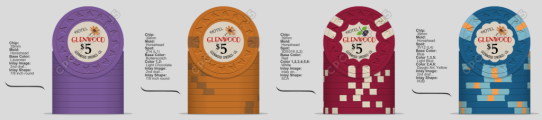
The concept: Fantasy chip set from the Hotel Glenwood.
1) What if the Hotel Glenwood had produced a set of chips as a tribute to Doc Holliday before it burned down in 1945?
2) Doc lived out the tail end of his life at the Hotel Glenwood and could have played his last card games there.
3) HHR mold because it's historic, the horse theme can play into the Old West stories, and I like a heavily textured inlay. HHR stacks well and is a good, consistent quality mold. I like the H mold as well and it has a great history, but may have to save that for an eventual tourney set and/or secondary mold to mix in with this set.
4) My game is mostly 25c/50c, so the $1 is the workhorse. I thought making the $5 chip with maroon base as the huckleberry chip as it means business if it hits a pot. Maybe I need to move the maroon base to the $20 chip and use a butterscotch or yellow for the $5.
5) I'm not a big fan of a white $1 and don't want to go with grey either. Maybe the blue can play into the theme of the Glenwood hot springs as Doc moved there thinking the springs could offer some healing powers to his tuberculosis. I've thought about doing just a solid $1 chip, so may end up that way and could be quite a few base colors that could pull it off and maintain a clean, simple look and contrast between the quarter and either maroon or butterscotch $5. My sample set on the way will be a huge help in really dialing this in, but I know plenty of y'all have more samples/chips/experience so fire away with your ideas!
6) The quarter can be any color, though I am wanting to avoid dayglo base colors due to the weight and also wanting this set to feel a bit old school, so not really needing/wanting a lot of bright colors.
Last edited: