The Rainier Room
Owner: @madforpancakes
Artist: @madforpancakes
Manufacturer: CPC
Mold: CSQ
Showcase Thread: https://www.pokerchipforum.com/threads/the-rainier-room-cpc.64177/
Thoughts from the owner:
Back in 2007, I decided to upgrade my college poker game with a "custom" set. I bought some Nexgen LAS VEGAS mold chips and had a friend create some label artwork for me. Those chips worked great for many years, but the label material was not ideal and after a few years the primary denom labels were too worn to read. I joined PCF in 2016 I knew I wanted to eventually create a new custom set, but I had no idea where to start. Paulsons would have to make do in the meantime. It took 4 years for inspiration to strike and the timing to be right, and I began the project in earnest in April 2020.
If there's one thing that people in the PNW don't get sick of, it's seeing Mt. Rainier. I saw a photo from a person's house whose living room had a view of Rainier and that got me thinking about how cool it would be to have a poker room with a view of Rainier. That idea gave me the name "The Rainier Room". While I can't yet afford such a lavish poker room, maybe these chips get me a little bit closer in the meantime.
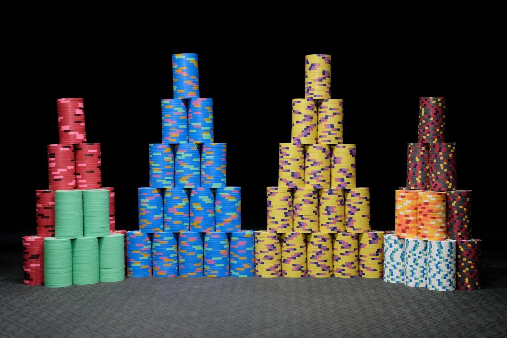
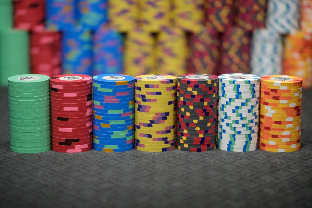
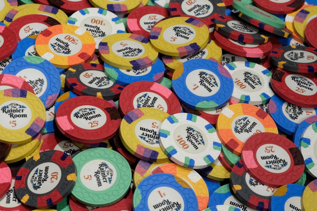
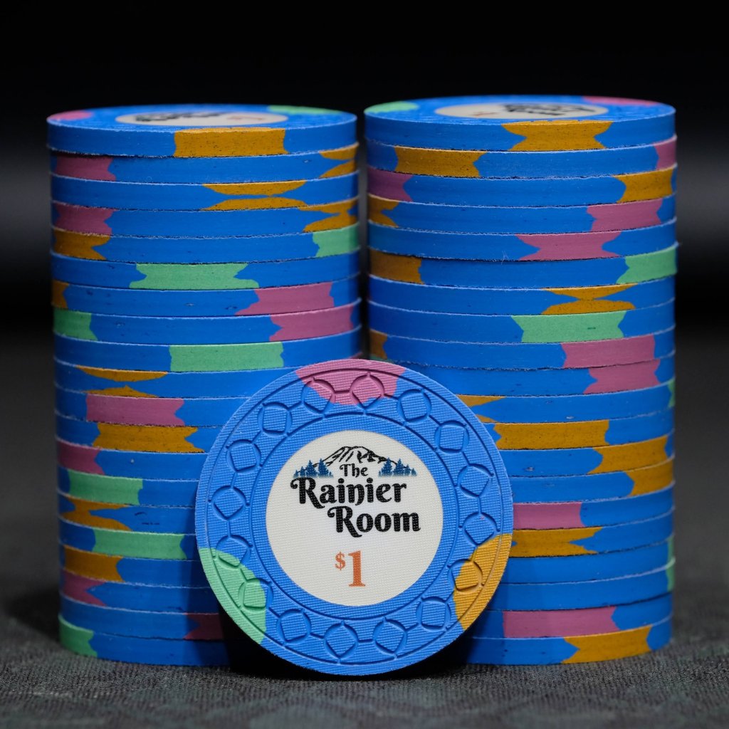
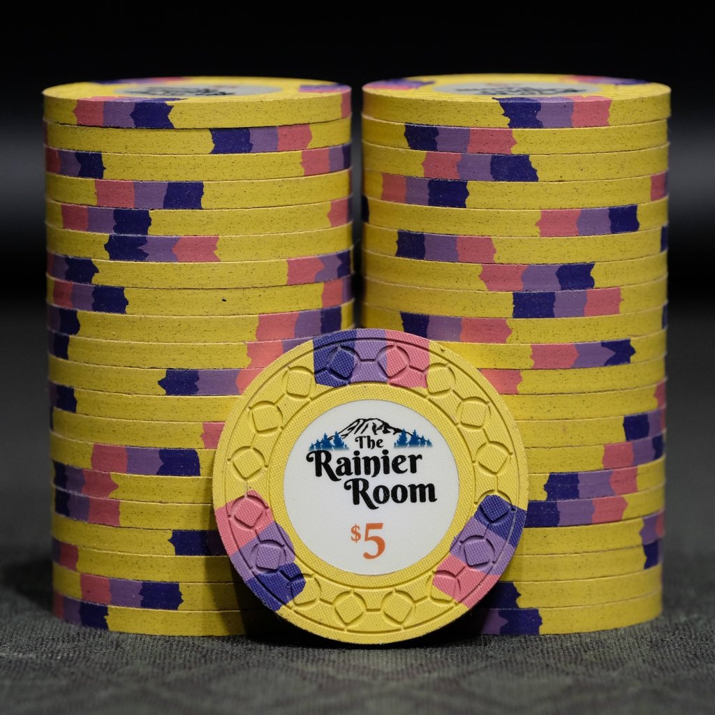
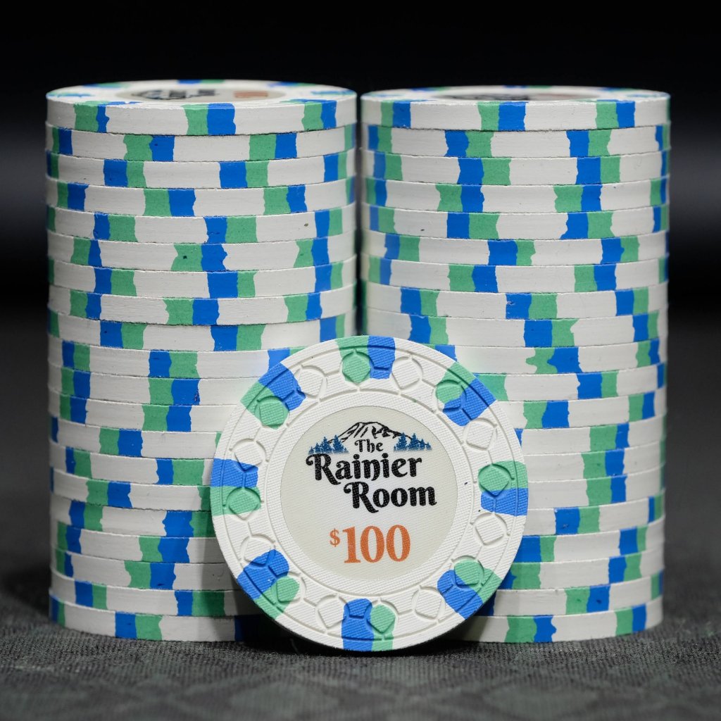
I ended up deciding I wanted Cali colors with as much blue and green as I could manage to fit in. The first chips I really settled on a design for were the $1, the $5, and the $100. The $1 is meant to remind you of a PNW nature scene. The blue base represents water, the green and brown the forest, and the lavender a typical stunning sunset. The $5 is an homage to the University of Washington, whose colors are gold and purple. The $100 has a similar color scheme to a vintage white Seahawks jersey.
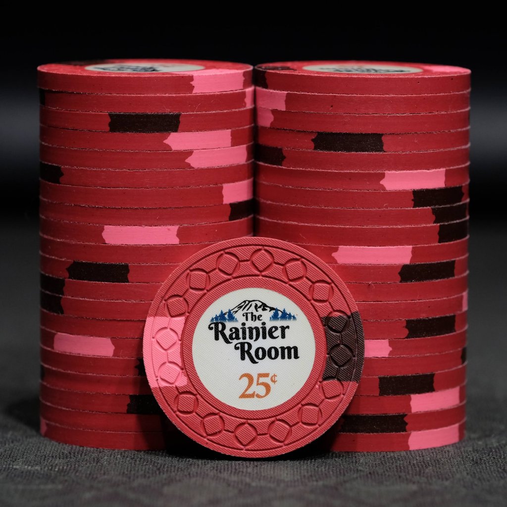
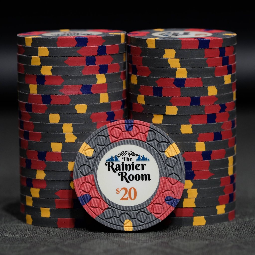
I wish I could say I had some great PNW inspiration for the remaining chips, but having decided on the above it was really a question of trying to make chips that work nicely in the spot progression and hopefully wouldn't make any dirty stacks. I've always liked color gradient style chips, as the $5 shows, so I did something similar with my red 25c. The $20 was a real challenge for me. I wanted to have something pretty flashy, as this is generally the highest denom that regularly hits the table in .25/.50 games. This chip went through the most revisions and I am pretty happy with what I came up with in the end, but I do wonder if it would be even better with peach instead of arc yellow.
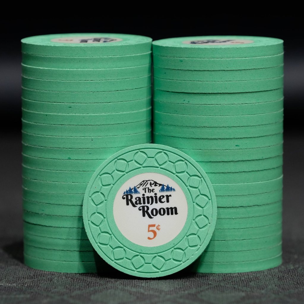
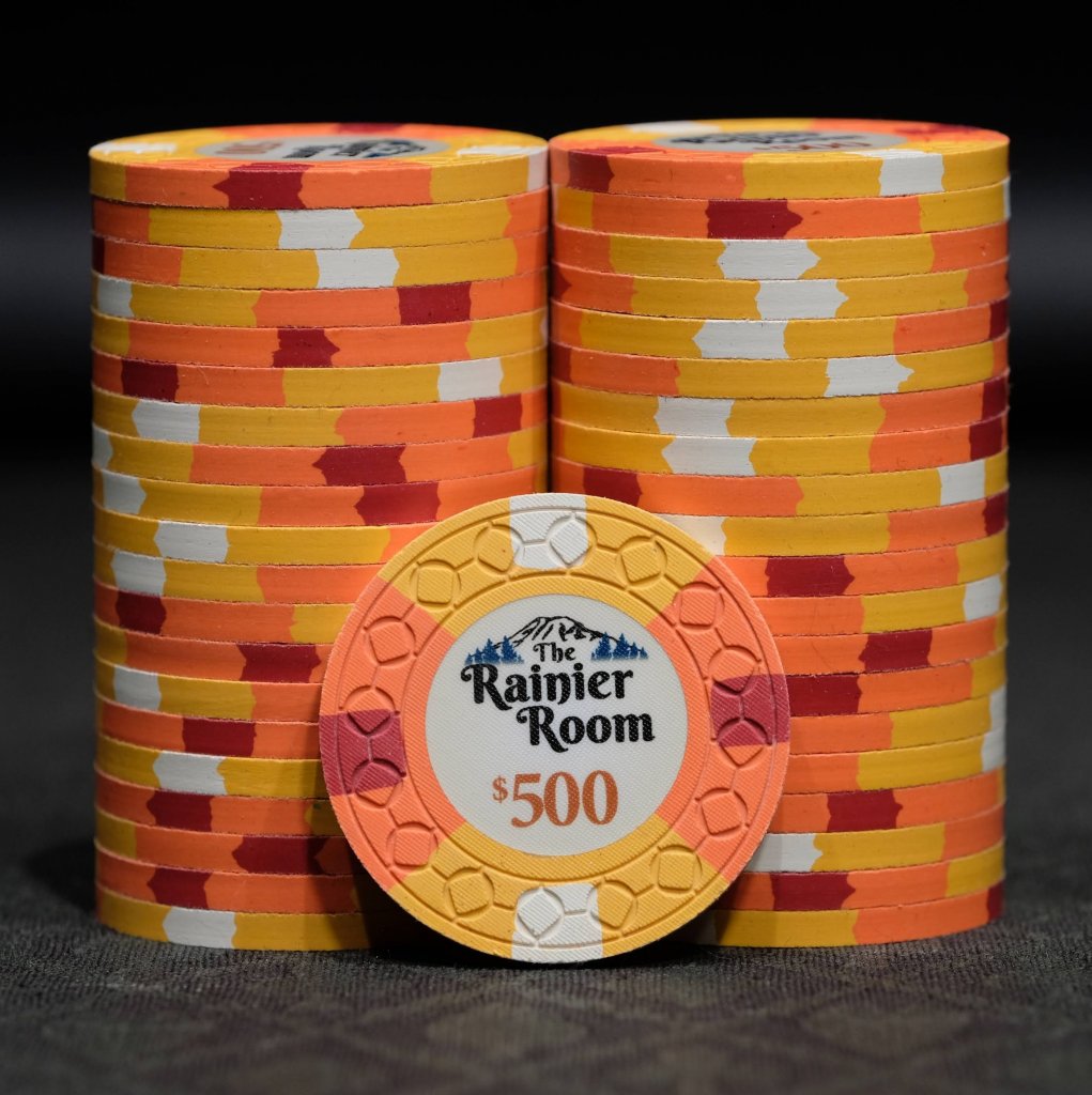
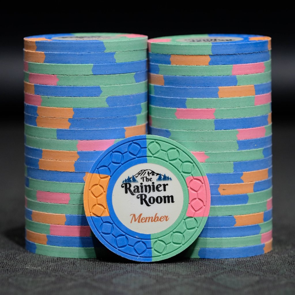
The final 3 chips to come into the set were all last minute no revision additions. At some point when you're ordering 1300 chips, you realize you might as well tack on a few probably unnecessary denoms and special chips. The idea for the $500 was to have another gradient chip featuring DG Tiger, but with greater extremes. The 1/4 pie 4A14 spot pattern is pretty rare, I can't think of any set I've seen that has used it. I really like how it came out. While I was at it, why not a rack of solid 5c for microstakes? Green was an easy choice here. @The Nuts had the great idea for a member chip, so I created the blue and green 1/2 pie 2A12 to give to my regulars.
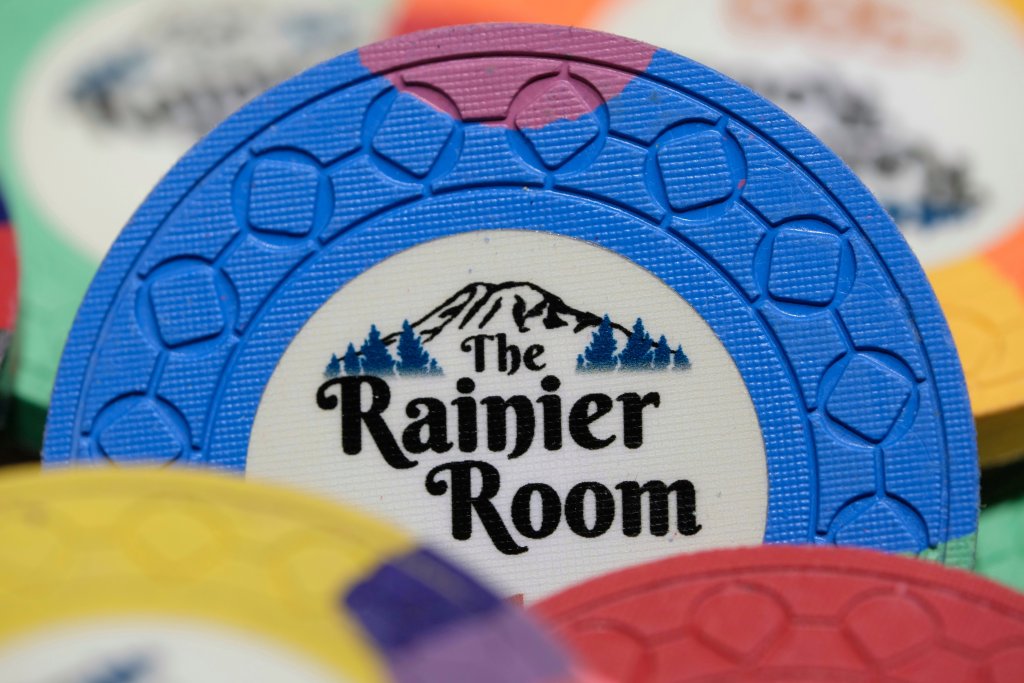
Designing the inlay was a fun - but very time consuming - experience. It was my first project of this type so there was a decent learning curve involved. I made the initial mockups in Photoshop. Once I had solidified my ideas I started to learn Illustrator to translate the design to a vector graphic, which is better for printing at arbitrary sizes. This made adding some accessories like a dealer button and cut cards simple.
The mold was a very tough decision. In my initial mockups I was planning on using Scrown. After trying out the mold samples, I needed to get shuffle stacks of the molds I was considering to see how they felt in quantity. I was very sad to find that I absolutely hated the way the Scrowns shuffled. The other options I was considering were CSQ and Jockey, which were both fantastic to shuffle. I found the little jockey man distracting and CSQ ended up winning the day. I was very lucky to happen to e-mail CPC with my order right at the cutoff for the CSQ run happening at the time, so unlike a lot of people I only had to wait 4-5 months for the chips to be produced and delivered.
What's next for The Rainier Room? I am planning another order in the next year or so to create 50c and $25 chips and increase the number of $5s to 600. Additionally, I have a couple designs for a tournament set that may be produced eventually.
Thoughts from the committee:
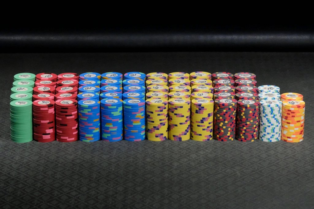
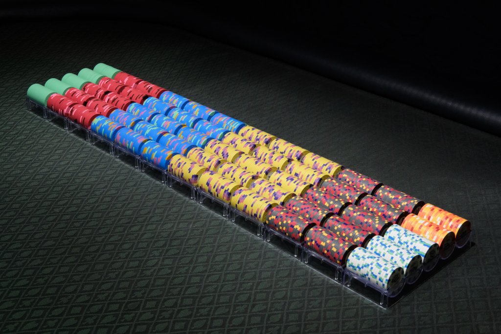
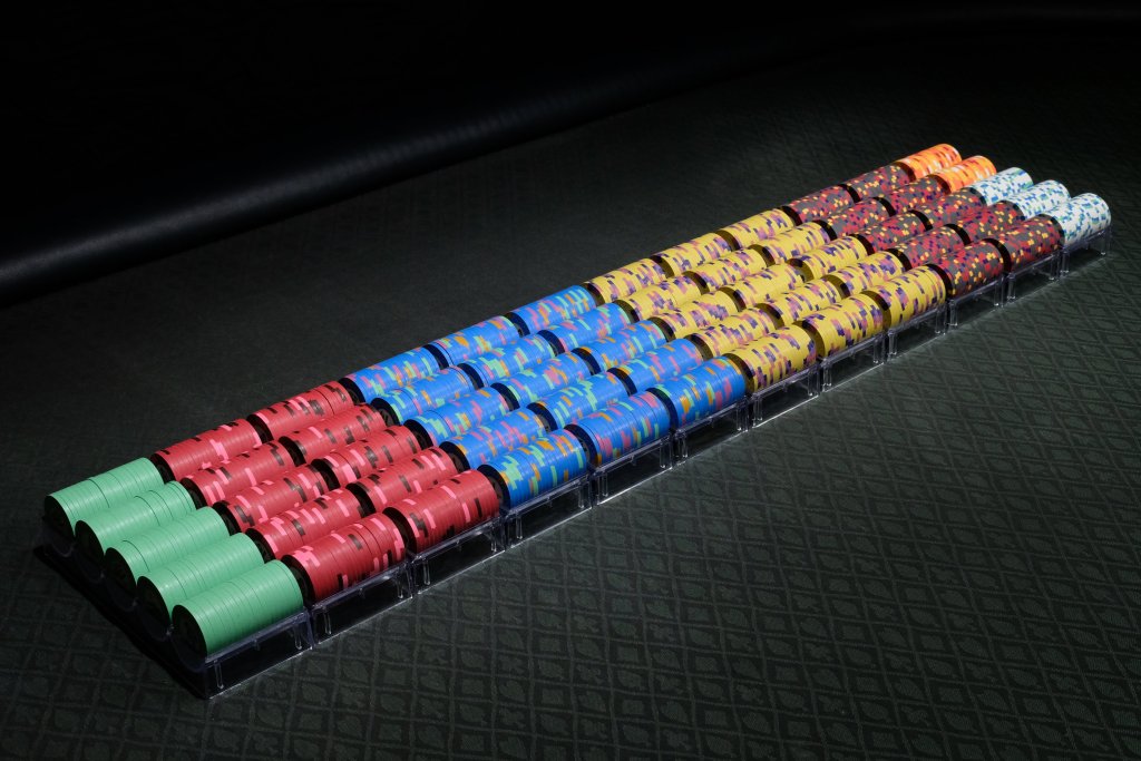
This set has an incredible clay lineup the with some very unique color combinations that embody lots of natural colors while cleverly avoiding the risk of dirty stacks. The simple and clean inlay design nicely compliments the clay selection and adds to the picturesque pacific northwest theme.
Set Denominations & Breakdown:
- 100 - 5¢ - Dayglo Green
- 200 - 25¢ - Retro Red 2A12 with Dayglo Pink / Maroon spots
- 300 - $1 - DG Peacock 3TRIM with Retro Lavender / Butterscotch / Dayglo Green spots
- 300 - $5 - Canary 3TA316 with Blurple / Lavender / Pink spots
- 200 - $20 - Charcoal 3V12318 with Retro Red / Retro Blue / Dayglo Arc Yellow spots
- 80 - $100 - Bright White 8D18 with Dayglo Green / Dayglo Peacock spots
- 40 - $500 - Dayglo Tiger 1/4 Pie 4A14 with Dayglo Arc Yellow / Bright White / Retro Red spots
- Member Chips - Dayglo Peacock 1/2 Pie 2A12 with Dayglo Green / Dayglo Peach / Dayglo Pink spots
