Advice on coloring/edge spots (5 Viewers)

MrCrawdad

Sitting Out
Joined
Feb 3, 2025
Messages
17
Reaction score
11
Location
Alaska
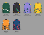
I'm going to build a custom set eventually and I'm getting started on the coloring and edge spots. I'm looking for serious input on my color choices and edge spots. I realize that there is a lot of greens and yellows until you get to the two big chips. This might have been done on purpose because I'm a Packers fan, but I could change it without being heartbroken.

As for inlays, I am getting them designed as we speak. I live in Kenai Alaska and have a great view of Mount Redoubt across the inlet from me. It's a massive volcano that dominates the skyline when looking west and is a cool feature of this area. I am getting a silhouette of the mountain with "Redoubt Poker Room" arched over the top and then the monetary denominations in large font as some of my players need help.

Denominations will be 25, 100, 500, 1K, 5K, 25K. Since we play a 20k starting stack tournament as our typical, I might ditch the 25K and get a small amount of plaques made instead, but we will see. I am just looking for honest feedback on what all of you experts think.
 

Attachments

  • Chips.png
    Chips.png
    328.4 KB · Views: 65
You don’t see that design a lot here
I feel like that's sarcasm? Hard to tell with text. Either way, I know that's not super unique to use a mountain, but the skyline of this mountain means a lot to those of us that live here and that's who plays in my game. It was either that or go with the river (Kenai River is known for its world class salmon fishing). Both are common themes. They look good in 1" circles and I personally like them way more than a circus tent or a tribute to an old casino. Everyone has their preferences and I don't mean to sound like I'm knocking those, they just aren't for me. The colors were the thing I'm mostly looking for criticism on.
 
Honestly i think you did a great job in your color choices and spot designs. I would make the 500 a 4 spot instead of 3 but I love the 25 and 100

Also the 25k should be a brighter lighter blue since the 1k and 5k and bright.

Just my suggestions but great job
 
Ekricket was making a joke I think. I agree with Joey about the lighter blue, though you only need T25Ks in larger tournaments, a fairly deep two-table tournament is necessary before requiring T25K chips. Look for "T25 Breakdown" and find any threads with the TOURNEY tag on them if you're looking for any help with quantities.
 
Could we make the arc yellow an orange instead for the color blind folks, the canary and arc look similar enough.

Or make the 5k a pink chip.
 
You don't need more than 5 chips for a two-table tournament, unless you are going with a super deep stack.

EDIT: ...or unlimited rebuys with uber degens.
 
5k is Broncos/Browns.

What is the 25k? Patriots?
I am half tempted to make them all NFL colors, but it's just hard for me to bring a dark purple and gold to life. I can't stand the Vikings. I did think about the Broncos on the orange one and it hurt as I grew up 3 hours from Denver and learned to loathe them.

For the rest of you, thank you for the advice. I wasn't planning on getting many of the 25K if I went that route at all. I get that we don't need a lot of them, but the word got out of the awesome tournament the other day and now the list keeps growing on how many want to come play. I think I need to build a bigger garage just to be able to setup enough tables.
 
I would make the 500 a 4 spot instead of 3
So my brain works in unique ways. To me, the number of spots and the number of digits in the value match, at least until you get to 5 digit numbers. A 5 spot is hard to do so then I just went LOTS of spots. That's why I did 3 spots but with more flair for the 500. Maybe I'm overthinking that?
 
Okay, vote time. The Great Pumpkin or the Pink Lady for the 5k? I also made the suggested modification in making the 25k a bright blue.

Chips.png
 
Both 5ks are cool! You can also do both if you can't decide and bring the other in as a secondary.

Sometimes it is hard to tell what color the 8V pattern is. If you add another dark blue to one of the sides it will be more of a blue chip than it is. Like if you look at the side and had to say what color the chip is it would be hard to tell... could be black red or blue. If you have two blue spots its easier to tell it is blue.

This both fixed your issue with the blue not being the prominent from the side and my 5 spots for a 5 digit value. I think I might like it a lot.
Chips.png
 

Create an account or login to comment

You must be a member in order to leave a comment

Create account

Create an account and join our community. It's easy!

Log in

Already have an account? Log in here.

Back
Top Bottom