GreekRedEye
Flush
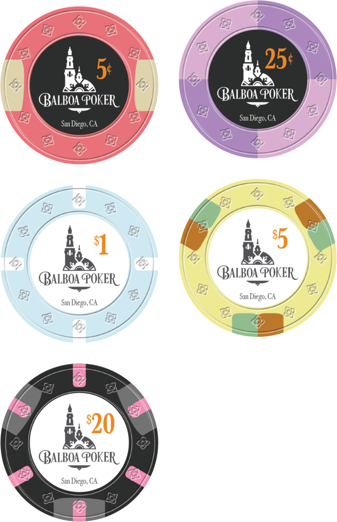
Whipped this up last night for fun. Trying my hand at a California, micro set. I like the $1 (based it off the popular Paris chip) and the $5. Not so sure about the rest.

It is a faux mold that @Colquhoun helped me with for a Tina set I just ordered. Recycled it here. Mold could be anything, I just thought it looked better than plain.Is that new Tina mold? Hybrid?
I attached the wrong file so went back and edited it. You must have been looking at it during those 2 minutes.Pics or it didn't happen
Thanks. I altered the Balboa Park logo (one of my favorite spots in the world btw). I was mostly messing around and maybe thinking about creating my own micro stakes set eventually. But I recently picked one up thanks to @quintooo so I do not see need to create my own for now. (But now that I think of it, could.easily build an affordable limit set with this too. Hmmm...).I like the inlay, nice SD vibes and the frac inverted colors is clever.
Was really hoping for the different denominations to represent the shorts. White/blue, black/yellow, red/white/blue, red. Could be solid....
Sorry, you are surpassing my poker lingo knowledge...I do not understand what "represent the shorts" means.Was really hoping for the different denominations to represent the shorts. White/blue, black/yellow, red/white/blue, red. Could be solid....
Apologies! Not poker lingo, I am a Rocky Balboa fan and in the movies, the boxers wear different shorts lol. When I clicked your link that's what I thought it would be representing.Sorry, you are surpassing my poker lingo knowledge...I do not understand what "represent the shorts" means.
Haha. Balboa Park, not Rocky. Ah, now I get why @ChipTalker posted the Stallone gif. I just thought he was saying it was a "strong" design.Apologies! Not poker lingo, I am a Rocky Balboa fan and in the movies, the boxers wear different shorts lol. When I clicked your link that's what I thought it would be representing.
I was speculating, maybe you meant the pips on the value chip should match the base color of the workhouse. Or maybe the pips on the CA colors should reference Vegas colors? You could have strung me along for a while if you really wanted."represent the shorts"
Thanks. I altered the Balboa Park logo (one of my favorite spots in the world btw). I was mostly messing around and maybe thinking about creating my own micro stakes set eventually. But I recently picked one up thanks to @quintooo so I do not see need to create my own for now. (But now that I think of it, could.easily build an affordable limit set with this too. Hmmm...).
Happy to share the design files if you want to put in a Tina order with @justincarothers (he has a no mold buy going right now I think). I can alter the colors once to make them more vibrant as @Colquhoun recommends. If you want more design changes (e.g. different pips or faux mold or denom changes) you can hire someone like @Colquhoun or other designers on this forum. They can make quick work of it with the .AI file.
@justincarothers You are also welcome to add it to the order library if you want the file too.
The red/black chips are going to be tough to edge align for Tina. It doesn't bother me during play.Balboa Poker, reinvented as a limit set, on the Tina Greek mold.
If I like the Greek mold as much as I think I will, there is high likelihood I will order a limit set. So feedback would be appreciated.
I am certain about the blue 1 (bonus points if you can guess the inspiration chip). The rest are totally open. Set will have 1x, 5x, and 20x with 1 and 20 getting most play. Maybe a 100x - but not necessary.
View attachment 1216615
I don't really like the red one. Was trying something out - I think I will drop it.The red/black chips are going to be tough to edge align for Tina. It doesn't bother me during play.
White (unprinted ceramic) can have smearing issues next to dark colors. I'd pick a different color for the 1x spot.
You are right. But now I am just using Balboa Park's logo straight up without modification.I'd suggest calling the set Balboa Park.
