Over the weeks and months I've been collecting pics of chips that I like for one or more reason.
These fall into two categories, broadly:

Please post your own!
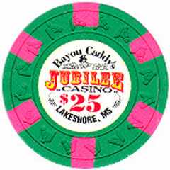
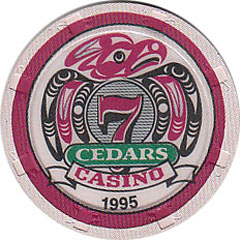
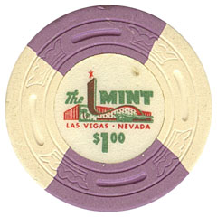
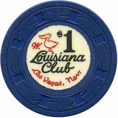
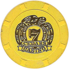
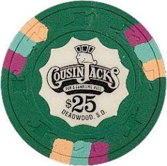
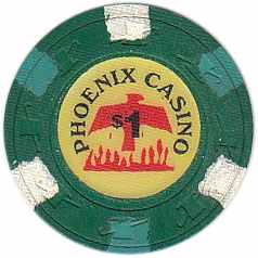
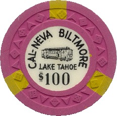
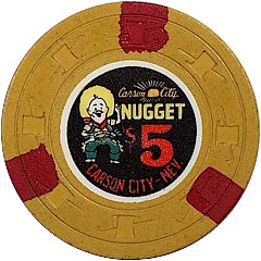
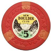
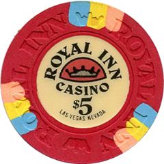
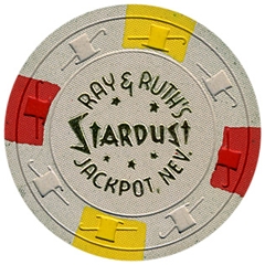
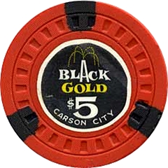
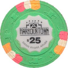
To kick things off, in the category of nice or interesting inlay/stamp design... These are chips that I think do a good job of filling the circular space, in no order.
I'm not suggesting that these represent perfection but most have elements that are pleasing to my eye. I'd prolly change things about some of them, e.g. color contrast levels and text size for readability...
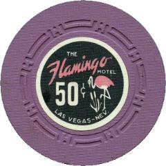
For the "Flamingo classic", a personal favorite and that heavily influenced my recent Black Cat cash set, I'd not realized that Marlow had done a promo chip version of one of the designs.
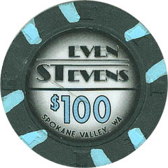
I'm on the fence about the Even Stevens. I like how the design fills the space but I'm not crazy about its Miami Vice stylings.
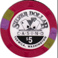
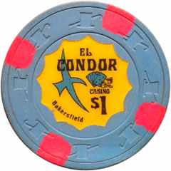
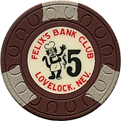
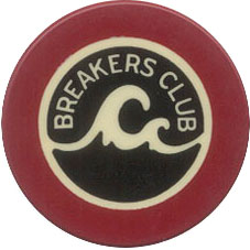

These fall into two categories, broadly:
- base/spot color combos that work nicely together; and
- inlay or stamp designs I dig
Please post your own!
To kick things off, in the category of nice or interesting inlay/stamp design... These are chips that I think do a good job of filling the circular space, in no order.
I'm not suggesting that these represent perfection but most have elements that are pleasing to my eye. I'd prolly change things about some of them, e.g. color contrast levels and text size for readability...
For the "Flamingo classic", a personal favorite and that heavily influenced my recent Black Cat cash set, I'd not realized that Marlow had done a promo chip version of one of the designs.
I'm on the fence about the Even Stevens. I like how the design fills the space but I'm not crazy about its Miami Vice stylings.
Last edited:

