Cascadia Casino ceramic design (1 Viewer)

Deucekies

High Hand
Joined
Sep 16, 2021
Messages
93
Reaction score
85
Location
Washington
Hi all,

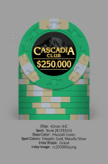
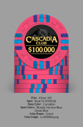
For my first post here, I'd like to share with you my ceramic design I've been working on. This set is for the fictional Cascadia Casino, obviously Washington-based.

cascadia_chips_os.png

$1-$100 are 39mm, $500+ are 43mm. It's intended to be a catch-all set, with enough $1s and $5s to play a cash game, or enough $100s-$25,000s to run a tournament. Also enough appropriate chips to run a Blackjack or Baccarat tournament.

The edge patterns are modeled off the Apache Casino chips, with some modifications. I've recently been reading here about the Cards Mold ceramic chips, and if I can get those with aligned edgespots for less than the $0.80/chip I paid for my last unaligned ceramic set, I'll go back to the drawing board and spruce the edgespots up a bit.

I made the design in Powerpoint, which I know probably won't work if I go with the Cards Mold. My last design was made in Powerpoint, and ABC Gifts and Awards was able to use them just fine.

What do you think?
 
Rolling edge design: a must for ceramic chips.

You don't need aligned edges if you don't mimic clay edge spots. There are other ways to make your design unique.
In general, yes, but the posts I've seen here of people's Card Mold designs that mimic clay edge spots, like the Aria tribute sets, have turned out pretty well I think.

This design as it stands is intended just as a regular ceramic design with rolling edges, and what I'm prepared to go forward with if it comes to it.
 
Hi all,

For my first post here, I'd like to share with you my ceramic design I've been working on. This set is for the fictional Cascadia Casino, obviously Washington-based.

View attachment 778855

$1-$100 are 39mm, $500+ are 43mm. It's intended to be a catch-all set, with enough $1s and $5s to play a cash game, or enough $100s-$25,000s to run a tournament. Also enough appropriate chips to run a Blackjack or Baccarat tournament.

The edge patterns are modeled off the Apache Casino chips, with some modifications. I've recently been reading here about the Cards Mold ceramic chips, and if I can get those with aligned edgespots for less than the $0.80/chip I paid for my last unaligned ceramic set, I'll go back to the drawing board and spruce the edgespots up a bit.

I made the design in Powerpoint, which I know probably won't work if I go with the Cards Mold. My last design was made in Powerpoint, and ABC Gifts and Awards was able to use them just fine.

What do you think?
Nice work. Welcome to PCF. Where are you? I’m in Tacoma. Tons of NW chippers here.
 
Nice concept! I actually worked on a Cascadia concept as well about 12-18 months ago. Eventually moved away from that idea/design. Hope you run with it and finish it through.

And welcome to PCF!
 
I'll echo what @allforcharity said about avoiding photos on chips. If it were me I'd go with an abstract drawing of the mountain over a photo of it.

It's a cool concept. I dig the inlay bulge on the $25000 to fit the denom.
 
I think if you ditched the photo and went for an abstract design as others above have mentioned you could make it really cool. Maybe take a mono-line artwork and incorporate "Cascadia Casino" as the base of the mountain. If I could draw I'd show you exactly what I'm thinking, so hopefully you're getting it.

Outside of that I really like your edge spots, haven't seen anything quite like that.
 
I'm gonna disagree with the majority and say that photo images on chips have their place. Most of what casinos produce is awful, but I think it works pretty well on your design.

The design as realized on an actual printed chip may or may not work as well as it does on screen, though. Be sure to do test prints on paper, and get test print samples from whichever vendor you work with.

Here's an example from a vintage crest-and-seal chip that shows how you can use this kind of design element well. It's a drawing, not a photo, but it has the photorealistic quality that you're shooting for as distinct from the simple vector art that so many chips use. It also has a subdued quality to it, which I think you're carrying off in your own design as well, and I think that helps make it distinct from just being a blatant photograph plastered onto a chip.

1210.jpg


(image courtesy @Jeff in Iowa)
 
As for the rolling edges - @allforcharity is right in that ceramics give you an opportunity that you shouldn't overlook. On the other hand, your edge spot design is distinctive and creative and has a lot of flair and is also capitalizing on using ceramics; you couldn't make edge spots like that in clay.

You might consider bolstering the edge spots with some further rolling edge pips between the edge spots. Consider, for example, the Bud Jones Yakama Nation Legends:

legends-poker-set-bud-jones-chips.jpg


That would give you two different opportunities to exploit these interesting edge spots you've produced - they'll create one impression when viewed from the face, and then a different, complementary impression when viewed from the side.
 
One drawback to using the photo is that it makes the background somewhat busy; I don't think that's a problem in and of itself, but the business makes the overlying text harder to read.

I think the text is sufficiently legible on the light-colored backgrounds like the $1 and the $25,000 but I think it suffers somewhat on chips like the red $5 and the orange $1000. I can tell you've already taken some steps to make the text stand out. I'm not sure what more you could do, but I think it's something you should think further about.
 
Thanks for all the feedback, everyone.

I'm pretty dead set on using the photo for these chips, but I'll obviously get samples made before I go ahead with the set. If the samples turn out hideous, I'll go back to the drawing board.

I definitely like the idea of emulating Bud Jones with the rolling edge; I've loved Bud Jones chips for years.
 
In general, yes, but the posts I've seen here of people's Card Mold designs that mimic clay edge spots, like the Aria tribute sets, have turned out pretty well I think.

This design as it stands is intended just as a regular ceramic design with rolling edges, and what I'm prepared to go forward with if it comes to it.
I see you mention cards mold, but I assume that you want these on a plain mold, correct? Cards mold would definitely interfere with the artwork in what appears to be an oversized inlay design. Cool concept. You might consider doing the whole set on 43mm to take advantage of more space with a busy inlay design.
 
I see you mention cards mold, but I assume that you want these on a plain mold, correct? Cards mold would definitely interfere with the artwork in what appears to be an oversized inlay design. Cool concept. You might consider doing the whole set on 43mm to take advantage of more space with a busy inlay design.
That's something I just noticed as I was tinkering the other day. I resized the inlays to fit a 1" inlay, and I don't think I like how small they look. I'm also experimenting with Super Grand size inlay, which I often see on TH&C chips, and would like to emulate.

If I go with cards mold, I'd probably go with Super Grand, and if I stuck with the size they are right now, I'd probably go plain mold. The design as is would be about a 1.2" inlay.
I you want to ensure you stay completely within the debossed circle on cards mold, even 1" is a little too big. You need to reduce to about 24mm. So good choice on staying with something bigger. It would be interesting to see an over sized inlay on a cards mold blank. I could be wrong, but I don't recall that anyone has done that yet.

My design is pretty busy, but I still think it turned out pretty well at 24mm.

20210719_170928.jpg
 
After seeing other people's Cards Mold sets that use aligned edgespots to emulate clay chips, I've decided to go back to the drawing board and go that route. I think I like the minimalism of this inlay, which evokes hints of Bellagio or Aria. Any thoughts of ways I can subtlely fancy them up?

I'm gonna try and teach myself Illustrator to recreate the chip art, but I may well have to hire one of the many experts on this board for that.
 

Attachments

  • Cascadia Club.png
    Cascadia Club.png
    318.2 KB · Views: 97
Quick update: Added a Space Needle silhouette to fill that negative space in the top.
 

Attachments

  • Cascadia Club B.png
    Cascadia Club B.png
    327 KB · Views: 95
Update: Space Needle silhouette on one side, Mount Rainier silhouette on the other side. Trying to decide whether or not to brand the 43mm chips as "Baccarat" chips or not, a la Vegas casinos. (Do casinos outside of Vegas even do that? I've only seen it done there.)
 

Attachments

  • Cascadia Club Reverse.png
    Cascadia Club Reverse.png
    465 KB · Views: 95
  • Cascadia Club Obverse.png
    Cascadia Club Obverse.png
    446.8 KB · Views: 97
  • Cascadia Club Baccarat.png
    Cascadia Club Baccarat.png
    552 KB · Views: 96
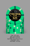
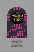
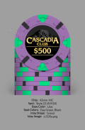
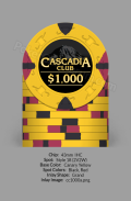
Rested on a final design. Space Needle is gone in favor of Mt. Rainier, in keeping with the Cascadia theme.

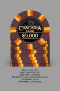
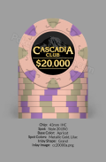
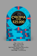
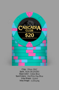
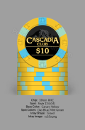
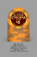
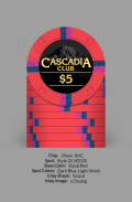
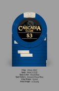
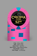
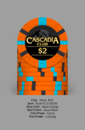
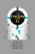
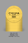
I got carried away creating a design for every denomination I could remember seeing in a casino. I won't have all these made. The majority of my set will be $1s, $2s and $5s, with a rack or two of $25s and $100s, and maybe the minimum of the bigger chips.

Yes, I really made an $8 CNY chip. I'm nothing if not thorough. :ROFL: :ROFLMAO:
 

Attachments

  • cc25mb.png
    cc25mb.png
    128.6 KB · Views: 82
  • cc100mb.png
    cc100mb.png
    122.4 KB · Views: 86
  • cc500mb.png
    cc500mb.png
    150.8 KB · Views: 81
  • cc1000mb.png
    cc1000mb.png
    149.7 KB · Views: 94
  • cc5000mb.png
    cc5000mb.png
    150.2 KB · Views: 79
  • cc20000m.png
    cc20000m.png
    157.2 KB · Views: 74
  • cc25000mb.png
    cc25000mb.png
    150 KB · Views: 76
  • cc20m.png
    cc20m.png
    129.9 KB · Views: 91
  • cc10m.png
    cc10m.png
    134.9 KB · Views: 84
  • cc8mb.png
    cc8mb.png
    145.4 KB · Views: 86
  • cc5m.png
    cc5m.png
    129.4 KB · Views: 87
  • cc3m.png
    cc3m.png
    111.2 KB · Views: 78
  • cc2p50m.png
    cc2p50m.png
    130.3 KB · Views: 85
  • cc2m.png
    cc2m.png
    126.2 KB · Views: 82
  • cc1mb.png
    cc1mb.png
    108.6 KB · Views: 79
  • cc0p50m.png
    cc0p50m.png
    112.7 KB · Views: 83
  • cc250000m.png
    cc250000m.png
    151.2 KB · Views: 78
  • cc100000m.png
    cc100000m.png
    160.9 KB · Views: 94
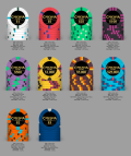
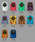
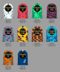
In the last couple years, the design has gone through several small changes. The most recent changes were adding a little brighter color background, using a blue sky for poker, red sky for baccarat, and purple sunset for the regular chips. Here are the latest iterations.

Notes:
- Cascadia Club is a fantasy casino, Golden Garden Baccarat Club is a fantasy Baccarat-heavy casino, and Cascadia Poker is, of course, poker. These are ostensibly three different chip sets.
- The $400 chip is because the max wager in WA state cardrooms is $400. $400 chips can actually be found in many WA state cardrooms.
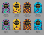
- The influence for the tournament chips is obvious. ;)
- I created designs for T10,000 and T50,000, but would probably not move forward with them unless someone would convince me that they're in some way better than T25,000 and T100,000.

2025CCSEA.png

2025GGSEA.png

2025CPSEA.png

Tourney-A.png

Tourney-B.png

Tourney-C.png

Tourney-QP.png
 

Create an account or login to comment

You must be a member in order to leave a comment

Create account

Create an account and join our community. It's easy!

Log in

Already have an account? Log in here.

Back
Top Bottom