Casino Tavern & Lounge - Lousy Service... (1 Viewer)

MrWookie69

Pair
Joined
Jun 6, 2024
Messages
175
Reaction score
252
Location
Wisconsin
My first go at playing around designing a set - though this wasn't my first concept, when I was first joined the board a few weeks ago. This is more like #3. Too many ideas, and only one of me...

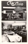
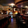
We used to visit the Casino Lounge in La Crosse, Wisconsin back in our college years - it's been ages since we've visited. ...It was kind of a laid back "Art Deco dive bar", right in the heart of the "Pub Crawl" street area, with a pretty cool neon sign out front. They always pushed the "Lousy Service", and it's prominent on that old neon sign.

They had a fire a few years ago, and it's may or may not re-open. So not sure if we'll ever get back.

So...this is kind of my tribute to that old pub - though slightly gussied up. ...not really "dive bar" quality. It would be wild if CPC could inlay foil stamped prints.

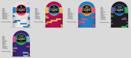
I didn't realize it, but huh. Throwback Packer Colors for the $25... matches my new jersey. I kinda like it. :p

I might design this set out to $5,000 - wouldn't be that difficult - but we generally play friendly low-stakes cards, so I'd probably only order a ¢.25 - $500 set (I love that purple chip).

Good lord, I can see myself wasting a LOT of valuable time designing all sorts of chip sets.

Chewy


casino set 3.png


I have to leave for a photoshoot in a couple of hours, but I couldn't leave it alone just yet. Already updated. :wtf: ....I flipped-flopped "Lousy Service", and "Tavern & Lounge" - which definitely reads better....


casino set 3b.png
 
Last edited:
Look very good!

I would worry about the 100 and 500 being to dark together on the table,

This is blurple chip
1718969678144.png

For the 1k I woould go with DG Tiger or Arc yellow as base color

Getting a color sample set is must to see the colors in real life!
 
More refinements this morning....

Wanted to use the inlays to introduce a secondary color into the lower denom chips for a little more visual fun, so mixed those up quite a bit.

removed the horizontal line below the word Casino - gave the text much needed breathing room.

Removed the line "Tavern and Lounge", and created a tighter lockup of "The Casino Lounge".

I've always like white as $1 chip. ...though I might go back to blue. So I changed the ¢25 chip to pink, and the $1 to "bright white".

I also perfer $20 over $25, because most of my buddies hand me a 20's when they buy in. As a result, when I have to cash out at the end of the night, I'm handing them 20's, 5's and 1's. ...because of the denom change, I could go with the "blue 20".

Dropped the $500 chip from Blurple to Purple.

Switched the $1000 chip to Canary.

This whole set already feels more "Casino Loungee" than the previous layout.


casino set 3c3.png


Inlay detail

Screenshot 2024-06-22 at 1.25.00 PM.png


Two alternates for edge spots to keep the pricing down. The option above is more fun... though I could be happy with any of these.

Alt 1

casino set 1.png


Alt 2 - though those last two edge spots will be a pricey, but I won't be wanting more than 50 chips each in my final set.

casino set 2.png
 

Attachments

  • casino set 1.png
    casino set 1.png
    223.1 KB · Views: 30
Early morning, so more tweaks to Alt 2 - expanded the line out to 1000, also added a black line detail around the edge
casino set 2b.png
. Really grooving on these 3TRIM+ edge spots. Gives it a bit more of "deco" detail than just a series of square spots...

Still want to play with the color options though. Really want the sample colors to get here, so I have a better idea of how these colors will look.
 
A couple of variants today...

Really re-worked the inlay. Also wanted to see what the chips might look like with a more mono-tone feel. The big thing is, can I make these visually 'sing' at minimal pricing. I removed La Crosse, Wisconsin from the label to give them more of a universal appeal. IYKYN. IYDYD... No biggie either way.

Another note - there's a small diamond motif in the label, it present in various places around the bar - along the ceiling, painted on the side of the booths. It's a nice little 'echo' from this little dive art deco bar.

Still love the "Lousy Service", that's a mainstay.

Unknown.png


Cleaned up the design further - removed that lower line to simplify the design. I'm going to try an option where I swap the inlay colors around and see what happens. Right now I like the mono-tone nuance. Really liking where this is going.

Unknown4.png


Chip design detail. This new font option and dumb little diamond detail picked up from the bar, then minimizing the rest of the design, really plussed this design up.

Unknown-1.png


I have no idea if this will print well with the color band having a gradient behind the logotype.

My wife used to visit this bar when she was in college, before me we met. She's really grooving on this project, as it's hitting nostalgia with her as well, and is now wondering how much it will cost to get these produced. ...Realistically tying to keep a set of 600 chips to around $1,400.
 
Injected a touch of neon flair to the set - Now we're getting to vide of the "Casino Lounge". ...threw a little "shade to the Green Bay Packers with that $20 spot. ...shit! My wife is going to want to order this set for herself....


Unknown9.png
 
Yeah, your definitly hooked. Be patient, it will change 20 more times (at least) before you are close to a final product. Keep pecking away at it. Allforcharity mentioned something most people around here will repeat...Cash sets generally have progressive edge spots. I am a big fan of that as well.
 
Go with a Gaussian spot distribution if you are going to change up spots. Don't restrict your nicest spots for the highest denominations you'll rarely see! But those on the workhorse chips and get less complex as you move away from those. I should have done this a lot earlier in my custom sets than I did:

https://www.pokerchipforum.com/threads/a-d-s-devils-nest-cpc-customs.78031/

That is a good point, and I really like that idea. But damn. That's going to drive the price up. LOL

Yeah, your definitly hooked. Be patient, it will change 20 more times (at least) before you are close to a final product. Keep pecking away at it. Allforcharity mentioned something most people around here will repeat...Cash sets generally have progressive edge spots. I am a big fan of that as well.

Overall, I wish I had an unlimited budget for this, but I don't. And for sure....I'm going to peck away at this quite bit.

Looks like I'm selling my 3 Floyds Russian Imperial Stout unopened 20-year vertical to pay for this. Hell if I'm ever going to drink it. ...these chips? They'll will be WAY too fun to use. ...Now the pressure is on to nail this... :)
 
More fun this morning - have to finish up a photoshoot this afternoon. But...here's another round. LOL

I love the tri-moon (don't care), but they sound like a pain in the ass, so FK, not even considering them.

We mostly play low-stakes cards, so not sure why I was bothering with a $500, much less a $1,000.

Damn red chip looks a DiGiorno Pizza box - gonna have to fix that. FK! I hate red chips. I might make that pink (which is close to damn red), and do something different with the .25¢ chip. I might go .25¢ Imperial Blue, $1 Bright White, $5 DG Pink, $20 lavender, $100 black (bottom pic)...

Futzed with the color combos ago.

Unknown2.png


Color alternates...

The sucky thing about having a white chip, is the flavor color of the inlay is tough with white - so I used Green (based off of DG Green) to give the chip a little extra punch of color, and it's not being used for the other denoms, so I like it.

Unknown2b.png


The more I simplify and refine, the more I like the set... smaller spots.

Unknown2b2.png


Here's the inspiration behind this set: Third Street in La Crosse is a legendary Pub Crawl. The Casino was a few doors up from the 3rd on Pearl St, and it was one of our (me and my buddies) favorite bars to chill out. Not only was it a fave of mine, but my wife's before I met her. Her whole family in fact (she has a pretty big brood), would stop in at the Casino Lounge during their pub crawl days.

The structure was built in the late 1870's, and was immediately established as tavern. In 1933, new ownership took over, and they re-opened in 1934 as the "Casino Tavern". ...but it eventually became known as the "Casino Tavern and Lounge", to which people shortened it the "Casino Lounge".

The building caught fire a few years ago, and while the word is it's going to re-open, no one knows when. Sounds like they've been building it out on and off for a few years, and right now it seems to be sitting empty and in disarray.

A few pics of this little dive bar...

644486_10151373679780674_1608172973_n.jpg
24796337_10155958907031248_8743623916681077846_n.jpg


o.jpg


1034494.jpg.png


     000.png


There's some serious orange going on in there, so maybe the $1 goes back to blue, the .25¢ goes back to DG Pink, and the $5 goes to orange.


Then again, the front of the building is white with blue and pink accents...

Oh well. ....the design continues.

Onward.
 

Attachments

  • 302431973_10166505065160627_59955418356562215_n.jpg
    302431973_10166505065160627_59955418356562215_n.jpg
    126.9 KB · Views: 19
  • IMG_5323.JPG
    IMG_5323.JPG
    54 KB · Views: 21
This is a ton of information for a product that is changing so drastically by the day and sometimes by the hour. If I were you I would keep grinding away privately and then when you really feel like you have things nailed down come back and start a new thread. Some of the advice given is irrelevant the next day when things completely change so people kind of check out from your project. There is tons of great people here that give great and helpful advice. I would just get things nailed down a bit more. Best wishes, you are doing great.
 
Just airing out my design process. Some people seem to have a bit of a difficult time finding inspiration - not knowing where to go (you can find it anywhere), maybe this will give a few members a little push. ...and I already implemented a recommendation or two. ;)
 
Really cleaning up the layout. Removed that color band behind "CASINO" - as it was feeling WAY to close to "DiGornio Pizza" from my graphic design days working on Kraft Foods projects.

based on traditional Vegas colors

ph52.png


#2 - playing with the $5 (DG Tiger) and $100 (Blurple - love this color) - I have a stupid affinity for white chips, and bright white seems could work as a $500. ...Am I reading it correctly that there's upcharge for using bright white? If so, this is where I'd want it.
ph5b.png


$3 - Moving white to the 25¢ would allow me to move pink to the $5 - a non traditional color, but still kinda in the red family. It's not a terrible departure, and I much prefer pink over red. ...CPC's Pink is a bit dark, so for me it works.

I'm partial to black for $100, and I still like purple for $500 over white. ...but having white for the 25¢ could drive the price up if there's that upcharge.

I need to talk to Mr. David Spragg...

ph5c.png


Much prefer the cleaned up version than busyness of the previous layouts. ...getting closer by subtraction...


Should also note: I have a full set of color sample chips from CPC so I have a better idea of color combos. I'm not entirely too picky on recycled spots colors. I just want the spot colors to *POP*, while not being TOO busy or overpowering the chip base color/design....
 
Last edited:
Maybe try a white (or other light) background colour on the inlays? I get this ponderous dark feeling from the set as is.

Never really been a fan of white inlays.

The Casino was never "bright and vibrant" as a lounge bar. The lighting was always dim and moody...

ph5d.png
 
Never really been a fan of white inlays.

The Casino was never "bright and vibrant" as a lounge bar. The lighting was always dim and moody...

View attachment 1350081

I'm less worried about the historical lighting than what you have around your own table at home. The less contrast you have on your chips, the brighter the ambient light will have to be around your table in order to differentiate chips in players' stacks and the pot.
 
With the rapid iterations, the one common concern I have is the font size on the bottom. I worry it won’t be legible, especially with a textured inlay.
 
I really like what you have going on. However I do agree with Warma. It feels like something needs to go at the bottom. I really think it would look better.
1719530464265.png
 
I really like what you have going on. However I do agree with Warma. It feels like something needs to go at the bottom. I really think it would look better.View attachment 1350100

Definitely moved on beyond this. But yes, I felt the same way.


With the rapid iterations, the one common concern I have is the font size on the bottom. I worry it won’t be legible, especially with a textured inlay.

That has been in the back of my mind. I've seen inlays with ridiculously small text and details. This is where "addition by subtraction" comes into the play. Gonna have to let something go, so I can adjust text size without getting cramped.

It's interesting about the textured inlay. I have sample chips from CPC, and a few of the inlays feel smoother, while the others are more textured. The chips also have superfine lines and details ('stars' as an example) - where it gives me hope the fine lines could work. ...but probably best to be safe than sorry...


I'm less worried about the historical lighting than what you have around your own table at home. The less contrast you have on your chips, the brighter the ambient light will have to be around your table in order to differentiate chips in players' stacks and the pot.

Not overly concerned about the lighting on the chips - that won't be an issue. I have the CPC chip color samples in front of me, and I'm sitting in light that'll be worse than the table I'll play at. The readability of the inlay is a concern. It's a 1" inlay, and right now I feel like I'm trying to stuff ten pounds of shit in a 2 pound bag. ...which is making everything 'tiny'. So...purging more, and adding another update.

While I'm positive lighting won't be an issue at my table - and this won't be a travel set, aside for our holiday family gatherings... AFC's comment on the colors is noted. So.... I adjusted the colors again, inspired by the California casinos - though not following totally to a tee. ...I believe $20 is black and the $100 is white... But I'm deviating here. working on making the denominations a bit larger. Removed the location (again). "Lousy Service" has to stay...

Played with the spots again...

Posting photos to this site really softens the resolution, and you lose a ton of clarity. So added a larger detail below. When I reduce the labels down to 1", they're pretty readable now...


Unknown-2.png


Detail

Unknown-3.png


Big thanks for the feedback. Still loving where this is going...
 

Create an account or login to comment

You must be a member in order to leave a comment

Create account

Create an account and join our community. It's easy!

Log in

Already have an account? Log in here.

Back
Top Bottom