Cavalry Club at The Armory (1 Viewer)

Psypher1000

Straight Flush
Joined
Feb 2, 2015
Messages
7,626
Reaction score
13,570
Location
United States
This will be a solid, hot-stamped NCV set. This is the initial mock (art comes by way of @p5woody and is only a quick, initial draft).

The fifth color will be Imperial Blue. I'm locked into Canary and ImpBlue, but I'm still mulling the rest.

Add your thoughts below - which line, 1-5, do you think works best?

Cavalry Club Lines 1.png

Cavalry Club Lines 2.png
 

Attachments

  • Cavalry Club Sample.png
    Cavalry Club Sample.png
    83.1 KB · Views: 371
Last edited:
This will be a solid, hot-stamped NCV set. This is the initial mock (art comes by way of @p5woody and is only a quick, initial draft). Thoughts?


View attachment 44365

I really like it. Would that be on both sides, or would there be a denomination on the other side?

I suppose that NCV could still be denominated, but I think that it won't. Maybe he should edit it to say Non-denom and not NCV.:)

But, to answer Psypher's question. Looks good.
 
I really like it. Would that be on both sides, or would there be a denomination on the other side?

It would very likely be on both sides. The idea is to be able to use them as 25/100/500/1k/5k or 25/100/500/2000/10k or 25c, $1, $5, $20 as the situation warranted (not all in the same sitting, of course...that's bad juju). In a joust the riders also needed to be able to defend themselves w/swords after getting knocked off, so this set, as with the best tournament champions in history, needs to be adaptable to the situation.
 
Love the concept on HHR. Maybe a Latin motto and shield for the reverse side?
 
I suppose that NCV could still be denominated, but I think that it won't. :)

Yeah, when I saw "NCV", I just associated that with a tournament set, not necessarily that it wouldn't be denominated. Though I agree, my first assumption was that it would be on both sides and without denomination.
 
I've updated the OP with the various color progressions I'm considering. I'm sticking with a traditional tournament set color progression for the most part. My current favorites are 1, 2, and 5, but I'm looking for input. The last two colors - Canary and Imperial Blue - are locked in, and the only colors I'm considering are weighted colors. I figure if a tournament was meant to test a competitors mettle, there better be some metal inside the chips.

I'd add a poll, but apparently you can only do that when you create it with the OP.

So, top to bottom, lines 1-5. What say you?
 
Last edited:
Man I think you nailed it already!
1. Love the stamp as is (although I really want to see a denom on one side at least).
2. Love line #1 as is.

Nice work.
 
For those who have weight in so far - thanks! I've done some more playing w/chips, looking at them in context w/the other chips they'll likely be in play with, looking at them on the background they'll be played on, etc, and I'm pretty sure I've made my decision. I'd like to get a little more detailed input from those that have taken a look, though

So, just to make sure I'm not missing anything that the hive mind is seeing... @Chippy McChiperson, @Mr. Cheese, @72o, @GenghisKhan, and any others that care to weigh in, I'd like you to speak to two questions if you would, please...

1. What is it about your top choice that makes it your favorite line of the ones presented?

2. Before choosing, did you happen to break out your color samples/comparable chips and see how they looked, or did you just look at them on the monitor? I'm certainly not mad if all you did is look at the pictures to choose vs. breaking out the samples, but it helps me to know what you're basing your opinion off of - pixels in an image, or clay in your hands.
 
I picked #3 and #5 because I love the lavender color, and the light green provides more contrast against the charcoal than the green (as does the green with the grey). I didn't look at the samples for this specifically, but I have looked at them very recently as I am mocking up my own set.
 
I like the contrast between the denoms. Definitely no dirty stack possibilities with the 1st line colors IMO. I feel like the purple/lavender grey could get mixed up.

Purely on monitor as I don't own a sample set. Also just going off what I remember when I did have samples here.
 
I was just going off my monitor. And I edited my earlier post due to different colors on different monitors.
It made me flip flop. However I just got a CPC sample set yesterday. Stupid me forgot.
I just checked these combinations with your real colors on my poker table. (Dark background, low lighting.)
All these combos look great, but going to point out tiny 1st world chipper issues:

Line 1: the black sticks out too much compared to other colors
Line 2: the charcoal & pink don't play well together
Line 3: going left to right the progression is not as smooth between charcoal and lavender
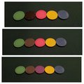
Line 4: left to right progression through all 5 chips feels seemless. Like these are all part of the same color palette. There's a real flow for me, nothing sticks out or doesn't belong.
Line 5: The dark green doesn't blend in well with the rest
Line 6: Took line 4 that I felt worked great, and tried with the pink. Also meshes well together.
In person I find it's even better than line 4.

I took pics of each line using samples and did a collage lol. I set my camera so that these pics, after taking them, looked as close to real life as possible in my poker room lighting. But....it might look different on your screen.
 

Attachments

  • 1,2,3.jpg
    1,2,3.jpg
    105.5 KB · Views: 138
  • 4,5,6.jpg
    4,5,6.jpg
    115.5 KB · Views: 115
Last edited:
I just feel that lines 1 and 2 have the best overall feel to them. I really like what the pink brings to the lineup compared to the lavendar. I feel that the lineups involving lavender are just missing that extra punch that pink brings. Definitely love the light green hands down ( I feel its one of CPCs best colors esp. for a base color). I think light green and gray though could get mixed up fairly easy.

With that said, it narrowed my choices to lines 1 and 2. I love charcoal as a base a lot but ultimately chose black due to the silver hotstamp. I think the foil color would look better on black compared to charcoal.

I do have samples but was at work when I posted. I just recently spent about 6 months mocking up my own customs so I feel that I can picture these colors better than picturing my own kids :D. I did however get the samples back out when I made this post and confirmed my previous thoughts.
 
Order placed. Here's what I ultimately went with...

Armory hot stamp final.png


Line 1 was where I started. I liked the idea of the bold, black chip and no chance of dirty stacks. The black seemed a little stark, though, so I switched it to the charcoal in line 2. The more I played with the set, the more I didn't really care for how the solid Canary played with the Solid pink on the table, so I switched the pink to Lavender. Unfortunately that looked too dark w/the charcoal, so I switched it to Grey - and then I didn't particularly care for how I the light green looked w/Grey, so I switched that to regular Green.

But then I didn't really like how the regular green looked with everything else.

*sigh*

Five lineups, and something I don't like about all of them.

At that point, I took a break and started looking at other hot-stamped sets...GCR's, casino sets, customs...looked at a bunch of stuff. After looking at that, a few of my "likes" were reinforced...
  • The Clermont Lounge set by @jbutler affirmed my initial decision to go with a blue hue for the 5k. His set also uses an orange color (fire?) for the 1k, but i wanted to stick with more traditional tournament colors for the rest of the set.
  • The vast majority of the sets I enjoyed the most used both a day/light green 25 and a charcoal hundo. Clermonts, GCR's, etc. I figure that if I like them in those sets, I'll like them in mine. Light green and charcoal locked.
  • Since I want to stick with more traditional tourney colors, the canary is locked in at 1k.
That left only the 500 to decide. After playing w/the chips more I decided I didn't want the pink/canary combo for this set, but regular lavender was a bit too dark with the charcoal hundo. If only there was something that was a bit in the middle...

Retro lavender.

No, it's not weighted. That's a compromise I had to make, though. It was either that, or go with colors that, frankly, I didn't want to look at in the context of this set. I can live with a few small sparklies missing from a chip. I can't abide by paying hundreds for chips that I don't really want.

Sooo...done is done. These are the final color mocks. Now it's just waiting on a production-ready image from Steve for the hot-stamp and paying David when I see him at the chip convention in a couple weeks.

Thanks for your input, everyone!
 
On one hand I am not a fan of non denominated, on another I am very much a fan of the hot stamp you have devised
 
On one hand I am not a fan of non denominated

I strongly considered denominations, but ultimately I decided not to. The clincher was that if I went 2000 on the Canary then I was basically precluded from using them as 1k's. I wanted to retain the option of a 500/1k/5k tournament lineup while also using them (in other sessions) as $5 / $20 / $100.


I am very much a fan of the hot stamp you have devised

Steve really knocked it out of the park, and did so on his first attempt. Literally no other feedback besides a drawing and no changes after receiving the draft. Here's the requisite "hobo" drawing that he translated it from.

image.jpeg
 
I strongly considered denominations, but ultimately I decided not to. The clincher was that if I went 2000 on the Canary then I was basically precluded from using them as 1k's. I wanted to retain the option of a 500/1k/5k tournament lineup while also using them (in other sessions) as $5 / $20 / $100.


Steve really knocked it out of the park, and did so on his first attempt. Literally no other feedback besides a drawing and no changes after receiving the draft. Here's the requisite "hobo" drawing that he translated it from.

View attachment 44519
Hobo mockups ftw!
 
Also it seems like solid hot stamps are all the rage right now [emoji38]
 

Create an account or login to comment

You must be a member in order to leave a comment

Create account

Create an account and join our community. It's easy!

Log in

Already have an account? Log in here.

Back
Top Bottom