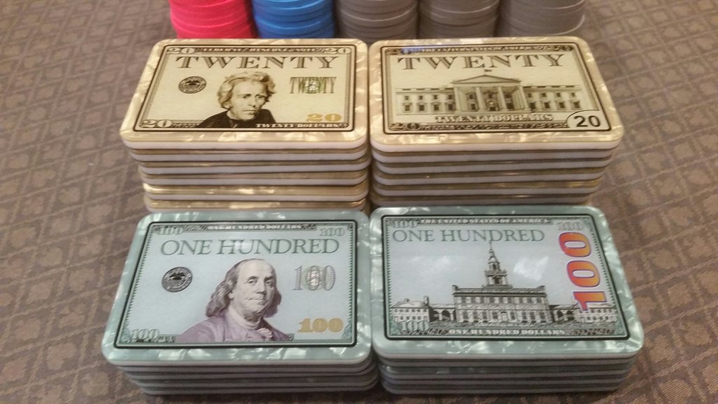
I'm kind of struggling with my plaque edge designs. I love the idea of edgespots, but hate the idea of them all lining up when the plaques are stacked up. Can anyone show me some of their favourite examples examples of plaques with edgespots that are set up to not align with the plaque below it?
Make sense?
This is the look I'm trying to avoid...

Make sense?
This is the look I'm trying to avoid...


