CPC Design and Spot Progression Help (1 Viewer)

lovetowel

Waiting List
Joined
Apr 6, 2024
Messages
6
Reaction score
5
Location
Denver
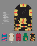
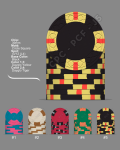
Working on a CPC chip set. The problem I'm running into is the $5 chip is the center piece (using alma mater colors and ties with theme of inlays that are in development). I'd like more complex version of the two options (the 3V12) spot pattern over the less complex (2V12). But I'm not sure if the spot progression works in the attached images. Maybe there's a spot pattern I'm missing that can bridge the gap between the Red 5 and the Black 100.

Also just looking for general feedback on colors/progression. It's a cash set going .25/1/5/20/100. (Yes I'm also considering 25 since I'm going green on that chip).

Thank you in advance kind PCF'ers.
 

Attachments

  • Version 2.png
    Version 2.png
    197.6 KB · Views: 174
  • Version 1 Spendy.png
    Version 1 Spendy.png
    199.9 KB · Views: 172
Not sure it works in what way? Does it work for you? Chances are 80% of your players (unless they are all PCF members) don't even know what spot progression is. Have you seen some of the fugly casino lineups, with no progression, haphazard spots, or even backwards progression? Personally, I would 100% go with the second option for the reasons you stated. If your $5 is your workhorse, then upgrade it to the 3V12. It's a much better looking spot pattern, IMO.

Also, in your first lineup - MY opinion - You're going backwards from your quarter to your $1.

One more edit - 100% go $25 for that green chip. Green $20s can be really confusing. Some players are confused by $20s no matter what the color, but you are going to really mess with them if it's green.
Counterpoint:
1715496460680.jpeg


As for the lineups, strong preference for #2. Flow is much better vs #1.

Whatever you do, don’t rush the decision. When you think you’re happy with a lineup, let it sit for a few days and then re-visit. You may find you’ve changed your mind completely. Enjoy the process - the journey with making a custom set is half the fun!
 
Spot progression as you see it here is a fabrication, created 100% by chippers who think the most elaborate spots belong on the highest value chip.

You know... the ones nobody ever gets to see.


After six custom sets, I realized this was pretty stupid and finally made a set where the chips with the best looking spots belonged on the workhorse chip with progressively less complex spots on "either side" of the progression:

https://www.pokerchipforum.com/threads/a-d-s-devils-nest-cpc-customs.78031/

I've started calling it the "Gaussian Progression":

https://en.wikipedia.org/wiki/Probability_theory

...though "Normal Progression" is closer to the correct term.


Ignoring the semantics, they are your chips and your custom chips. Do whatever you want and ignore what the group-think says you should do.


(Both versions are good starts. Load up the workhorse chips, make them the sexiest, and proceed as you want).
 
There are soooooo many spot options available, why repeat 3v and 4v? Yes, it is technically different, but it is the same spot, just one more. And with the $1 also being 312 and the $20/25 also 1/2” spot sizes the only different spot size is the 25c 1/4 pie chip. I like tournament sets that use the same spot pattern or increasing the same spot size pattern. But for cash get a variety of shapes and sizes if that is what you are looking for.
 
Spot progression as you see it here is a fabrication, created 100% by chippers who think the most elaborate spots belong on the highest value chip.

You know... the ones nobody ever gets to see.


After six custom sets, I realized this was pretty stupid and finally made a set where the chips with the best looking spots belonged on the workhorse chip with progressively less complex spots on "either side" of the progression:

https://www.pokerchipforum.com/threads/a-d-s-devils-nest-cpc-customs.78031/

I've started calling it the "Gaussian Progression":

https://en.wikipedia.org/wiki/Probability_theory

...though "Normal Progression" is closer to the correct term.


Ignoring the semantics, they are your chips and your custom chips. Do whatever you want and ignore what the group-think says you should do.


(Both versions are good starts. Load up the workhorse chips, make them the sexiest, and proceed as you want).

Agreeing on all your other points…

I’m not sure there are many fans of “progressive” spots left (if there ever were many) who are really arguing that the spots must always get more complex from bottom to top.

This seems like a bit of a worn and discarded argument now. As best as I can tell, having “only” been a member 7 years, discussion of progressions arose as a reaction against some oldschool assumption that sets can only use one or at most two spot patterns.

I’m not even sure most of us could agree what “more complex” means.

For my custom set, I focused on the overall look, the interaction of base and spot colors, the sizes of chips, and avoiding duplications without the set feeling incoherent.

The difficulty of acquiring enough chips for my main denoms was a bigger a factor — if you want spotted THCs in excellent condition, in quantity, you either have to be very patient or very rich, or just work with what you can get.

In general I would say custom set creators are leaning toward more minimal choices for fracs and $1s and more luxurious ones for high denoms, but there are no hard and fast rules... I do some design, and tried to use variations on the inlay to also carry some of the burden of visually distinguishing values.

It certainly makes sense to put the most effort into nailing the workhorse chip.
 
Last edited:
There are a lot of design and feedback posts, not too difficult to find. You can always browse the forum or search.

The hard part about it is understanding what universal things are and then chip specific styles. My tastes would never let me spend money on a Vegas style set.

Here is my latest post, I think its best to show other sets that have something you like about them.
 
Yep.

There’s also the state regulations that require designs allowing b&w casino cameras to differentiate chips, at least in some states, which drives casino design and thus influences design here.

There’s a good case for mixing up spots from an accessibility perspective, identified by @Taghkanic, to help ensure folks can visually identify the chips, no matter how they process color.

Some folks design higher level chips for security, but that logic breaks down after the $5 or $10.

Go with what’s important to you. But yeah, I also recommend your workhorse chip should be the best chip, why hide it?
 
Go with what’s important to you. But yeah, I also recommend your workhorse chip should be the best chip, why hide it?
I agree so much why this statement.
PXL_20240510_012804406.jpg

Just because it's a work house doesn't mean they can't be a SHOW HORSE! It's a poker game not a stable!!


Though I've been to some that smelled like one ....
 
Last edited:
Great comments from everyone here, I really appreciate the feedback. Going to spend a couple days redesigning and ignoring spot progression, and just picking out my favorite patterns and building around the workhorse chips. I think this is what I needed to get away from concerns about progression and to just build a fun set.
 
Some advice I heard a while back, that I still use today when creating edge spots: "If it doesn't look good in black and white, it won't look good with colors."

Ever since, I've started each design by using a white main chip with gray and black spots. Then obviously I'll move on to coloring, but here's an example:

1715646528886.png


BTW, your #2 photo would work really well with the white chip strategy.
 
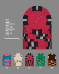
Been playing around, here is a revised version. Still focused around the red chip and just having fun on either side.
 

Attachments

  • Revised.png
    Revised.png
    205.4 KB · Views: 71
Im a fan of the 2v12214+ pattern which is similar to what you had originally. It reminds me of the aria 25K cranberry chips which i think is one of the better looking chips in all of Vegas. BUT i do agree that you should make your workhorse chip the way you want it as it will be in play the most. After trial an error on multiple set designs for myself and friends I feel like we decided the biggest thing is that every chip is different outside of color. Maybe the same pattern but with a differentiation of at least one extra spot or a different spot pattern all together.
 

Attachments

  • Screen Shot 2024-05-15 at 11.47.56 AM.png
    Screen Shot 2024-05-15 at 11.47.56 AM.png
    461.6 KB · Views: 76
  • Screen Shot 2024-05-15 at 11.57.56 AM.png
    Screen Shot 2024-05-15 at 11.57.56 AM.png
    445.4 KB · Views: 75
Im a fan of the 2v12214+ pattern which is similar to what you had originally. It reminds me of the aria 25K cranberry chips which i think is one of the better looking chips in all of Vegas. BUT i do agree that you should make your workhorse chip the way you want it as it will be in play the most. After trial an error on multiple set designs for myself and friends I feel like we decided the biggest thing is that every chip is different outside of color. Maybe the same pattern but with a differentiation of at least one extra spot or a different spot pattern all together.
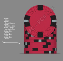
Additionally i think a component that some new chippers overlook is how the chips looked stacked especially for their $5 in most cases. These are going to be the most dominant chip stacks on the table and sometimes a pattern with more base color on side when stacked allows for dirty stacks to be more visible as its not as busy.
 
Im a fan of the 2v12214+ pattern which is similar to what you had originally. It reminds me of the aria 25K cranberry chips which i think is one of the better looking chips in all of Vegas. BUT i do agree that you should make your workhorse chip the way you want it as it will be in play the most. After trial an error on multiple set designs for myself and friends I feel like we decided the biggest thing is that every chip is different outside of color. Maybe the same pattern but with a differentiation of at least one extra spot or a different spot pattern all together.
Thanks! As far as making sure chips are differentiated, are you considered about the 5 and 100 (black) chip dirty stacking in the current configuration?
 
Spot progression is a made up thing.

Having said that:

For cash set, use your favourite spot patterns for your workhorse chips (varying depending on your stakes). Your highest denoms only get into play if you've got tons of reloads and your lowest denoms are mostly for blinds.

For a tourney set, a full progression from lowest to highest may often work. Your lowest two denoms will eventually be coloured up, and your top 2 (or 3) denoms will see the most play in the second half.

All in all, you should be able to distinguish each denomination when looking at stacks from the side and in pots from the face. Often it is easier said than done.
 
Thanks! As far as making sure chips are differentiated, are you considered about the 5 and 100 (black) chip dirty stacking in the current configuration?
Just looking at it and knowing how bland some of the colors are (get a color sample set if you haven’t already) I think you’ll be alright. The dayglo colors you are using in the $100 will really pop. My first thought on your $5 chips is that’s it’s not really gonna be a show stopper just based on seeing the colors in real life. With that said, I don’t know what your table, lighting, room look like so if you like it, that’s what’s important. Your $100 will really pop and your $25 will look awesome as well.
 

Create an account or login to comment

You must be a member in order to leave a comment

Create account

Create an account and join our community. It's easy!

Log in

Already have an account? Log in here.

Back
Top Bottom