So even though I still haven't finished murdering and applying labels on my custom tourney set, I have already designed and printed sized versions (on paper) of a custom cash set using chips I already have acquired in previous purchases. These chips were not necessarily bought to make a custom cash set, but the numbers I have of each and the quality work for what I want to do. These chips were all originally bought for different purposes, but plans change and this lineup just kinda fell together. I don't hate it... I went with RHC for this set due to the larger inlay area which works well for custom labels and visibility.
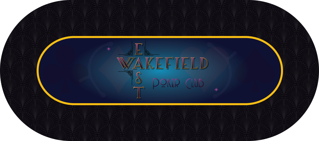
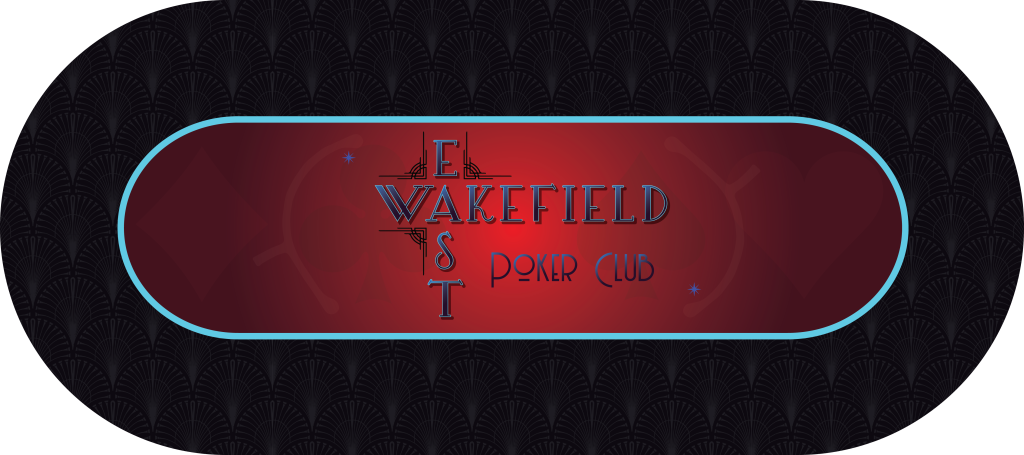
While my custom tourney set is Christmas themed (explained in the dedicated thread), I did label each chip with "Wakefield East Poker Club". Based off of what I did there, I designed and ordered custom poker mats with that name on them. They have been ordered and I am just awaiting delivery at this point... But I went with an art deco influenced design for the mats.


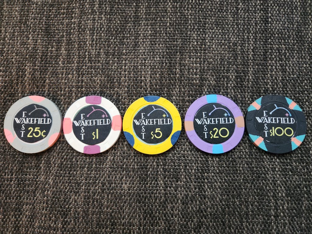
Now, based on what I did on the mats, I moved forward with the custom cash set design. Obviously you can see the art deco influence and the re-use of the Wakefield East "logo". And before anyone asks, the whale or dolphin looking design at the top of the chips (and on the mats) is actually the street (double cul-de-sac with 1 entrance) as seen from the satellite view on Google maps. The star on the right is the location of Wakefield East poker club. The street and star will be color matched to each chip and spots. I tried to do it but my printer is running out of cyan which is causing some issues. It looks good in Illustrator. Just not on the paper printout.. lol

The original chips used are as follows:
.25 - Paris 2
1 - Dover Downs 1
5 - Boulder Station 2
20 - UltimateBet 500
100 - Horseshoe Cleveland 100
Anyway, open to any thoughts, opinions, ideas, or criticisms.
While my custom tourney set is Christmas themed (explained in the dedicated thread), I did label each chip with "Wakefield East Poker Club". Based off of what I did there, I designed and ordered custom poker mats with that name on them. They have been ordered and I am just awaiting delivery at this point... But I went with an art deco influenced design for the mats.
Now, based on what I did on the mats, I moved forward with the custom cash set design. Obviously you can see the art deco influence and the re-use of the Wakefield East "logo". And before anyone asks, the whale or dolphin looking design at the top of the chips (and on the mats) is actually the street (double cul-de-sac with 1 entrance) as seen from the satellite view on Google maps. The star on the right is the location of Wakefield East poker club. The street and star will be color matched to each chip and spots. I tried to do it but my printer is running out of cyan which is causing some issues. It looks good in Illustrator. Just not on the paper printout.. lol
The original chips used are as follows:
.25 - Paris 2
1 - Dover Downs 1
5 - Boulder Station 2
20 - UltimateBet 500
100 - Horseshoe Cleveland 100
Anyway, open to any thoughts, opinions, ideas, or criticisms.
