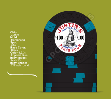
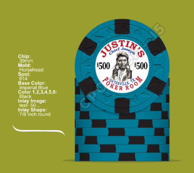
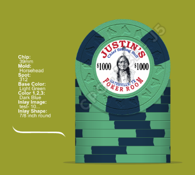
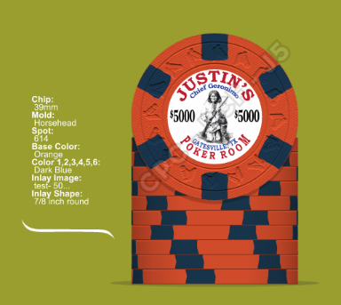
I put together a tournament set and i need your input and feedback. Thanks to p5woody for the artwork
-
This site contains affiliate links. If you choose to make a purchase after clicking a link, Poker Chip Forum may receive a commission at no additional cost to you. Thank you for your support!
You are using an out of date browser. It may not display this or other websites correctly.
You should upgrade or use an alternative browser.
You should upgrade or use an alternative browser.
Custom CPCs....Need any feedback input (1 Viewer)
- Thread starter justincarothers
- Start date
slisk250
Straight Flush
I like the concept, very similar to the Paulsons. For my tastes I'd like different spot colors on each denom. Add a Chief Cochise 25 chip. 
I like the artwork. I think there is a Paulson fantasy set, which looks quite similar.
Using the same colors for your $100 and $500 chips might confuse some of your players and will lead to dirty stacks.
tapatalking ...
Using the same colors for your $100 and $500 chips might confuse some of your players and will lead to dirty stacks.
tapatalking ...
I like the artwork. I think there is a Paulson fantasy set, which looks quite similar.
Using the same colors for your $100 and $500 chips might confuse some of your players and will lead to dirty stacks.
tapatalking ...
Any suggestions? I was trying to keep a color to bind the set..... What color would you change?
This is just a rough idea based on your first mock-up. I guess you like it simple and the color blue. 
X14 spots which get more and more complex and the color blue which gets darker.
This way you have a nice progression in your set.

tapatalking ...
X14 spots which get more and more complex and the color blue which gets darker.
This way you have a nice progression in your set.
tapatalking ...
spikeithard
Flush
liking the canary chip a lot
Poker Zombie
Royal Flush
I would consider dropping the "$" sign from a tournament set. You're not really betting $5000, but you are playing for real money. Dollar signs are for real cash games, or kids playing make-believe.
Also, starting the set with hundos makes the set more expensive as you are shelving 5 chips for every color-up. Starting with 25s only benches 4 of the small chips, and blinds will probably work out better.
Since this is my opinion, I say stay with Vegas colors. If you want a carry-over color I would make it a brown or reddish color on vibrant colored chips, and smaller (x18) spots.
Mr Tree
Straight Flush
I agree with this 100%. Tournament sets with $$$ on the denoms always tilt me a littleI would consider dropping the "$" sign from a tournament set. You're not really betting $5000, but you are playing for real money. Dollar signs are for real cash games, or kids playing make-believe.
These are inspired by the Paulson fantasy set but different pictures. I think I will drop the chief name and I am goin to change the colors up a bit and post tomorrow. Any feedback you have is appreciated
Love the clean chip design but I agree that there is just too much blue. Can you find it within you add some color for contrast? Also, if there is any way you can avoid using the denomination twice on the face I would suggest doing that. I did it for my cash set, and it works, but with the 3 and 4 digit denominations, it just seems a bit busy.
Oh, also, I think I'd drop the "chief" from the names. To me, their names in and of themselves say "chief". Sitting Bull doesn't need chief to be Sitting Bull...Sitting Bull just says it all. That would give you more space for the name itself, potentially. Just an idea.
Best of luck!
Oh, also, I think I'd drop the "chief" from the names. To me, their names in and of themselves say "chief". Sitting Bull doesn't need chief to be Sitting Bull...Sitting Bull just says it all. That would give you more space for the name itself, potentially. Just an idea.
Best of luck!
chipjoker
Flush
This is just a rough idea based on your first mock-up. I guess you like it simple and the color blue.
I like the concept and art work is nice, I'm with patthecat on colors, and I agree with zombie about the $$$ signs..
X14 spots which get more and more complex and the color blue which gets darker.
This way you have a nice progression in your set.
View attachment 11304
tapatalking ...
If you are restricting yourself to a four chip tournament set, I strongly advise you to consider T5, T25, T100, T500 or T25, T100, T500, T2000. Either way, you'll get more bang for your buck. With the latter, it can even double as a small-stakes cash set by representing cents (25c, $1, $5, $20).
Nice tie-in, except that dark blue is darker than retro blue.
X14 spots which get more and more complex and the color blue which gets darker.
Nice tie-in, except that dark blue is darker than retro blue.
i took most of your comments and came up with a couple of different sets. Let me know what you think. Thanks again to p5woody for artwork
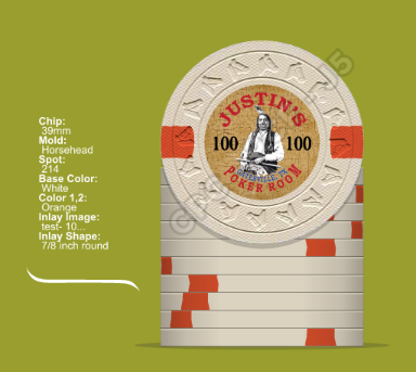
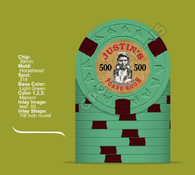
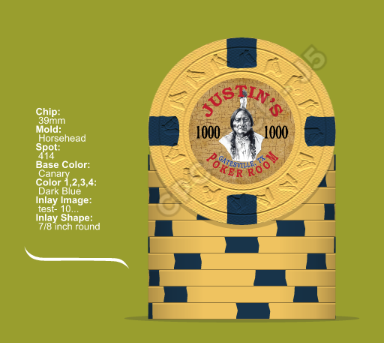
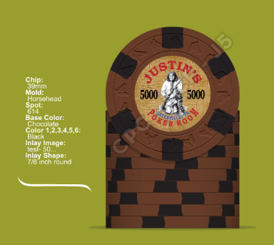
ssanel54
Flush
I think you have too many dark colors in your initial mock up. Id love to see a brighter spot on the 500 chip. Imperial blue is an awesome color that has so many possibilities to compliment it.
The Palmas Club Set uses your exact 5000 color combo for its RD $500 chip...you should dig up Noelsarchs albums if you want to see them.
The Palmas Club Set uses your exact 5000 color combo for its RD $500 chip...you should dig up Noelsarchs albums if you want to see them.
i took most of your comments and came up with a couple of different sets. Let me know what you think. Thanks again to p5woody for artwork View attachment 11329 View attachment 11330 View attachment 11331 View attachment 11332
definitely an improvement on the inlay. and these are my favorite versions so far for the base/spot colors, but i agree with sanel that it could stand some brightening up.
i really liked your initial imp blue/black mix. how about something like:

Mr Tree
Straight Flush
The chocolate/peach combo on the 614 is the nutsdefinitely an improvement on the inlay. and these are my favorite versions so far for the base/spot colors, but i agree with sanel that it could stand some brightening up.
i really liked your initial imp blue/black mix. how about something like:

courage
Full House
- Joined
- Oct 29, 2014
- Messages
- 4,264
- Reaction score
- 6,748
Agree since it's usually the T25 in tourney sets.a green T500 would tilt the crap outta me.....
Coming along great, but give these changes some consideration?
T100: Love this one as is. The white works great since CPC white works as light gray.
T500: lavender base with light green or dg green spot.
T1000: use retro blue for spot color. More vibrant for sure. Dark blue is far more muted than rendered on screen. Check your sample set. Of course a muted look works nicely with the theme but even so, I'd go retro blue.
T5000: 814 spot using bright white.
Similar threads
- Replies
- 22
- Views
- 793
- Replies
- 3
- Views
- 265
