Custom rental felt feedback (1 Viewer)

T_Chan

Full House
Site Vendor
Joined
Apr 25, 2013
Messages
4,688
Reaction score
14,257
Location
Vancouver
I am considering refelting all of my rental tables so that they match and have some relevant information printed on them.

Every rental event I do, I get the question: "which seat is seat #1?" I put table numbers on the tables so I don't get the question of which table is which.

I also want to brand the tables with my logo for some advertising. I've got a few designs in mind but I'm afraid they're too busy. I'm trying to keep it simple while including a bit extra to make them look nice but not cluttered.

Any feedback is much appreciated.

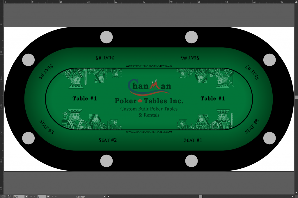
v1
Screenshot 2018-01-12 22.35.03.png


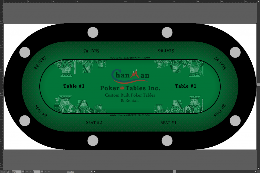
v2
Screenshot 2018-01-12 22.35.22.png


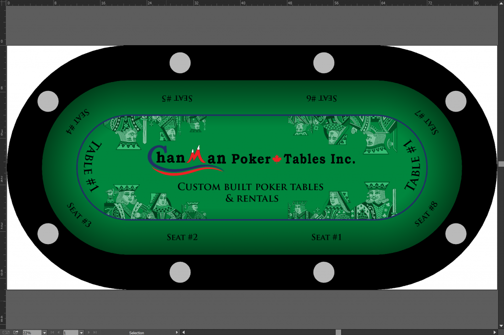
v3
Screenshot 2018-01-12 22.35.35.png
 
I just spent about three minutes trying to figure out the difference between tables 2 & 3. It's late!

I don't care for the size of the logo on the first one. And there's not contact info (unless I'm missing it. Quite possible)

I like the smaller logos on tables 2 & 3

SSC pattern is nice

My preference would be the third version, but with "Table #1" (size and font maintained) moved to where its located on the first version.
 
I like the 3rd one best as well. Smaller font and ssc pattern are a plus on that one. Print it. (y) :thumbsup:

Maybe reverse one of the "table 1" so it can be read from reverse side?
I'm not 100% sure about that suggestion. Maybe design it and have a look.
 
Use different background colors to differentiate the table? For instance: "Blue table, seat 6". That would eliminate the table number text. Your seating cards could just have a colored number on them.

Perhaps just put the number instead of "Seat #x"?
Agree that the royalty graphics are too busy with everything else.

Agree with prior posts: eliminate/streamline some of the other elements, but maximize the advertisement!
 
Last edited:
I like #1, your logo should be big. I also don't think that it has to be absolutely symmetrical with regards to the graphics. I think that maybe just having 1 set of the royalty or 2 sets of the royalty at max on diagonals from one another. I like that the table number font is on the curve of the ellipse. My only question is what if you need to rent out a set to one party and a set to another party, or one gets damaged in the sequence. Obviously you could print multiple table 1s etc, just something to consider.
 
What about a large but simplified (and maybe subtle/faded) logo in the center, but then smaller logos with contact information between each seat (or every other seat). Or maybe even make the betting line a repeat of your contact info.

If the contact info is in the center, not everyone will have a good view of it and it'll constantly be covered by flops and pots. Make the logo subtle so they see and recognize the brand, then give them contact info in a close a readable format.

JMHO.
 
You are going to get so many different opinions on this which is good. From a marketing viewpoint, simple and to the point is best. If it is too busy the eyes will wander. Decent size logo with website underneath in small copy. the brand should be the first thing they see to build brand equity. In all ad print., website or any advertisement, keep the logo consistent. Try placing the logo in a decent size in the middle of the table and then if you want to use the K, Q and J's on the felt print them at a 50% opacity.

Couple of specific suggestions though. The logo should be a good size but if there is any other words along with it they should be smaller as to draw attention to the logo. This will help build brand identity. I would not put the table number on them. If you have a large tourney then you have to make sure they are placed in the correct order
 
Maybe build a little place you can have an engraved brass plate which you can change out with the table number/limits etc.
 
I’d skip printing table #’s as it will become a pain to make sure the tables have some kind of order during setup or even storage.

I’d just print table tents on thick paper. So after the tables are setup you can specify which is which. Once play is about to start, tents get picked up.

This way it’s less busy on the felt too.

Other options:

You could use lammers to show seat numbers, table number, etc.
 
I know it's advertising but there is a lot to read & makes it a very busy felt.

I like the logo design in #1 better but move the URL into the empty space below the logo and away from the betting line. makes it more visible and eliminates the clutter on the outer part of the table. IE:

Screenshot 2018-01-12 22.35.03-A.png


I also agree that different colors for the tables to indicate table number instead of the TABLE 1, TABLE 2, etc printed on the felt. Also would eliminates clutter.

Just leaving the "Seat #" printing around the outer ring.

And the court faces are fine as is.
 
Thanks for all the feedback everyone. I think removing the table number's a good idea for logistics. I'll just keep using the table number cards that I place on each table so that I don't have to keep them in order all the time, plus I can rotate them as I please for even wear on all the tables.

I thought about doing different colors for each table but I have 15 tables... I'll run out of basic colors and don't want to start getting into fushia, teal, magenta, etc...

A few quick revisions, will do some more later but I gotta run.

v4, the royalties are at 40% opacity. In v1 it's at 50%
Screenshot 2018-01-13 08.38.28.png


v5, I kind of think is too plain
Screenshot 2018-01-13 08.38.36.png
 
I really like where this is going. If these were for my business I would go with #1 but reduce the size of the king, queen and Jack so that it is smaller than the logo. Good work!

Edit: the court still takes away from the logo. Reducing size should draw the eye to your logo
 
I can't help thinking seat 1 should be where seat 2 presently is.
 
I can't help thinking seat 1 should be where seat 2 presently is.
I don't know how they number seats in Canada, but for consistency sake, I agree with upNdown, in the US, Seat #1 is immediately left of the middle dealer tray whenever there's a dealer. Unless there's a reason to deviate from this, I would also recommend seat 1 start left of one of the middle positions on the long edge of the table, even if there's no dealer. My reasoning -- it can help newer players get accustomed to learning the little things about poker games when they're played in other environments or a casino -- they play in your game, on your tables, then if they ever play in a Casino tournament they know where seat #1 is, etc.
 
Smaller center logo would be nice - less gaudy.

Love the seat numbering.

Maybe make the betting line a black with a repeating chanmanpokertables.com in white?

I don't know how much they are used anymore but a QR code by each seat number that takes you to a landing page with all the info re: ordering or renting would be cool...
I would disagree with smaller logo. This is being used for a business and he needs to build brand equity. Not gaudy when it is advertisement IMO.
 
Also, even if you don't use the colors to distinguish the tables, using different colors will give an idea of how vibrant your tables look. At the very least it should get you more custom cloth business.
 
I don't know how they number seats in Canada, but for consistency sake, I agree with upNdown, in the US, Seat #1 is immediately left of the middle dealer tray whenever there's a dealer. Unless there's a reason to deviate from this, I would also recommend seat 1 start left of one of the middle positions on the long edge of the table, even if there's no dealer. My reasoning -- it can help newer players get accustomed to learning the little things about poker games when they're played in other environments or a casino -- they play in your game, on your tables, then if they ever play in a Casino tournament they know where seat #1 is, etc.
Excellent point.
 
Yeah the seat numbers aren't right, I was too lazy to change it on the mock up. That will be changed in the next draft.
 
I dunno, Tony. I assume in your setups you never have more than 8 people per table, then? I thought for this reason using markers was best.

If they are going to be dye-sub then I think a different base shades for different tables is not a bad idea. Lighter shade inside the betline, slightly darker shade in the faux racetrack so your logo is nice and clear. Doesn't have to be a different colour for every table, but maybe 3 tables each colour. As long as you don't arrange the same colour in the same row in the room, it should be fine. 5 base colours: green, blue, yellow, red, grey. But if it costs way less to do the same felt 15 times and use cards, hey, that's fine, too.

I'd rather have the court figures removed. Why not try duplicating your logo, moving one to the left and one upside down on the right? That way during play your community cards won't obscure the logo, and the muck likely only covers one side.
 
  • Like
Reactions: 72o
Maybe this is just me but I think that maybe taking the word "seat" off will also be fine, it will look less cluttered and its clear what that number is. As long as your tents say the word "Table" and a numeral it should be clear what that is and people won't confuse table with seat either. I think that having the word seat is just redundant.

And we all know people may still ask you what where is my table or seat without even looking - those people can not be helped.
 
I’d just print table tents on thick paper. So after the tables are setup you can specify which is which. Once play is about to start, tents get picked up.

Yeah that's what I do right now.
Other options:

You could use lammers to show seat numbers, table number, etc.

Lammers would go missing faster than I could replace them :(o_O
 
...
I'd rather have the court figures removed. Why not try duplicating your logo, moving one to the left and one upside down on the right? That way during play your community cards won't obscure the logo, and the muck likely only covers one side.

^^^^I was going to suggest the same thing.
 
@T_Chan
I know you do more than poker tables. How about the last line reading:
"Custom Made Gaming Tables and Rentals"
....although that won't help with the player question, "Where are the poker tables?"
 

Create an account or login to comment

You must be a member in order to leave a comment

Create account

Create an account and join our community. It's easy!

Log in

Already have an account? Log in here.

Back
Top Bottom