Custom Royals Tournament Set Color Denominations (1 Viewer)

Which Denomination do you prefer?

  • V1

    Votes: 2 12.5%
  • V2

    Votes: 1 6.3%
  • V3

    Votes: 0 0.0%
  • V4

    Votes: 4 25.0%
  • V5

    Votes: 3 18.8%
  • V6

    Votes: 6 37.5%

  • Total voters
    16
  • Poll closed .

dutch_whaley

Two Pair
Joined
Feb 5, 2020
Messages
253
Reaction score
445
Location
Michigan/New Jersey
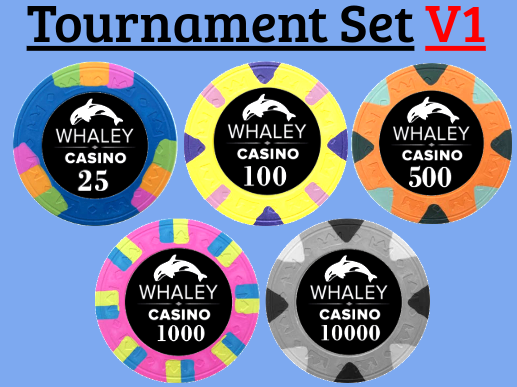
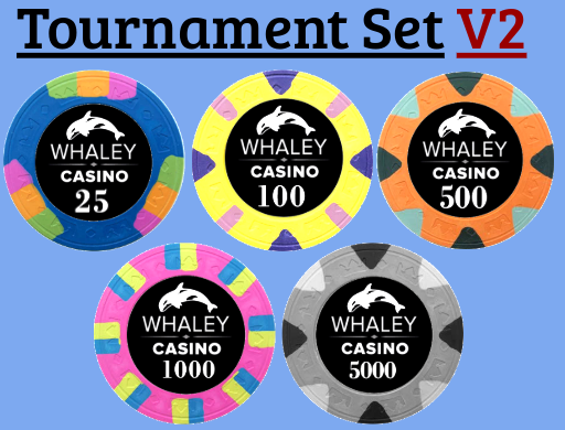
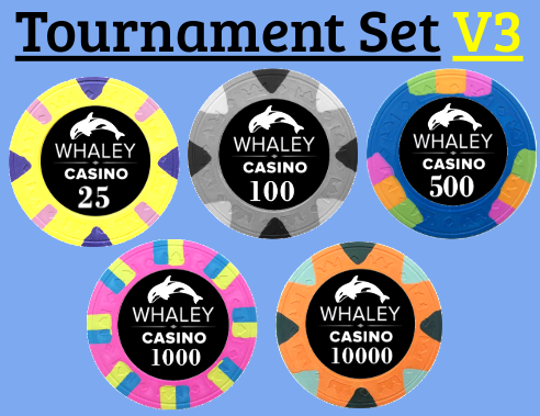
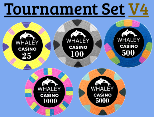
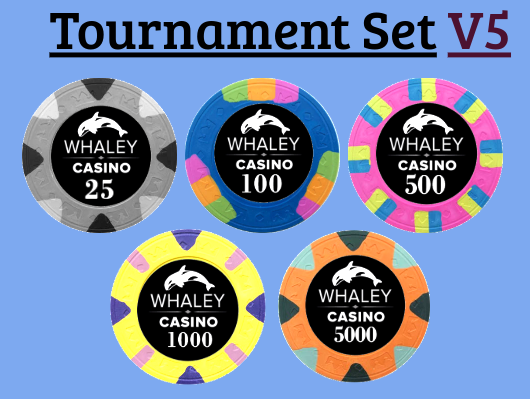
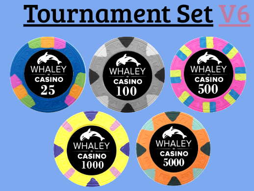
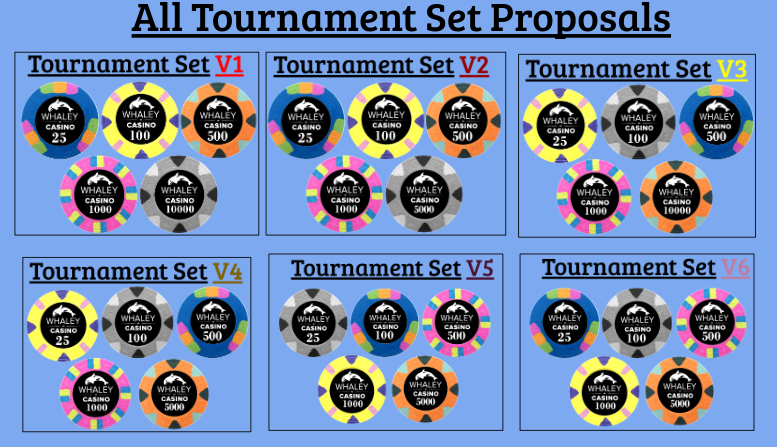
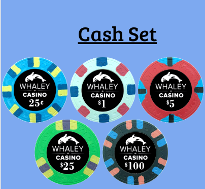
Hey everyone. I’m considering getting another Royals set, for Tourneys this time. I’d love any/all feedback you have on which color/denominations you prefer. The “Whaley Casino” label isn’t up for debate at the moment, and is already in use for my cash set.

Thanks for any feedback guys!
BFC9E688-AEA9-49EB-8BE2-C1A5AC003294.png


Screenshot 2020-04-10 at 10.26.25 AM.png


Screenshot 2020-04-10 at 10.26.35 AM.png


Screenshot 2020-04-10 at 10.26.51 AM.png


Screenshot 2020-04-10 at 10.27.03 AM.png


Screenshot 2020-04-10 at 10.42.16 AM.png


Screenshot 2020-04-10 at 10.39.26 AM.png


26C6CB0C-F1A1-46D4-A551-18CE86A2E7C4.png
 
I like the grey chip looks like a great replacement of the black.

You could get custom 10k plaques then.

Any reason why some have 5ks and some have 10ks denom (and skip the 5ks completely)?
 
You could also scrap the gray chip altogether (or make it a bounty chip), and get custom plaques for the T5000.
Lol @Himewad the idea is to convince my wife that me buying poker chips is a “good” idea! Now stop putting thoughts in my brain about custom plaques, I’ve seen your Royals set... you know I’m jealous of it!
 
I like the grey chip looks like a great replacement of the black.

You could get custom 10k plaques then.

Any reason why some have 5ks and some have 10ks denom (and skip the 5ks completely)?
When I originally did this mock-up there wasn’t a 5k until it was mentioned, I didn’t really think about it to be honest, I just assumed 25,100,500,1k,10k
 
I wouldn’t skip the T5000 denomination.

The only problem I have with the gray chip is the other chips are so, so bright. If the gray chip had something else going for it with bright edge spots, I could see it. But I have never liked this gray chip for anything more than a bounty or reload or something like that.
 
Damn @Himewad I can't get over how dope your chips look. Your hawk matches the same colour of your chips!!
Just curious though why have 25k plaques and 100k chips for your own set? Why not make 100k plauqes as well

Something to consider @dutch_whaley not sure how much more (if any) it will cost though.
 
Damn @Himewad I can't get over how dope your chips look. Your hawk matches the same colour of your chips!!

Something to consider @dutch_whaley not sure how much more (if any) it will cost though.
It's actually funny @PokerDots WAY before I even considered getting custom chips, I took a picture of those colored logos and was in amazement. I considered it for a while, and don't get me wrong, I love his logo, but I really like the simplicity and elegance of just the white on black.
 
It's actually funny @PokerDots WAY before I even considered getting custom chips, I took a picture of those colored logos and was in amazement. I considered it for a while, and don't get me wrong, I love his logo, but I really like the simplicity and elegance of just the white on black.
Sure I understand :) Personal preference trumps all for customs!
 
Damn @Himewad I can't get over how dope your chips look. Your hawk matches the same colour of your chips!!
Just curious though why have 25k plaques and 100k chips for your own set? Why not make 100k plauqes as well

Something to consider @dutch_whaley not sure how much more (if any) it will cost though.
I don’t have a 100k chip. The plaque is the highest denomination in my set. And thank you again.

The pisser is that my set wasn’t ready until about 6 weeks ago, so they haven’t been in play yet. :(
 
I don’t have a 100k chip. The plaque is the highest denomination in my set. And thank you again.

The pisser is that my set wasn’t ready until about 6 weeks ago, so they haven’t been in play yet. :(
Sorry my bad I saw the 10k as 100k LOL nice set. Hope you get to put it into play soon!
 
It's actually funny @PokerDots WAY before I even considered getting custom chips, I took a picture of those colored logos and was in amazement. I considered it for a while, and don't get me wrong, I love his logo, but I really like the simplicity and elegance of just the white on black.
There is definitely something to be said for having the label look the same on every chip. I went back and forth on it for while.
 
Thanks for this guys, I'll try to finalize the denominations soon!
On a separate note, if you guys feel like weighing in, any thoughts on an idea like this for plaques (thanks @Himewad :ROFL: :ROFLMAO:)?
My thoughts right now are to go with a similar element of my labels, which I guess is: "ocean/underwater, clean/classy". I may be way off, and these may make you want to vomit, but this is my non-Adobe screw-around 1st go.
Screenshot 2020-04-10 at 12.51.21 PM.png

Screenshot 2020-04-10 at 12.51.32 PM.png
 
I love the water. What would it look like if you removed the killer whales by the text in the corners, and put a large logo in the center? Or can you find a pic of a real killer whale to go in the center?
 
Thanks for this guys, I'll try to finalize the denominations soon!
On a separate note, if you guys feel like weighing in, any thoughts on an idea like this for plaques (thanks @Himewad :ROFL: :ROFLMAO:)?
My thoughts right now are to go with a similar element of my labels, which I guess is: "ocean/underwater, clean/classy". I may be way off, and these may make you want to vomit, but this is my non-Adobe screw-around 1st go.
View attachment 437682
View attachment 437680
Yeah, I'd feature the logo and put the 25k's on both sides or below the logo.
 
Thanks for this guys, I'll try to finalize the denominations soon!
On a separate note, if you guys feel like weighing in, any thoughts on an idea like this for plaques (thanks @Himewad :ROFL: :ROFLMAO:)?
My thoughts right now are to go with a similar element of my labels, which I guess is: "ocean/underwater, clean/classy". I may be way off, and these may make you want to vomit, but this is my non-Adobe screw-around 1st go.
View attachment 437682
View attachment 437680
Great idea! I would think it might be nice to add more border designs, and if possible maybe put your logo as a watermark so it becomes part of the the background. Either enlarge and use one, or use multiple small whales repeated I guess
 
This is great feedback. If you still want to play!
V1- whale on top, Whaley Casino on ocean floor
Screenshot 2020-04-10 at 1.58.49 PM.png

V2- big whale in background not very transparent
Screenshot 2020-04-10 at 1.59.35 PM.png

V3- big whale in background, more transparent
Screenshot 2020-04-10 at 1.59.44 PM.png

V4- big whale in background, more transparent, lighter font color
Screenshot 2020-04-10 at 1.59.53 PM.png


All 4 Together
Screenshot 2020-04-10 at 2.05.18 PM.png
 
Regardless of the rest of the lineup, this is some solid advice:
I would choose v4, but I would swap your T25 with your $25. Make the cash game chip a $20 yellow, and your T25 green.

A $20 chips seems more practical than a $25 for you 'muricans with your $20 bills. At least that's what the polls usually say. :-)
 

Create an account or login to comment

You must be a member in order to leave a comment

Create account

Create an account and join our community. It's easy!

Log in

Already have an account? Log in here.

Back
Top Bottom