-
This site contains affiliate links. If you choose to make a purchase after clicking a link, Poker Chip Forum may receive a commission at no additional cost to you. Thank you for your support!
You are using an out of date browser. It may not display this or other websites correctly.
You should upgrade or use an alternative browser.
You should upgrade or use an alternative browser.
Designing a new Tournament Set EPT Style (2 Viewers)
- Thread starter Gunnar
- Start date
Quicksilver-75
4 of a Kind
I notice you have the denom more or less centered within the ring but the text seems on a different track. The font is fine but IMO I would increase the size of the font, shrink it's total length and keep the denom and text centered within that space.
All said they pop nicely.
All said they pop nicely.
hmm you have given me food for thoughtI notice you have the denom more or less centered within the ring but the text seems on a different track. The font is fine but IMO I would increase the size of the font, shrink it's total length and keep the denom and text centered within that space.
All said they pop nicely.
How is this ?I notice you have the denom more or less centered within the ring but the text seems on a different track. The font is fine but IMO I would increase the size of the font, shrink it's total length and keep the denom and text centered within that space.
All said they pop nicely.
Quicksilver-75
4 of a Kind
Nice! Is there a bright color to go with the white chip. The chip on its own is very nice but it feels muted next to the others.
That is the thing if I use some color with it I feel it connects to another chip.Nice! Is there a bright color to go with the white chip. The chip on its own is very nice but it feels muted next to the others.
White / Purple
White / Pink
White / neon Green
White / Red
Are all killer combos but they make some other chip suffer. I was thinking to have the 100.000 chip 43mm to make it stand out from the others. Do you have any color ideas for the inner ring ?
trever
Flush
The 25,000 chip is the only one that has complementary colors rather than contrasting ones.
The 25,000 chip is the only one that has complementary colors rather than contrasting ones.
I also tried this I´m not sure if it is better or not
What about something like this ? Is this off ?


Nice! Is there a bright color to go with the white chip. The chip on its own is very nice but it feels muted next to the others.
trever
Flush
What if you replace the 100k brown with the 25k purple and put black or charcoal as the highlight color on the 25k?
What if you replace the 100k brown with the 25k purple and put black or charcoal as the highlight color on the 25k?
I tried using black but then the logo merges with the lines.
If I use a greyish color It makes the chip dull. So I think the 25k is better with black HPT but line colors is staying.
For the 100k I kind of like the darker brown with rainbow HPT.
I love 'em! I really like the white with brown and red chip.
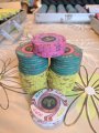
There's two things that stand out to me that may need tweaking. The light blue HPT on the green chip and the purple HPT on the pink chip. Not sure yet what the fix is but they just need more contrast.
There's two things that stand out to me that may need tweaking. The light blue HPT on the green chip and the purple HPT on the pink chip. Not sure yet what the fix is but they just need more contrast.
I love 'em! I really like the white with brown and red chip.
There's two things that stand out to me that may need tweaking. The light blue HPT on the green chip and the purple HPT on the pink chip. Not sure yet what the fix is but they just need more contrast.
Nice. I didn't want to steal the yellow HPT from the 100 but maybe the light blue will work there?
Nice. I didn't want to steal the yellow HPT from the 100 but maybe the light blue will work there?
It is not the same yellow one is more orange. I think it will be fine they are quite different.
Quicksilver-75
4 of a Kind
Who are you using to make these? GOCC, OWPs or ???
They're looking great! In for a sample if you get some!
They're looking great! In for a sample if you get some!
")
Hello,Looking for feedback on my new set design.
We wanted to have them EPT chip style so that is final.
But colors and fonts are still in thinking and any ideas and critics welcomeView attachment 80504
I think the EPT chips have a really nice design and your design compliments it even more. I am actually looking to get custom EPT chips, can you share with me who designed these for you and where you ended up getting the chips from? Thanks
Similar threads
- Replies
- 2
- Views
- 311
- Replies
- 15
- Views
- 292