-
This site contains affiliate links. If you choose to make a purchase after clicking a link, Poker Chip Forum may receive a commission at no additional cost to you. Thank you for your support!
You are using an out of date browser. It may not display this or other websites correctly.
You should upgrade or use an alternative browser.
You should upgrade or use an alternative browser.
Feedback: Custom Tourney Chips (1 Viewer)
- Thread starter alkregha
- Start date
You really don’t need a $50 chip. I’ll be the first to say it.
100%You really don’t need a $50 chip. I’ll be the first to say it.
I'd turn the $50 into a $500 and turn the $500 into a $5000.
Thanks - great suggestions. That allows larger starting stacks and more color up capabilities. I’ll work on that. Will slide my spot progressions to the right to line up.100%
I'd turn the $50 into a $500 and turn the $500 into a $5000.
You might want to change the color below R on the $25 chip, it is too bright and a bit hard to see the text.
Great suggestion, I agree the more I look at it. How about the gray on the $500?You might want to change the color below R on the $25 chip, it is too bright and a bit hard to see the text.
I'd say they are fine, but you could also change it a bit just to be safe.Great suggestion, I agree the more I look at it. How about the gray on the $500?
I wouldn’t miss the obvious opportunity to brighten the set up by using the excellent dg arc yellow as my 1k. Black and blurple will look fairly close.
Definitely skip the 50 and make a 5k instead.
Definitely skip the 50 and make a 5k instead.
w00zie
Flush
If that's gonna be a used for tourneys only you can skip the $ sign.
Unless you wanna go WPT style:If that's gonna be a used for tourneys only you can skip the $ sign.
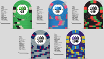
LOL! I think I’ll keep the $ just for “Casino effect”. I did a second attempt using some of the advice above. Darkened the green on the 25 R, moved the blue to 500, moved the gray to 5000, and tried a DG Arc Yellow 1000. Still not in love with everything but I think this is an improvement.
I think the $5000 looks killer. I like that the green and black become the workhorse chips as those are awesome. Still not sold on the $1000 design but was struggling with the warning about mixing DG base with non DG spots. Also the creator doesn’t do the DG Arc Ylw justice.
I think the $5000 looks killer. I like that the green and black become the workhorse chips as those are awesome. Still not sold on the $1000 design but was struggling with the warning about mixing DG base with non DG spots. Also the creator doesn’t do the DG Arc Ylw justice.
Attachments
LOL! I think I’ll keep the $ just for “Casino effect”. I did a second attempt using some of the advice above. Darkened the green on the 25 R, moved the blue to 500, moved the gray to 5000, and tried a DG Arc Yellow 1000. Still not in love with everything but I think this is an improvement.
I think the $5000 looks killer. I like that the green and black become the workhorse chips as those are awesome. Still not sold on the $1000 design but was struggling with the warning about mixing DG base with non DG spots. Also the creator doesn’t do the DG Arc Ylw justice.
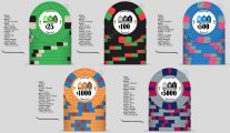
not a fan of the 25 & 100 sharing 2 colors.
RPC is my poker league / circuit name. The idea of the set is I would break it out for the annual tournament of champions. The trophies represent that to an extent. Still not sold on the inlay in any case. I think the yellow on the 100 is a good call and aligns with what raynmanas said.Why RPC? and why the gold cups?
The text on champions is too small, and the $ sign. It would look better without it.
I would use yellow instead of green on the 100
Yeah, similar to above, maybe yellow or something else will be better than green on the 100. Could likewise replace black on the 25.not a fan of the 25 & 100 sharing 2 colors.
MrWookie69
Pair
I don't know if your league has a cash set based off this "chip identity", but to me, "Royal Princess Casino" - words alone - just evokes a level of sophistication and elegance about it. This layout doesn't bring these chips to that level. It feels a bit clunky in comparison. ...especially if you're going to be playing a higher stakes tourney game.
...then there's the investment factor. If you're going to be spending a good chunk of change on a tourney set, you'll want your investment to look the part. If that makes sense.
...then there's the investment factor. If you're going to be spending a good chunk of change on a tourney set, you'll want your investment to look the part. If that makes sense.
I agree. To me, the current inlay looks too much like a corporate logo.I don't know if your league has a cash set based off this "chip identity", but to me, "Royal Princess Casino" - words alone - just evokes a level of sophistication and elegance about it. This layout doesn't bring these chips to that level. It feels a bit clunky in comparison. ...especially if you're going to be playing a higher stakes tourney game.
...then there's the investment factor. If you're going to be spending a good chunk of change on a tourney set, you'll want your investment to look the part. If that makes sense.
I don't know if your league has a cash set based off this "chip identity", but to me, "Royal Princess Casino" - words alone - just evokes a level of sophistication and elegance about it.
I don't think this set has anything to do with Royal Princess Casino, it's just the letters R, P, and C.
MrWookie69
Pair
I don't think this set has anything to do with Royal Princess Casino, it's just the letters R, P, and C.
Fair. I just clicked the RPC letter in the comments, and that's what popped up.
Regardless - there's a lot of room to really "plus it up"....
Yeah that’s right. It’s the name of the three league / tournament founders. So a little trickier to create something “elegant” but the point is well taken. I’m trying to come up with some concepts that are either less corporate looking, or take a different tact all together. Like… making the primary theme “The Champions” or similar, with RPC spread around the edges in a sort of “background” way instead of front and center. In the mean time, I’m continuing to optimize the color schemes as well. I imagine it takes most people several iterations before they find the right look.
For the record, the 100 and 1000 chips will be the workhorses of the tournament set (and will require the most quantities).Continuing to experiment. Retooling the inlay in parallel, but here are some new color combos:View attachment 1354089
I really really love the white red and black on the $5000Continuing to experiment. Retooling the inlay in parallel, but here are some new color combos:View attachment 1354089
Similar threads
- Replies
- 15
- Views
- 804
- Replies
- 13
- Views
- 683
- Replies
- 4
- Views
- 194
- Replies
- 25
- Views
- 1K
- Replies
- 10
- Views
- 577