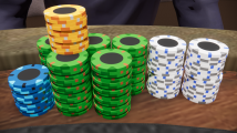
Feedback on 'golf theme' set (Cards Mold) (1 Viewer)

kkcc98

Pair
Joined
Mar 7, 2021
Messages
129
Reaction score
389
Location
UK
Hey PCF. I'm looking to design a new set to be made from the cards mold chips, and I've decided to use golf as a theme around the colour designs etc.

So I started off with looking at colour schemes of 'golf'.
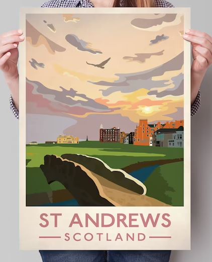
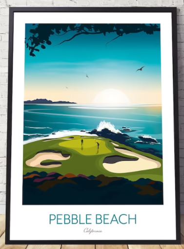
Google searches brought me these images:
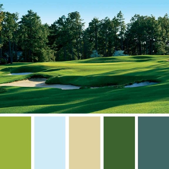
a363bbd15e0716413d0c7c4d708997d8.jpg


etsy1.JPG
etsy2.JPG


From this I decided on a few colours to base my chips around. Not gonna lie, my favourite colour is green, so I want to emphasise on this, making this the main workhorse chip.
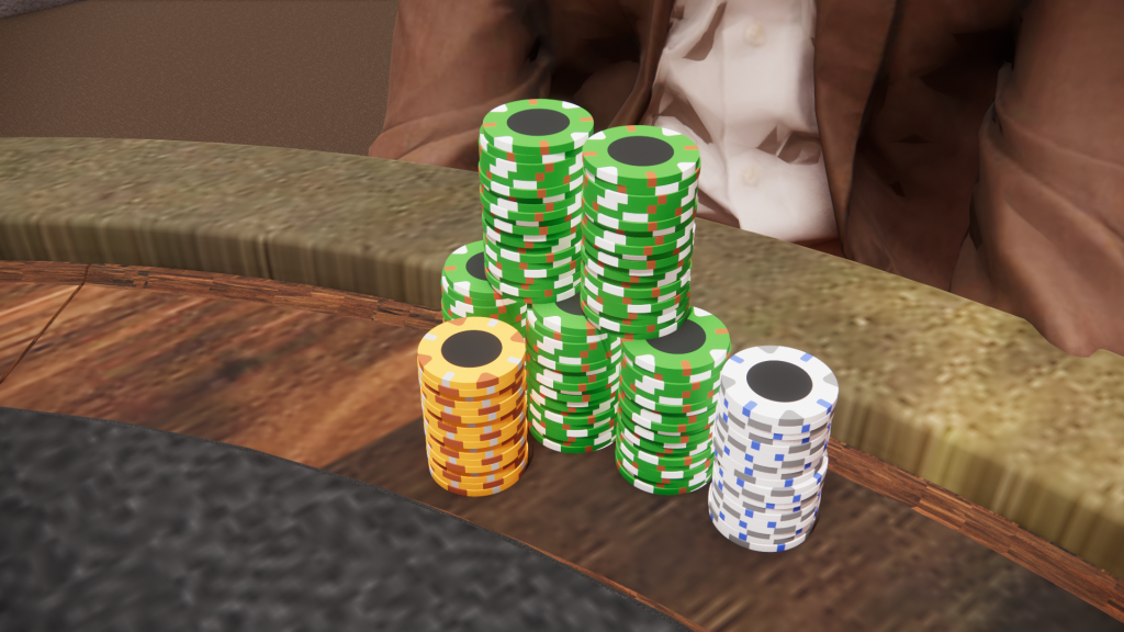
The idea of all players having many barrels of green chips in front of them, reminds me of what you see at the golf course, the endless landscape of green. The other colours are white, which reminds me of the mini flag pole, golf carts, perhaps the white clouds seen in those posters above. The last colour of orange I have in mind reminds me of the sand in the bunker, or the colour of the setting sun.

Now I understand the colours-denominations are not standard at all, (I hope this doesn't trigger anyone), but I just feel like doing something different. Also did I mention I want more green stacks? :)

The edge spots of each chip relates to something that reminds me of the surrounding landscape or I felt it goes well with it.
White chip: edgespot of blue relates to bodies of water, grey relates to rocks
Green chip: edgespot of brown relates to surrounding trees, white relates to the things that can be spotted on the course
Orange chip: edgespot of darker brown and light grey to the rough terrain outside the course
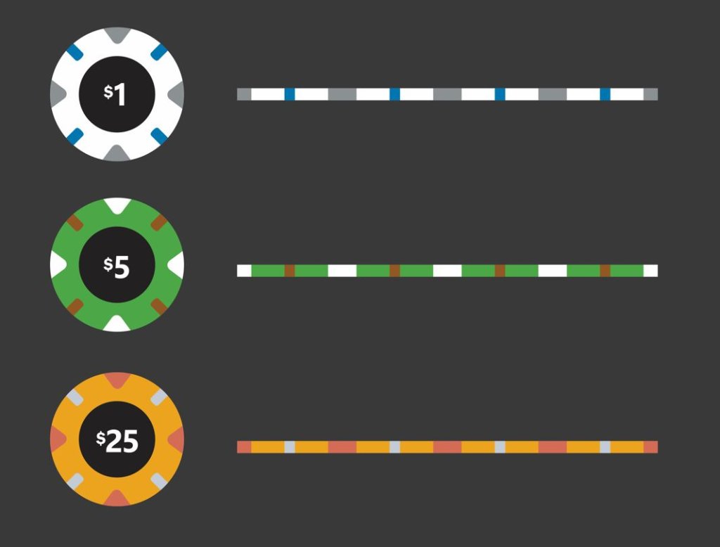
mockups.JPG


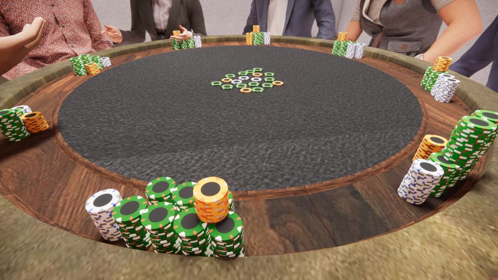
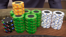
I built the chips in sketchup and rendered it with the 'stacks', as well as what it would look like on a table setting!
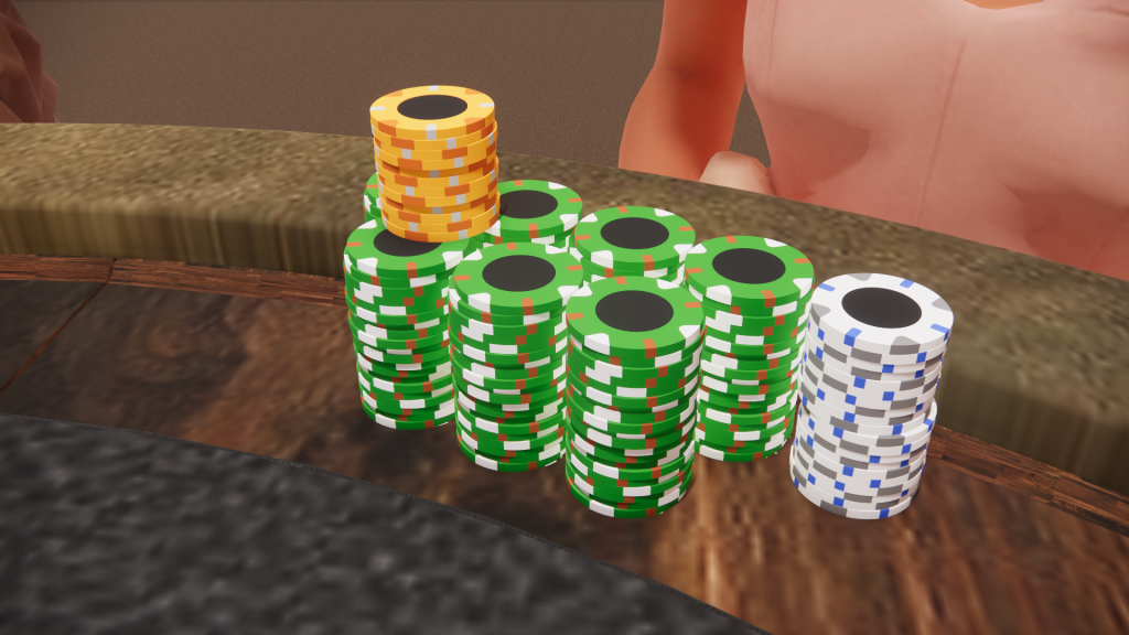
test golf chips v2.png

test golf chips v2.2.png

Enscape_2022-01-13-01-14-05.png


This is an idea I literally thought of today and finished in a few hours, so any feedback is welcome! :)

If you have any thoughts on what the $100 chip should look like, please feel free to let me know.
 
As someone with more of a golf background than poker, I really like this idea and prefer these colours rather than ‘traditional’ for this design.

The $100 could be a blue chip perhaps? While still not traditional, it could play in with the clear skies/water hazards you might see on most courses. Also perhaps ocean themed like you see at pebble beach

Overall I love this idea! I hope to see some inlay designs if you follow through with it!
I thought about blue as well! Will give it a shot and see.

And you definitely will be updated with any inlay designs! Just haven't moved onto that yet. Thinking of how I can make a nice golf theme inlay design without completely copying the Dunes :LOL: :laugh: My current set is the apache china clay version, which hugely inspired this.
I was definitely also thinking about designing some golf themed chips but you’ve beat me to it! Can’t wait to see how these turn out
 
Love the theme.

Id go for a different tone of green on the $5 instead of a white spot. Maybe try to represent the different shades of grass?

Would love to see a blue hundo for water.

white chip could have some bright spots to represent some of the other bright coloured balls available.

orange is a great for sand.
 
Btw, has anyone played the steam game Tabletop Simulator before?
You can add your own custom image in for poker chips, and it's a great tool to visualise new sets or whatever!
Here's mine I uploaded:
20220113115827_1.jpg

Capture.JPG


I can go into detail about anyone would like to know :)

EDIT: someone on the steam workshop already made the WSOP and MGM chips :O
20220113120202_1.jpg
20220113120226_1.jpg
 
Last edited:
View attachment 845684View attachment 845685
Added the first iteration of blue hundo and changed the triangle edgespots of the $5 to forest green, loving that idea btw @davislane
Side by side comparison available above

Below is a closer look at the hundo.
View attachment 845688
nice iteration. i feel like it need some different colours incorporated like some red, purple or pink. maybe a pink or purple spot on the one instead of blue.

are you planning on having the same spot pattern all the way through?
 
nice iteration. i feel like it need some different colours incorporated like some red, purple or pink. maybe a pink or purple spot on the one instead of blue.

are you planning on having the same spot pattern all the way through?
Hmm I see, I just feel like the colours of the edgespots need to relate to something you see on the golf course.

And yes, I really wanna try a set with the same edgespots. I understand the term of spot progression and what not but I just wanted to experiment with the triangle and stick mold.
 
Straight up, as a novelty set this is fine.

HOWEVER, as a functioning poker set, having a green $5 is going to cause issues. It is THE COLOR for $25's in everybody's mind. IMHO, you should reconsider. Your set though, so do what makes you happy.
 
Straight up, as a novelty set this is fine.

HOWEVER, as a functioning poker set, having a green $5 is going to cause issues. It is THE COLOR for $25's in everybody's mind. IMHO, you should reconsider. Your set though, so do what makes you happy.

Nope! The proper color for a $5 is yellow!

I agree, the orange 25 and green 5 even with denoms will trip people up. I'm in for non Vegas colors, but it has to be something new. I went for a non denom set, Vegas colors, but instead of red I went blue. White, Blue, Green, Black. I dislike red.

The rendering is amazing
 
Love the golf theme. I've been working on a golf theme chip off and on for a bit as well I keep jumping between themes for a custom set. Personally, I find it really difficult to choose edge spots without an inlay idea at least.
 
Wow, great idea for a theme, and those renders....:wow:

Green $5's wouldn't bother me, I think I'd get used to it after a few hands. Personally, I'd like to see the orange chip be more of a sand color....but then again, if I was designing this set based on my golf experience, all the chips would be blue and sand colored, maybe a few very dark green chips to represent being in the deep rough and trees....

If you play tournaments, please make a Mulligan rebuy chip!
 
You know if you were to change spot patterns...tri-moon might make sense with the theme.

whoa-surprise.gif


Good call, but I still really like the current spot pattern I'm on, will see how it develops.

My first thought was a black hundo with blue, white, and/or red spots for traditional tee marker colors.

Whipped these up quickly to see how it looks.

Hundo black 1.png


Hundo Blue 1.png


Both look good... I love the bright popping colours of blue and how it sits with the rest, but black has that oomph factor of a big chip.
Blue or black?
 

Attachments

  • Hundo black 2.png
    Hundo black 2.png
    740.5 KB · Views: 79
  • Hundo blue 2.png
    Hundo blue 2.png
    744.2 KB · Views: 77
That black chip is giving me Mario vibes. I would say maybe just two red Vs and two blue Vs?
 

Create an account or login to comment

You must be a member in order to leave a comment

Create account

Create an account and join our community. It's easy!

Log in

Already have an account? Log in here.

Back
Top Bottom