Flamingo Lounge Cash Set Design (7 Viewers)

Salmonblaster

Two Pair
Joined
Feb 25, 2023
Messages
253
Reaction score
572
Location
Riverside, CA
I had previously done some mock-ups in another section of the forum to come up with a design for a cash set for my Flamingo Lounge theme. I was happy with it, but ultimately it didn't wow me. The set didn't have the style that I had hoped for, or the versatility I realized I needed to be able to move between micro-stakes (5c/10c) for family games and regular stakes (25c/50c or 1/2) for the games with my poker crew. I also felt a little constrained trying to label already made chips where the colors and spot patterns were predetermined. I've picked around with the idea for another little while and this is what I've come up with.

I tried to choose colors I like (I've had a hankering for a hot pink quarter from pretty much the inception of the project so it was a must-have for me), have some type of interesting spot progression while not feeling like it's too rigid in the progression. I also wanted have it feel like a cohesive set whether it is the full set from 5c to $100 or broken into their respective micro and regular stakes sets. The micro set will be 5c, 25c, 50c, $1, $5 and $10. The regular stakes set will be the 25c, $1, $5, $25 and $100.

Any and all help, guidance, criticism and suggestions are greatly appreciated!
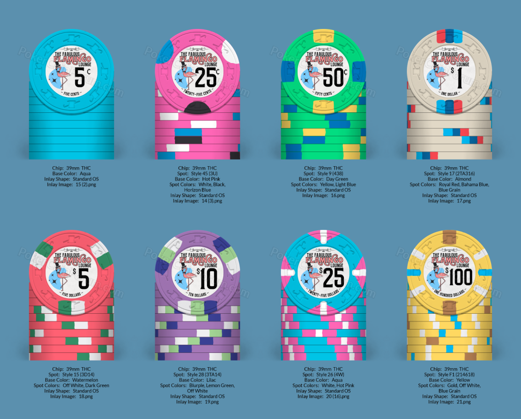
FLAMINGO CASH.png
 
- Are you planning on doing a custom cards mold or Tina hybrid mold set for these?

- There's way too much white across the set IMO

- I like the label/inlay design, but it's a little busy and the text is going to be illegibly small when printed. Try printing out 7/8" diameter circles with your design on them for reference.
 
I agree drop the white In the 5,10,100.

The .25 and $25 is fine as you won’t have a quarter and $25 normally in same game. Hot pink is fire! And so is the $25
 
- Are you planning on doing a custom cards mold or Tina hybrid mold set for these?

- There's way too much white across the set IMO

- I like the label/inlay design, but it's a little busy and the text is going to be illegibly small when printed. Try printing out 7/8" diameter circles with your design on them for reference.
Thanks for the response! I've printed some mocks at 1" and 7/8" and it's all legible but I have also toyed with possibly removing some elements as well to clean it up a bit.

I think I had a bit of tunnel vision on each chip because I do see the point about a lot of white once I take a step back at the whole set....any color swaps or anything you see that might work better for some of them?
 
I agree drop the white In the 5,10,100.

The .25 and $25 is fine as you won’t have a quarter and $25 normally in same game. Hot pink is fire! And so is the $25
Any ideas for color swaps or just drop the white altogether and keep everything else?

I came to the same realization that you did about the .25/$25 after I finished the $25 chip but I just liked them both too much so it's funny that I wasn't the only one.
 
Also a lot of blue between the nickel and the $1 chips. I don't think it's as bad as the white, but the blue on the $.25 could create some possible dirty stacks with nickels.

Quite like the set for the most part though.

I'm assuming you're planning custom ceramics route for these?
 
Also a lot of blue between the nickel and the $1 chips. I don't think it's as bad as the white, but the blue on the $.25 could create some possible dirty stacks with nickels.

Quite like the set for the most part though.

I'm assuming you're planning custom ceramics route for these?
Yeah, most likely either cards mold or another ceramic supplier. I have a no mold tournament set that I ordered this go-around in the group buy so I'm going to see how I like ceramics past the sample set size and go from there.

And I notice lots of blue carryover now too...lol

Forest for the trees and all that...:LOL: :laugh:
 
If your going ceramics it’s no biggie on amount of chips or colors or denoms I like the idea

.25/.50/1$/$10 for micro game!
And $1/$5/25$/$100 for 1/2

To me more chips is better lol
I'm leaning towards keeping the $10 for the micro set because I think the family game (mostly in-laws and uncles beyond my immediate family) will enjoy more chips/color combos in play as they are mostly casual playing and more enjoying the social aspect of the game.

With tournaments it is easy to do since everyone throws in a little and gets a lot of chips. They like that aspect so I figure I can carry it over to the cash game for them. Since they only started playing initially because of me, it seems like the least I can do to help them continue having fun.
Do whatever you’d like since that’s the beauty of customs but IMO if you’re playing a 5¢ game how often will $10s even come into play? If it’s a casual social family game I would rather have more chips on the table (two 5s instead of one $10)
 
Do whatever you’d like since that’s the beauty of customs but IMO if you’re playing a 5¢ game how often will $10s even come into play? If it’s a casual social family game I would rather have more chips on the table (two 5s instead of one $10)
That's also a great point too. Food for thought
 
I agree with too many chips and lose the 50¢ and $10. But I think the $5 is the weakest chip, and the $25 isn’t my favorite with all the blue. How about moving the $10 chip to the $5, and 50¢ chip to the $25 (potentially some spot complexity changes necessary). The purple $5 is weird. But just tossing out ideas, since I am biased against the current $5. :)

Also agree that you will love the inlay more if you simplify!!
 
So I simplified the inlay design a little, changed some things around in terms of the colors and spots and did some removal of some of the chips as suggested and this is where I've ended up now. I love my first three chips even with all of the blue, I darkened up the 5 and changed the spot pattern a bit, and revamped the 25 and the 100 the most. Thank you all so far for your help and looking forward to any new thoughts.

Flamingo Cash 2.png
 
So I simplified the inlay design a little, changed some things around in terms of the colors and spots and did some removal of some of the chips as suggested and this is where I've ended up now. I love my first three chips even with all of the blue, I darkened up the 5 and changed the spot pattern a bit, and revamped the 25 and the 100 the most. Thank you all so far for your help and looking forward to any new thoughts.

View attachment 1156961
Are you doing these on cards mold? Also I’d mix the green $5 just way to confusing. I think of you did a royal red $5 and made the green $5 the $25 it would be optimal imo. I’m digging the yellow $100 though
 
Are you doing these on cards mold? Also I’d mix the green $5 just way to confusing. I think of you did a royal red $5 and made the green $5 the $25 it would be optimal imo. I’m digging the yellow $100 though
Likely cards mold or another ceramic...I think I will play around with flopping the 5 and 25 and see where I end up then...
 
Lots of changes since the last posting in terms of a major overhaul of the inlay design to simplify and possibly better execute my retro hopes as well as some new chip designs. Plenty of holdovers from the last set also as those are pretty well going to stay locked in regardless. Not too sure on the $100 yet as I'm still playing around with some thoughts but these are my two winners at this point.

Thinking these might go on the new hybrid greek mold that @justincarothers is going to be offering soon, but I feel like I probably have a lot more fiddling with to do before I get there.... :LOL: :laugh:
Flamingo Cash 5.png
 
Are you okay? :oops:

Lets slow this down a little, first stop bouncing off the walls!

Find a base color palate you like, then work around your .25 chip, I'm a fan of a Cali set for base color. You live in CA, and you can use purple as your 25, white 1s are so boring, go with blue =) - pick a boring color for your .05.

You'll also want to color match your denom to the chip
Going to try that denom to chip match and see what I think of it, thank you! Also I'm a little confused about the beginning of your reply.
 
Base color, start with solid colors and figure out the contrast/ base chip color without inserts.

There are two base color standards, I like the cali standard pink, blue, yellow, purple, white .25, 1,5,25,100

You can do a 20 instead of a 25 and the are typically black in the cali lineup

Check my signature links, CPC is a Cali set and new members willl help you as well
 
Ahhhhh, I get what you're saying...referring to the Cali color lineup as something to stick to rather than what I have going at the moment.
 
So I have a Cali color lineup working, but for now I have this that I think covers both ideas with the color match denom (thank you @Machine ) and a separate design for the front and back (thank you @allforcharity ).

The 5c frac is now green so that I can have the aqua color for the new $1.

Flamingo Cash 6.png
 

Create an account or login to comment

You must be a member in order to leave a comment

Create account

Create an account and join our community. It's easy!

Log in

Already have an account? Log in here.

Back
Top Bottom