euvi
Sitting Out
Hey all. I started working on a custom set which I'll use with my roommates+friends next year. We are in college and we are goons, so the design philosophy is pretty unserious.
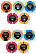
These will be hybrid mold Tina's ceramics but I haven't decided on greek or web mold yet. I went with the premade Aria tribute blanks for the chip designs because I have very little experience when it comes to poker chip spot patterns and colors, and I dig the Aria chips. I spent some time trying to design some nice looking chip patterns but didn't like any of them and figured I might as well use something that already exists and I also enjoy. The chips are just screenshotted from the Tina's blanks thread.
I have some design experience and I'm studying a field which requires lots of visual communication, but I want to stress that I am by no means an illustrator. This is mostly why I stuck with a typography-focused design, and also because I don't really have a fantasy theme or symbols to go with.
But, I am open to ideas/feedback on how I could make this a more illustrative design after seeing what other people have been making here. I'm sharing my design here for feedback on this, but also mostly for any general poker chip design things that I've missed or should know (basically just proofreading for any glaring mistakes). Thanks for your time.
Here is what I got so far. Just playing with the idea of coloring the logo.
Also, the drawing in the background is a smiley face because I thought it looked funny.