chicubs1988
Flush
After bouncing back and forth between about a dozen different ideas for what to do for my cash set, I've finally made a decision. As many of you are probably aware, there was a (now closed) casino in Reno name Harold's Club:
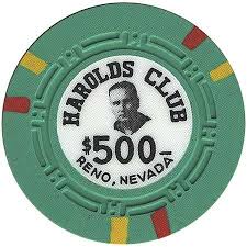

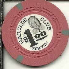
My gambling enthusiast grandfather was also named Harold. My first trip to Las Vegas was a celebration of my 21st birthday and his 80th. I decided that I would like to make a set that honors him and will bear his image much like Harold's Club Reno chips had the images of Harold Smith and his family. In terms of colors, I'm going for something that represents the bright neon lights of "Old School Vegas." Initially, I was fretting about following some type of traditional color scheme and ensuring "proper" edge progression, but I eventually decided that I just wanted to go with chips that I liked regardless of standard conventions. Here is my current lineup (.25, .50, 1, 5, 25):
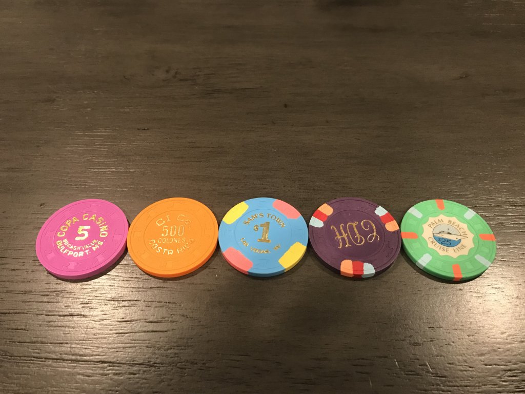
Currently, I'm in the final stages of accumulating the chips (if you have more CI Co 500s or Paulson Fantasy Purples, I'm your man), and I'm setting up the artwork. Once I've got all of the chips I'll turn to paying someone to get the milling done, and then I'll move onto the labels. I'll likely add more denoms in the future, so if you have any suggestions for chips that would work with the set, please post them here.
I'll post updates/progress pics here as I get them.
UPDATE: Some new variations
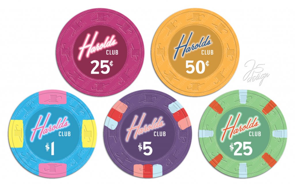
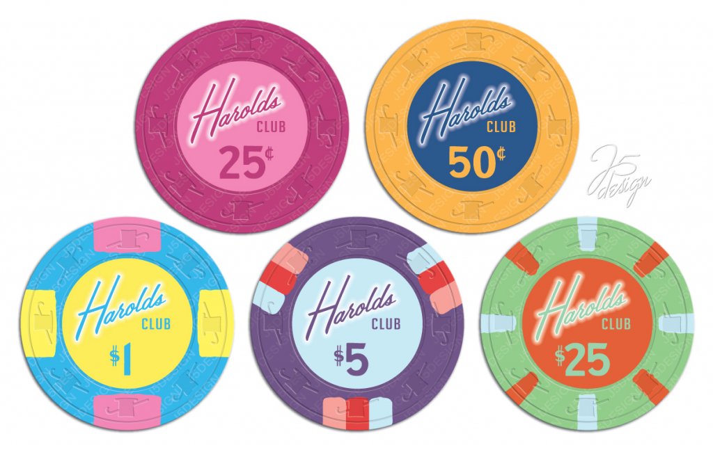
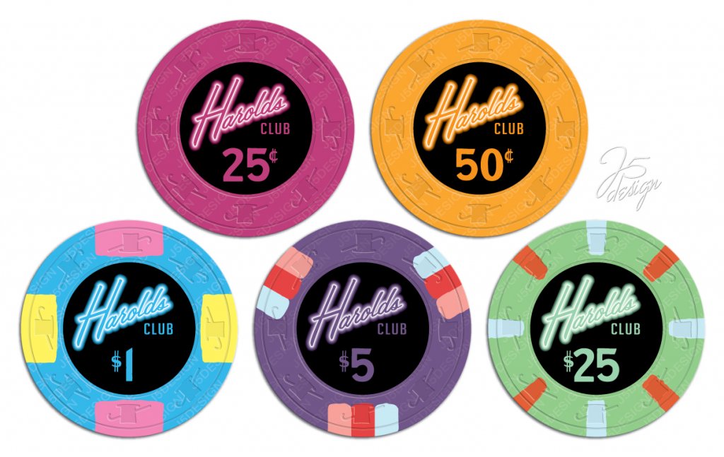
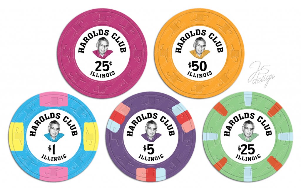
My gambling enthusiast grandfather was also named Harold. My first trip to Las Vegas was a celebration of my 21st birthday and his 80th. I decided that I would like to make a set that honors him and will bear his image much like Harold's Club Reno chips had the images of Harold Smith and his family. In terms of colors, I'm going for something that represents the bright neon lights of "Old School Vegas." Initially, I was fretting about following some type of traditional color scheme and ensuring "proper" edge progression, but I eventually decided that I just wanted to go with chips that I liked regardless of standard conventions. Here is my current lineup (.25, .50, 1, 5, 25):
Currently, I'm in the final stages of accumulating the chips (if you have more CI Co 500s or Paulson Fantasy Purples, I'm your man), and I'm setting up the artwork. Once I've got all of the chips I'll turn to paying someone to get the milling done, and then I'll move onto the labels. I'll likely add more denoms in the future, so if you have any suggestions for chips that would work with the set, please post them here.
I'll post updates/progress pics here as I get them.
UPDATE: Some new variations
Last edited:
