Head-up set "Els Segadors" (2 Viewers)

CarlosStorm

Straight
Joined
Sep 17, 2020
Messages
861
Reaction score
1,034
Location
Barcelona
Hello everyone!

I'm planning to design a label for a tiny relabel project for a head-up set, just 100 chips!

"Els Segadors" is the official national anthem of Catalonia. The original song dates in the oral tradition to 1640, based on the event that started the Reapers' War or Guerra dels Segadors, where Catalans fought against King Felipe IV of Spain, and eventually led to an open war and the establishment of a Catalan Republic under French protection.

I'm just starting to think about it, but I'd like to share the process with the community. I appreciate your help.

These are some key elements I want to add to the label:
  • Tha name - ELS SEGADORS.
  • els_segadors_transparent_v2 relleno.png
  • The casino, in that epoca may was a Tabern: La Taverna del Naips (Naips are cards)
  • Currency: In those years, there were differents currencies, I like "Sous"
  • The symbol: well, there are three main elements, the Flag, the Wheat, and their main tool, the sickle
  • els_segadors_emblema_transparent - rellenos.png
So, the label will have these elements. This is a simple mockup (with powerpoint...)
El Segadors Mockup v1.png

Work in progress!
I would appreciate opinions about what chips do you think is a good option for this project.

Thanks!
Carlos.

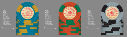
Edit 1 - First mock up
A Versión, CPC H-mold
Mock up CPC v01.png

B Version, CPC Plain

Mock up CPC v02.png


Edit 3, side A
Mock up CPC v04.png

Edit 3, side B
Mock up CPC v05B.png


Edit 4 , Side A & B
Mock up CPC v04A.png
Mock up CPC v04B.png
 
Last edited:
I could see this as an awesome hotstamp with a little font work.
No money for that...:cry:
I think this project needs a vintage style for chips and label. What do you think about the size of the label, 7/8" 1", 1-1/16 inches?
 
Vintage? A and 312.
 
Last edited:
Wow, I really like the symbol and what looks like a custom font. Did you design it yourself? Or is it something you found online?
 
Wow, I really like the symbol and what looks like a custom font. Did you design it yourself? Or is it something you found online?
It's an old poster, I think it has more than a century. I'm not an expert working with images, just managed the text as an image, it has more work than just using normal letters.

Els Segadors - ej01.jpg
 
New version, work in progress:
Edit 2a:
View attachment 1471944

Edit 2b, less saturated

View attachment 1471969
OK… if you’re using the big vintage background image from @chipinla, there’s a trick you can do to make the background change with every inlay, so it doesn’t look like the same background, but actually some vintage wear and tear. Read this thread for more: https://www.pokerchipforum.com/threads/you-want-customization.106181/

If you’re interested, Timinater & David Spragg might be able to help you out, but I would get on that fast given the change in ownership at CPC.
 
I like that weathered look! Edit 2A is my favourite so far.

Just check to make sure that the bottom line of text is not too small once printed. At actual print size, fonts which have a lot of detail might be hard to read.
 
Thanks for your opinions. I'm learning on my own, and it isn't easy to achieve at this moment, but for this tiny project, a more accurate job.
In any case, I think it would be a good idea to have different labels in each side.

Edit 3, side A
Mock up CPC v04.png

Edit 3, side B
Mock up CPC v05B.png
 
Last edited:
I printed a few label just to test the colors and the red wasn't dark enough for my test, so I'm using here the Catalan red color, used in our flag.
Do you think it's better than the older one?

L-ES-100-v04A.png
L-ES-100-v04B.png

Mock up CPC v04A.png
Mock up CPC v04B.png
 
First thing I noticed- the capital S in Segadors. It looks odd. I don’t see it before because the font was more muted.

Regardless, I think the more muted font better matches the vintage look. We would expect it to be faded a bit and match the aged paper.
 
First thing I noticed- the capital S in Segadors. It looks odd. I don’t see it before because the font was more muted.

Regardless, I think the more muted font better matches the vintage look. We would expect it to be faded a bit and match the aged paper.
Agreed on both accounts, fwiw
 
I've decided to change everything, I want to make that the label looks something like an old coin, called "Croat" (cross in old Catalan).
This is the coin vs label:
Croat Pere III - 01 - creu.jpg
L-ES-100-v05.png


And a mock up with differents CPC molds:
Mock up CPC v05.png


It's still work in progress, what I think the look better. I have to think about the currency and so on...
Thanks for you advice!
Carlos
 
True, you don't "need" denominations. You don't "need" chips either, since money, pente stones or bottlecaps will work just fine.

...but if you want the best, you need chips (with denominations).
 
True, you don't "need" denominations. You don't "need" chips either, since money, pente stones or bottlecaps will work just fine.

...but if you want the best, you need chips (with denominations).
Yes, I have to have denominations, haha, maybe something like that.
L-ES-v06-5.png

Mock up CPC v06.png
 
Last edited:
What denoms are you going to use for this cash set? Fracs or no?
Those are for a head-up tourney set. In any case, I'm looking max for a min set with only three denomination. I have doubts about which three:
  • 1/4
  • 1
  • 5
Another option:
  • 5
  • 25
  • 100
But not for a cash!
 
I would make the number "pop" a little more, Maybe color match to the chip, the spot, or silver like the coin (provided the silver doesn't just look grey).
I'll try some options. The original "croat" coin was made of silver, so it may be the main color of the label, and the number could match the chip or the spot. :unsure:
 
Gret job! i really like the retro looks there. But personally the inlay would be too much for me. Aswell i think that the font doesnt pop enough if you know what i mean. But again just my opinion
 
Gret job! i really like the retro looks there. But personally the inlay would be too much for me. Aswell i think that the font doesnt pop enough if you know what i mean. But again just my opinion
I'm trying to give some volumen and light, but the colors aren't consistent enough at the moment. I need to rest for a week and play poker a little more haha
 

Create an account or login to comment

You must be a member in order to leave a comment

Create account

Create an account and join our community. It's easy!

Log in

Already have an account? Log in here.

Back
Top Bottom