CallingStation614
3 of a Kind
Hey Everyone,
This is my first big post here. I've been reading this forum for a few months, lurking in the depths and recently finally signed up. Thanks to everyone who reads through it all the way and thank you to everyone that is contributing to this journey.
I managed to save up some money for a custom chip set. Sadly a CPC set is financially not in reach at the moment, so I decided to get in touch with Tina when I saw the new Web Mold 39mm Ceramic Hybrids. Currently I am strongly considering these chips as the base for my set, but let's take a step back and start from the beginning.
I am Daniel, 29 years-old and I live in Munich, Germany. I've started playing Poker when I was 17 and found joy in collecting different chips since a few years. I am working in finance (probably why I'm good at Poker), which means that my creative side is reserved for my hobbies, for example while building a poker table, which I am currently doing. After I found this forum and diving into countless threads, I decided that I want to design my own chip set.
But where to start. That's a good question. I've seen soooo many good designs here, that it was really hard for me to come up with something on my own at first. Then I saw the thread "If you could have one set, what would it be?". And while looking for an answer to that question, two sets stood out in my mind. My two favorite sets (for different reasons) are Le Paulson Noir and the chips from Rounders. While the latter might be a bit cliché I just really enjoyed that movie and I liked the simple design and edge spots, as well as the inlay with just a black bear in the middle. The Paulson Noirs are very different from the Rounders chips but I love the vibrant and bright colors and the color combinations itself.
My first idea was to design a set, combining elements of both chip sets and paying tribute to them without copying them. The idea of "Cirque Noir" (translates to black circus in french) was born. I wanted to take the vibrant Paulson Noir colors and combine it with the simple Rounders inlay, with each denom having a black portrait of a different circus animal. I had the idea because of the bear and I thought it would be nice to have different animals. So I thought, bear, tiger, elefant, sea lion and many more. However the designs I came up with were just not satisfying. Something wasn't right.
I didn't really keep on developing this idea because I wasn't happy with the progress. I tried to push it into another direction. The thing I liked from the Cirque Noir was that every denom should be represented by a different animal. This was the sprout for my next design. I wanted to create a chip set based on animals, with the smaller denoms being represented by smaller animals, and the animals getting bigger/more awesome (by personal opinion) with every denom. In addition, the chips should follow a rather traditional color scheme, so 1-white, 5-red, 25-green, 100-black, 500-pink/purple, 1000-yellow. Lastly, I wanted to have some sort of edge spot progression, so it would be possible to tell the chips apart in bad lighting. This is a lot of criteria that I had to factor into the design. Step by step, I found animals that fit the denom and color combinaiton and tried to mimick the fur/colors of the animals in the chip design. I used the following animals:
1 - White - Cockatoo
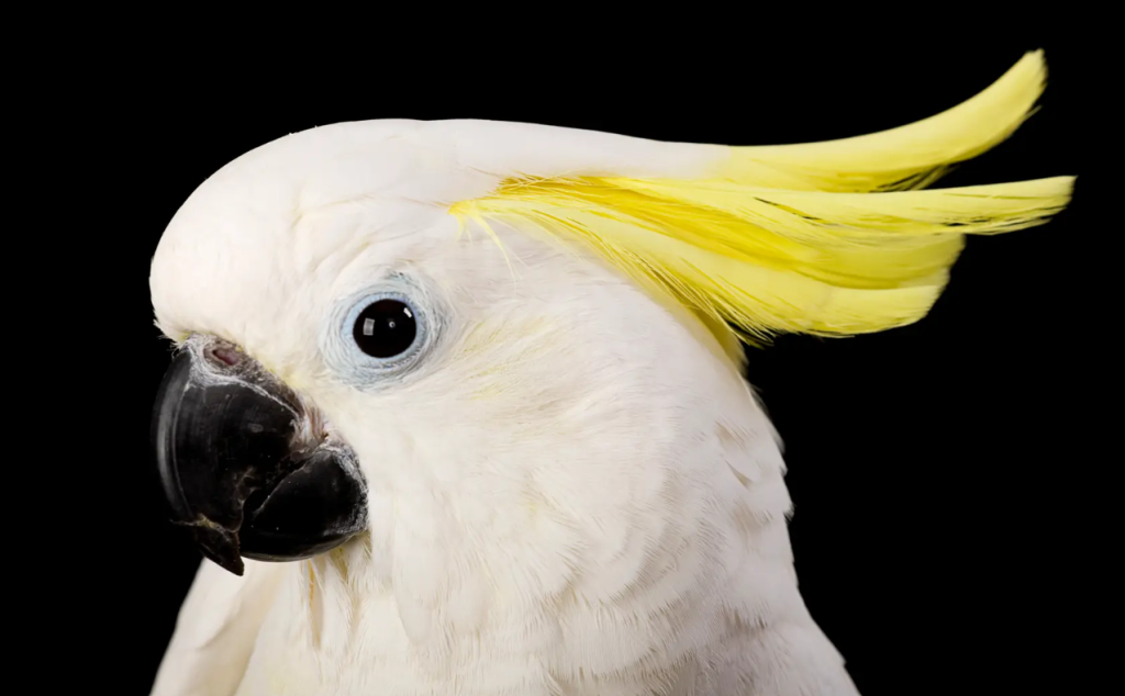
It's a rather small bird, fits the white for the 1 denom perfectly.
5 - Red - Parrot
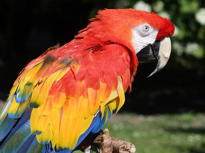
A bigger bird, bright and vibrant colors, red as main color - perfect for my 5 denom
25 - Green - Peacock
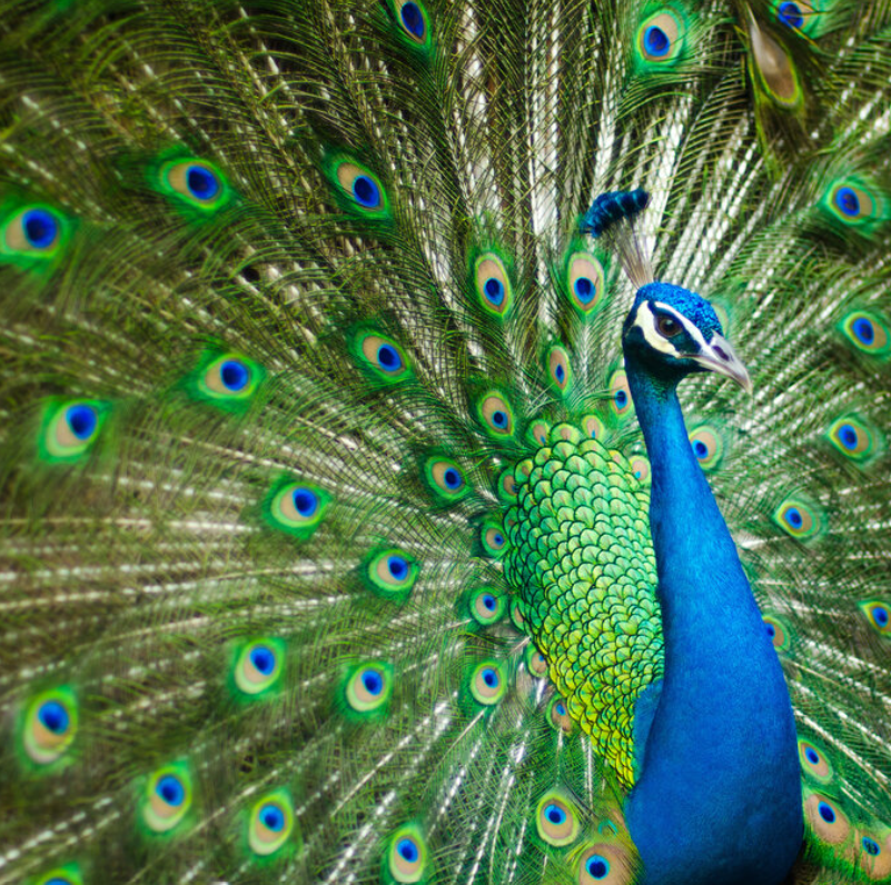
Again, bigger animal than before, and I liked the possible combinaiton of green and blue
100 - Black - Zebra
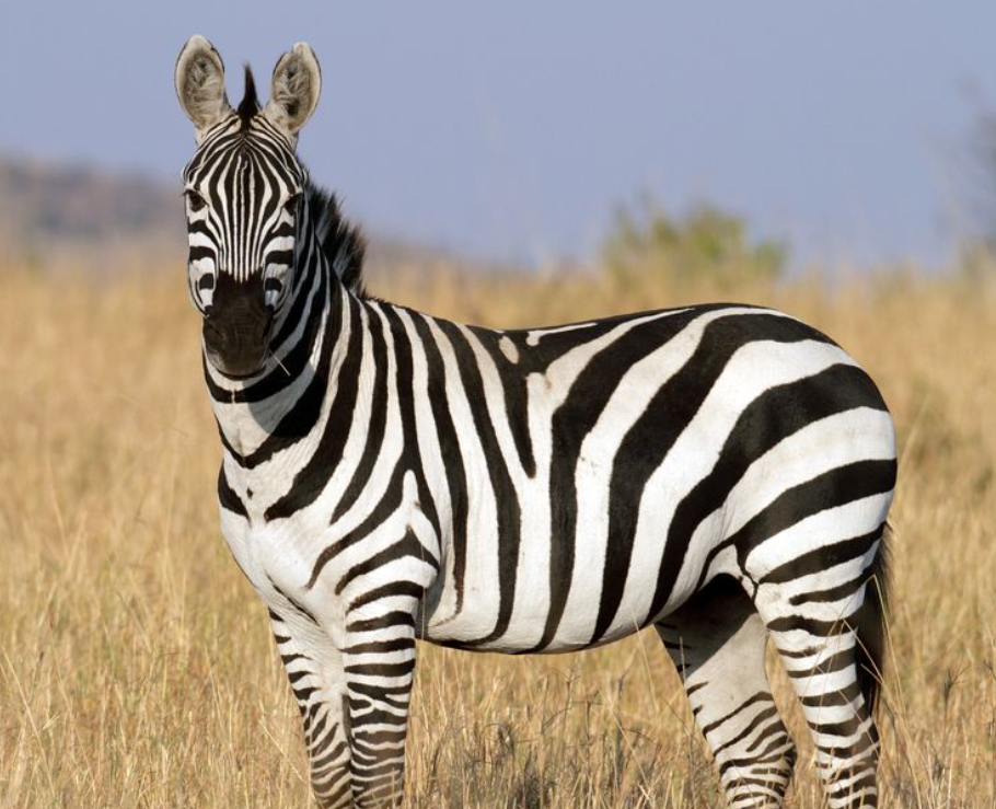
How cool are Zebras? Just think of the movie Madagascar. I chose this to be able to combine a black chip with white edge spots
500 - Pink - Flamingo
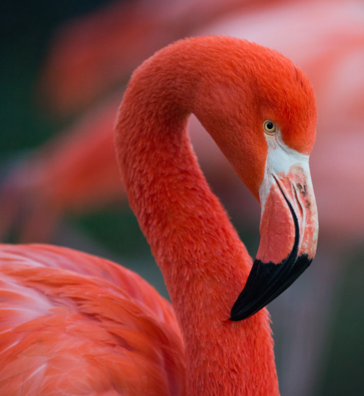
Who doesn't love flamingos. Very vibrant and I had a special idea for the 500 chip
1000 - Yellow - Giraffe
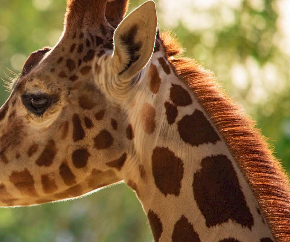
Big denom, big animal. Giraffe's are awesome and I thought "a perfect foundation for a yellow 1k"
5000 - Grey - Elefant
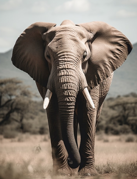
I wasn't sure about a 5k chip, but I remembered the 5k from the Le Paulson Noir and right then I knew I would include a grey 5k chip based off an elephant.
So much to the selection of animals. If you struck with me until this point, congratulations you'll see the first mock-up design shortly. I decided that I want to use white inlays, because of the vibrant and bright colors I would use and I think this somehow still enables me to pay hommage to my favorite sets mentioned earlier. The colors will be similarly bright and colorful as the Le Paulson Noir and I will try to work out an inlay design with each denom having a black portrait of its animal in the middle, but first I will finalize the chip design.
I thought about edge spot progression and came up with the following ideas:
1: white base, 4 simple yellow edge spots, similar to a Rounders chip
5: red base, 4 edge spots, 4 different colors
25: green base, 4 edge spots, 4 different colors
--> 5 and 25 have similar edge spots but red and green together with the brighter edge spots for the red 5 compared to the darker edge spots on the green 25 should be fine.
100: the zebra chip, just watch the design
500: I. love. flamingos. I wanted to have the 500 chip just a plain pink, even tho this is more common for fracs (from what I've seen while lurking in the PCF).
1000: Yellow base with 6 edge spots, 3 different edge spots colors
5000: I had no idea for this chip, but found something in the CPC Design Tool, that remembered me of a Big grey elephant with huge white tusks.
Please behold, the first design:
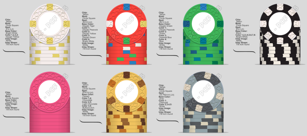
I am very happy with the progress and how it all came together after all, I am not copying anything existing and I just love the theme I came up with, designing the chips after the animals. It worked out way better thatn I thought with "bigger chips, bigger animals" while still having edge spot "progression" or being able to distinguish them.
For now I will stop writing, I am open to feedback of any sort. The most important thing: How should I name these. I am already thinking about inlay design and I didn't come up with a good name yet. "Cirque Noir" doesn't fit so well, because it's more Zoo animals now rather than Circus animals (which I like btw) and also I don't want to name a set this colorful "Noir". If someone as a great suggestion and I will go with it, you shall be named on the dedicated Cut Card to this set.
Best regards,
Daniel
<3
This is my first big post here. I've been reading this forum for a few months, lurking in the depths and recently finally signed up. Thanks to everyone who reads through it all the way and thank you to everyone that is contributing to this journey.
I managed to save up some money for a custom chip set. Sadly a CPC set is financially not in reach at the moment, so I decided to get in touch with Tina when I saw the new Web Mold 39mm Ceramic Hybrids. Currently I am strongly considering these chips as the base for my set, but let's take a step back and start from the beginning.
I am Daniel, 29 years-old and I live in Munich, Germany. I've started playing Poker when I was 17 and found joy in collecting different chips since a few years. I am working in finance (probably why I'm good at Poker), which means that my creative side is reserved for my hobbies, for example while building a poker table, which I am currently doing. After I found this forum and diving into countless threads, I decided that I want to design my own chip set.
But where to start. That's a good question. I've seen soooo many good designs here, that it was really hard for me to come up with something on my own at first. Then I saw the thread "If you could have one set, what would it be?". And while looking for an answer to that question, two sets stood out in my mind. My two favorite sets (for different reasons) are Le Paulson Noir and the chips from Rounders. While the latter might be a bit cliché I just really enjoyed that movie and I liked the simple design and edge spots, as well as the inlay with just a black bear in the middle. The Paulson Noirs are very different from the Rounders chips but I love the vibrant and bright colors and the color combinations itself.
My first idea was to design a set, combining elements of both chip sets and paying tribute to them without copying them. The idea of "Cirque Noir" (translates to black circus in french) was born. I wanted to take the vibrant Paulson Noir colors and combine it with the simple Rounders inlay, with each denom having a black portrait of a different circus animal. I had the idea because of the bear and I thought it would be nice to have different animals. So I thought, bear, tiger, elefant, sea lion and many more. However the designs I came up with were just not satisfying. Something wasn't right.
I didn't really keep on developing this idea because I wasn't happy with the progress. I tried to push it into another direction. The thing I liked from the Cirque Noir was that every denom should be represented by a different animal. This was the sprout for my next design. I wanted to create a chip set based on animals, with the smaller denoms being represented by smaller animals, and the animals getting bigger/more awesome (by personal opinion) with every denom. In addition, the chips should follow a rather traditional color scheme, so 1-white, 5-red, 25-green, 100-black, 500-pink/purple, 1000-yellow. Lastly, I wanted to have some sort of edge spot progression, so it would be possible to tell the chips apart in bad lighting. This is a lot of criteria that I had to factor into the design. Step by step, I found animals that fit the denom and color combinaiton and tried to mimick the fur/colors of the animals in the chip design. I used the following animals:
1 - White - Cockatoo
It's a rather small bird, fits the white for the 1 denom perfectly.
5 - Red - Parrot
A bigger bird, bright and vibrant colors, red as main color - perfect for my 5 denom
25 - Green - Peacock
Again, bigger animal than before, and I liked the possible combinaiton of green and blue
100 - Black - Zebra
How cool are Zebras? Just think of the movie Madagascar. I chose this to be able to combine a black chip with white edge spots
500 - Pink - Flamingo
Who doesn't love flamingos. Very vibrant and I had a special idea for the 500 chip
1000 - Yellow - Giraffe
Big denom, big animal. Giraffe's are awesome and I thought "a perfect foundation for a yellow 1k"
5000 - Grey - Elefant
I wasn't sure about a 5k chip, but I remembered the 5k from the Le Paulson Noir and right then I knew I would include a grey 5k chip based off an elephant.
So much to the selection of animals. If you struck with me until this point, congratulations you'll see the first mock-up design shortly. I decided that I want to use white inlays, because of the vibrant and bright colors I would use and I think this somehow still enables me to pay hommage to my favorite sets mentioned earlier. The colors will be similarly bright and colorful as the Le Paulson Noir and I will try to work out an inlay design with each denom having a black portrait of its animal in the middle, but first I will finalize the chip design.
I thought about edge spot progression and came up with the following ideas:
1: white base, 4 simple yellow edge spots, similar to a Rounders chip
5: red base, 4 edge spots, 4 different colors
25: green base, 4 edge spots, 4 different colors
--> 5 and 25 have similar edge spots but red and green together with the brighter edge spots for the red 5 compared to the darker edge spots on the green 25 should be fine.
100: the zebra chip, just watch the design
500: I. love. flamingos. I wanted to have the 500 chip just a plain pink, even tho this is more common for fracs (from what I've seen while lurking in the PCF).
1000: Yellow base with 6 edge spots, 3 different edge spots colors
5000: I had no idea for this chip, but found something in the CPC Design Tool, that remembered me of a Big grey elephant with huge white tusks.
Please behold, the first design:
I am very happy with the progress and how it all came together after all, I am not copying anything existing and I just love the theme I came up with, designing the chips after the animals. It worked out way better thatn I thought with "bigger chips, bigger animals" while still having edge spot "progression" or being able to distinguish them.
For now I will stop writing, I am open to feedback of any sort. The most important thing: How should I name these. I am already thinking about inlay design and I didn't come up with a good name yet. "Cirque Noir" doesn't fit so well, because it's more Zoo animals now rather than Circus animals (which I like btw) and also I don't want to name a set this colorful "Noir". If someone as a great suggestion and I will go with it, you shall be named on the dedicated Cut Card to this set.
Best regards,
Daniel
<3
