-
This site contains affiliate links. If you choose to make a purchase after clicking a link, Poker Chip Forum may receive a commission at no additional cost to you. Thank you for your support!
You are using an out of date browser. It may not display this or other websites correctly.
You should upgrade or use an alternative browser.
You should upgrade or use an alternative browser.
Help with design (1 Viewer)
- Thread starter Trapstar
- Start date
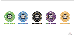
Very nice. Your first attempt may be your final product.
Since your design has a lot of white in it, the presence of a little black gives good contrast.
I'm a little puzzled by the meaning behind your text, though.
I'm a little puzzled by the meaning behind your text, though.
The black parts would be filled in with whatever the original color is
So all those black parts would be in pink on the $50. Yellow on the $25 etc etc
T.R.A.P means To Rise Above Poverty it’s just a saying I like lol
So all those black parts would be in pink on the $50. Yellow on the $25 etc etc
T.R.A.P means To Rise Above Poverty it’s just a saying I like lol
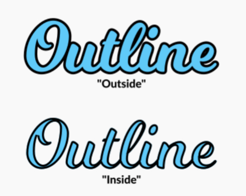
I highly recommend when doing a stroke around type like you have on your denoms, that you set the stroke to go on the outside of the type’s path, not the inside. You can see the issue mostly in your dollar sign, but would help in your numerals as well.
Many programs default to inside which can alter the look of the letterforms.
Set those to outside if you can, it will be more legible. Here’s an example:
Many programs default to inside which can alter the look of the letterforms.
Set those to outside if you can, it will be more legible. Here’s an example:
Last edited:
divinerites
Two Pair
May be dirty stack with 100 & 500. Too close ?Here’s all the other denominations
And 25/50/100 is overkill
LeLe
4 of a Kind
You don’t need $50, maybe u can drop the existing $500, covert the existing $50 to the new $500.
Also make a new white $5000 and your T25 tourney set is good to go
Also make a new white $5000 and your T25 tourney set is good to go
Yeah I’m afraid of the $100/$500 dirty stack hopefully the orange and green edge prevents that also I’ll get a sample set before full runMay be dirty stack with 100 & 500. Too close ?
And 25/50/100 is overkill
Similar threads
- Replies
- 1
- Views
- 140
- Replies
- 3
- Views
- 240

