You are using an out of date browser. It may not display this or other websites correctly.
You should upgrade or use an alternative browser.
You should upgrade or use an alternative browser.
HHR set in progress (2 Viewers)
- Thread starter AK Chip
- Start date
I love the gradient giving the background an aged/yellowed look. Are you sure you want black denominations though? I think it would look much better to keep the denominations as a different color from the rest of the text. If you don't like green, maybe red? (If red is overplayed, how about blue?)
I did love the blue on the Soapy chips.I love the gradient giving the background an aged/yellowed look. Are you sure you want black denominations though? I think it would look much better to keep the denominations as a different color from the rest of the text. If you don't like green, maybe red? (If red is overplayed, how about blue?)
extreme517
Two Pair
Those Rincon chips are killer workhorses. Such tight tolerances, beautiful texture to the inlays, and that blue is just ever so slightly different from any of the blues available the past 20+ years.
And I will gladly jump on your San Ramon set if these end up replacing that set for you.
And I will gladly jump on your San Ramon set if these end up replacing that set for you.
I purchased some older HHR chips, will have them milled and labeled by Gear.By "cream", I assume you mean the CPC standard white? I don't see a cream in their color chart, unless this is something new?
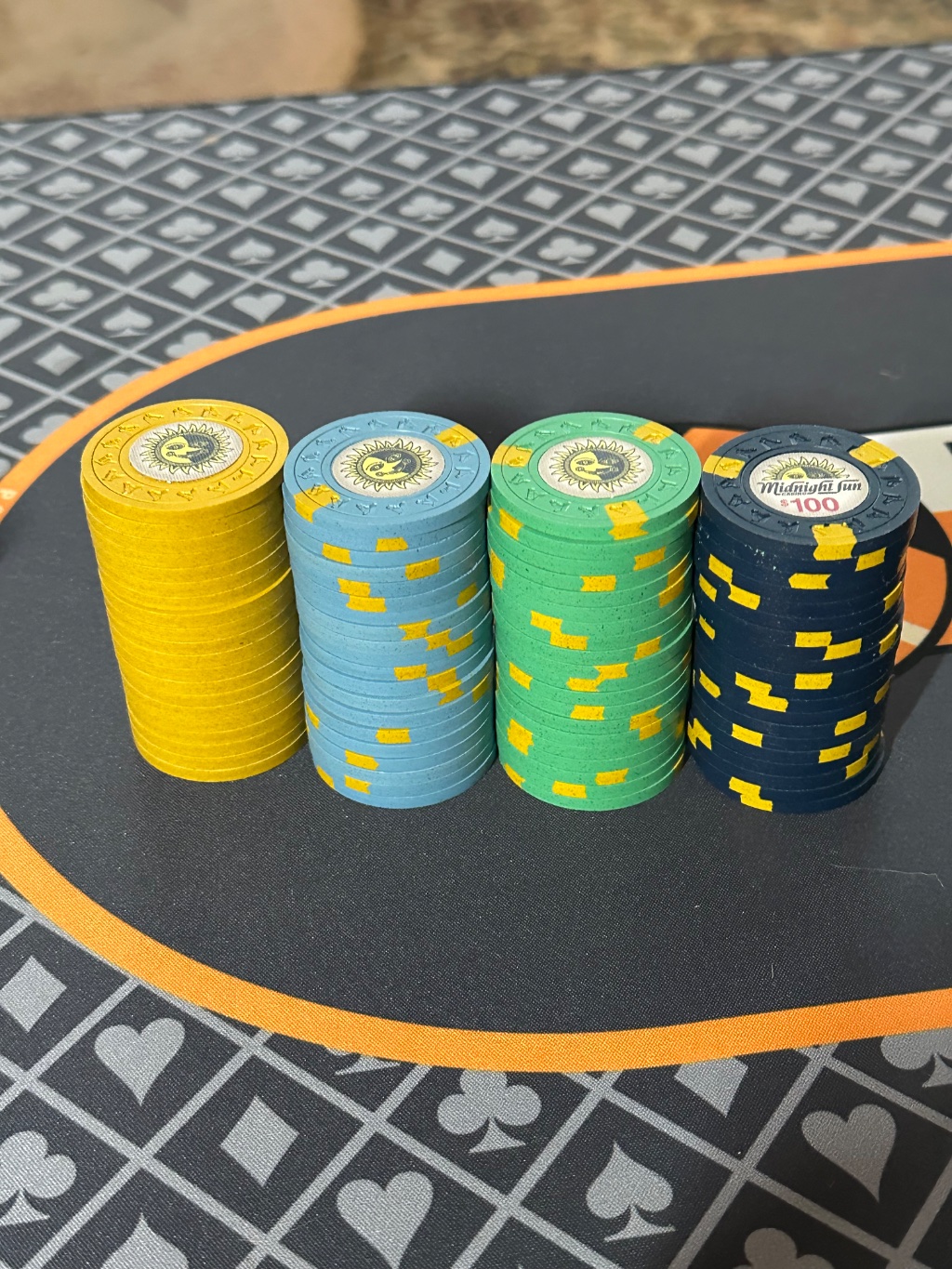
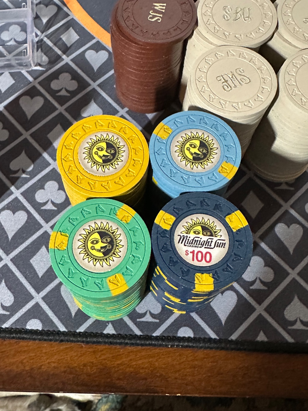
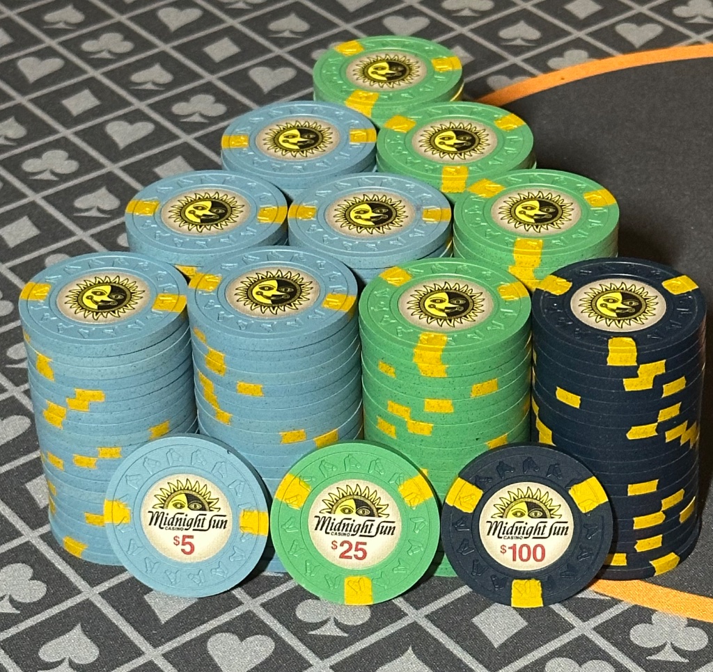
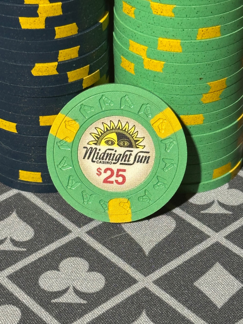
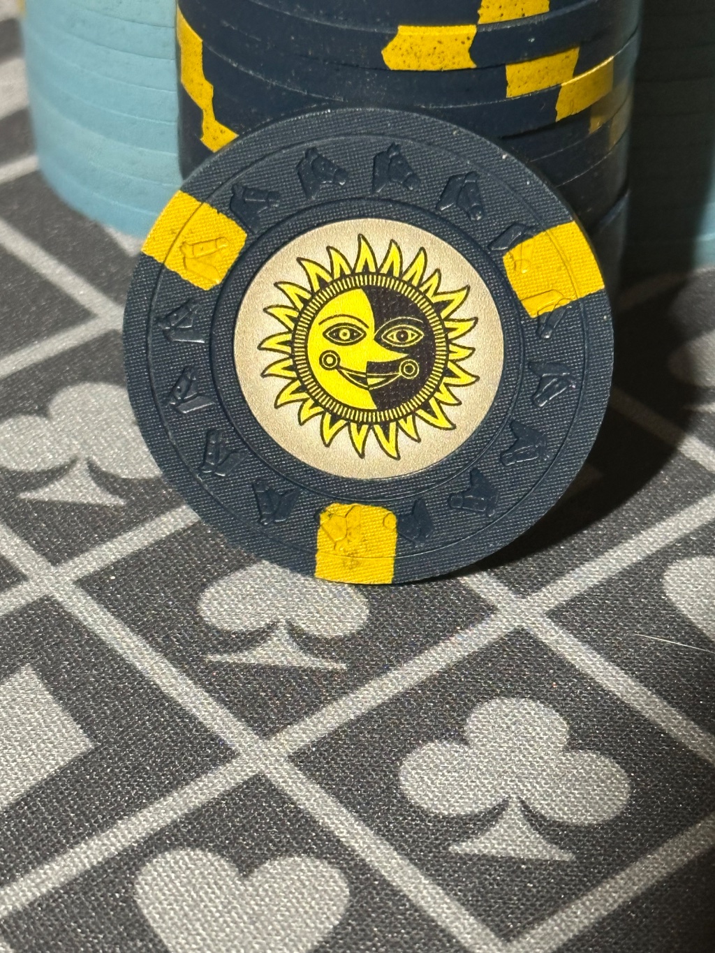
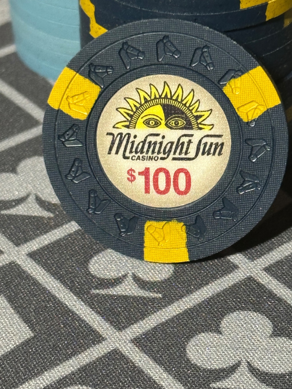
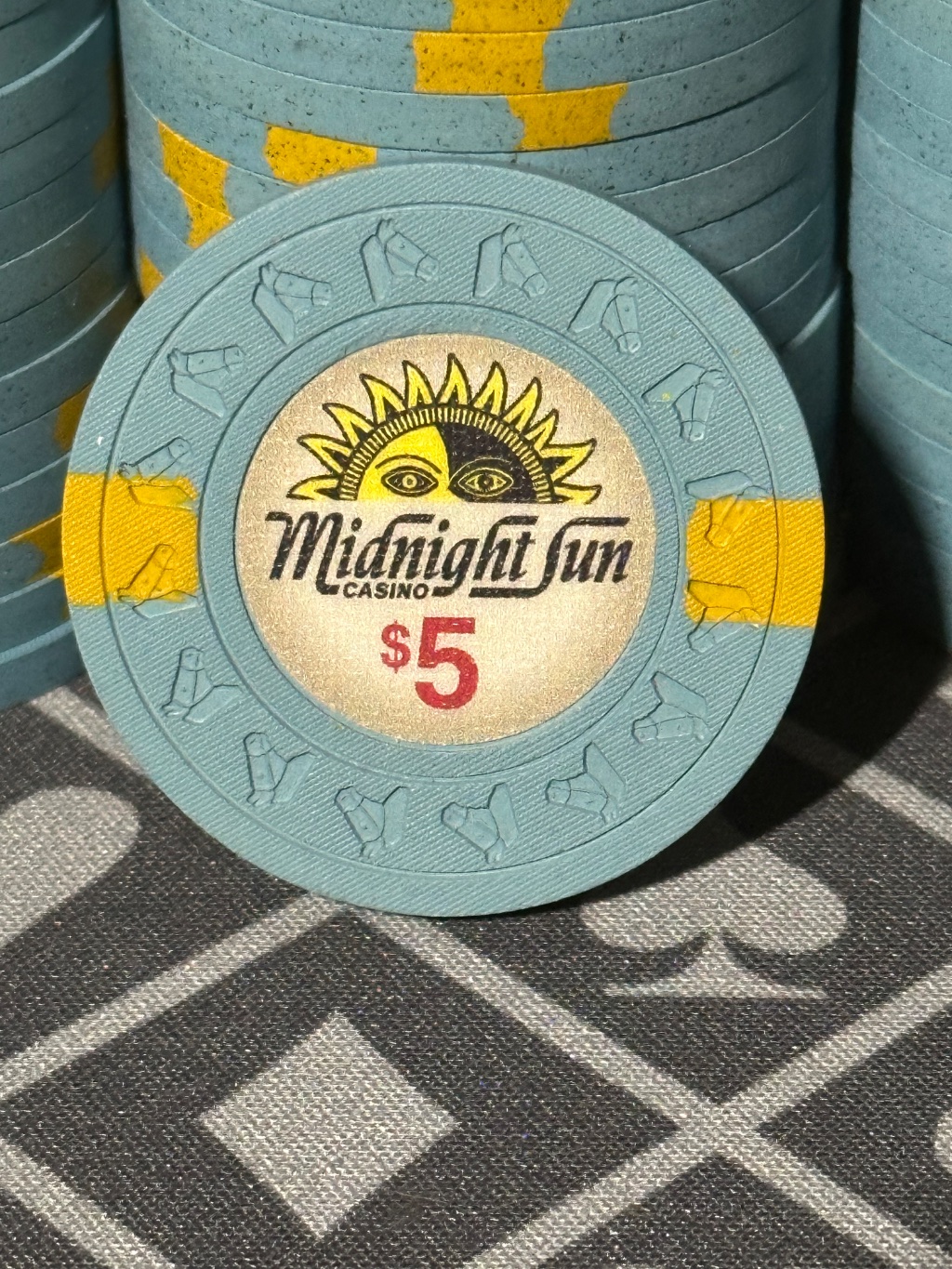
Chocolate frac, off white $1 light blue $5 green $25 dark blue $100
View attachment 1446231
Mixed .... wait... what???
Where's you get those chocolate LgKeys???
shoot me your address and I'll get you your chips. I think there are a couple barrels of each color.Mixed .... wait... what???
Where's you get those chocolate LgKeys???
Sent you a DM, I found a rack of 214 HHR's you may can use.
Oooh, in for a sample set =)
I need to find some $1's
I thought the solid yellow $1s were gonna be banger with the rest of the set, did that not work out?
Similar threads
- Replies
- 8
- Views
- 330

