High Meadow Poker Room (4 Viewers)

TheBiz1319

Waiting List
Joined
Mar 13, 2024
Messages
6
Reaction score
1
Location
Decatur Il
1743447075641.png


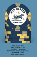
Working on my first custom set. These will be mainly used when playing the Horse Race Game. I know this will seem odd, but denoms will probably be .25, .50, $1, $2 and $5.

Would love to get some feedback and thoughts on the design so far.

High Meadow is my street name and the horse and jockey is from a painting that I had in my younger days.
 
These look good. Color matching is fine but I prefer denoms to all be the same color. In this case I think red is preferable to make the chip's value easily identifiable across the lineup. I'd also make all the denoms the larger size as seen on the navy blue chip. Good luck with your project.
 
I like the bolder type of the blue, grey, and yellow chip. I'm realizing, as I dicker around with my own insert design, that the final result will only be one inch in diameter, and bolder design elements will stand out better on a one-inch circle.

I really like the horse, jockey, and trotter rig graphic. It's classic! I think the Trotter and Jockey would pop even better if you removed the fencing, which, IMO, competes with the Trotter without adding any value to the design. Maybe also remove the bottom three thin lines under the Horse for the same reason. It would also allow room to enlarge "Poker Room" and the chip value
 

Attachments

  • Horse.png
    Horse.png
    62.7 KB · Views: 12
Last edited:
I like the bolder type of the blue, grey, and yellow chip. I'm realizing, as I dicker around with my own insert design, that the final result will only be one inch in diameter, and bolder design elements will stand out better on a one-inch circle.

I really like the horse, jockey, and trotter rig graphic. It's classic! I think the Trotter and Jockey would pop even better if you removed the fencing, which, IMO, competes with the Trotter without adding any value to the design. Maybe also remove the bottom three thin lines under the Horse for the same reason. It would also allow room to enlarge "Poker Room" and the chip value
This is some good feedback. Never thought of removing the fencing, but I think you are on to something with that. I like the cursive font better right now, but the bolder type may indeed end up being the better option. Thanks!
 

Create an account or login to comment

You must be a member in order to leave a comment

Create account

Create an account and join our community. It's easy!

Log in

Already have an account? Log in here.

Back
Top Bottom