The Tip Top Club
Drop in and stay awhile!

Background and InspirationDrop in and stay awhile!
It had been a few years since wrapping up my Story Hill set and I got the itch again to design another set. I had a couple themes I was kicking around but ultimately decided on The Tip Top Club. Disney World super fans might know the reference. This is the fictional club at the top of the Hollywood Tower Hotel (where the Tower of Terror ride is). I have fond memories from some family trips to Disney and have always loved the Golden Era of Hollywood vibe that Hollywood Studios (MGM back in the day!) had. I have always liked art deco and there are many touches of it in the buildings and signs around the park. I originally was thinking of doing a set around the Brown Derby restaurant there as it captures the vibe very well, but there are other Brown Derby type chips already in existence. I didnt want anything overtly and over the top Disney, simply a nod to the inspiration and something that captured the feel I was going for. Then I saw a poster for the Tip Top Club at the park and I loved the vibe and decided that was going to be the set.
I knew from the get go that I would be using the Large Crown mold for this set. I think the retro/old school feel to it fit perfectly with the vibe I was going for. I think its an under appreciated mold and I was very happy with the results.
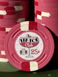
When I was designing the inlay, I knew I wanted to showcase an art deco font, capture the classiness of the fictional establishment, have a nod to the Hollywood Tower Hotel, have color matching elements, and have the same inlay on both sides of the chip. I settled on the font first (heavily inspired by the poster above). I played around with different layouts and images including dancers, an old school elevator top, art deco designs, an image of the hotel itself. Ultimately I decided to feature a coupe glass which I personally love for craft cocktails and I think is a good nod to the era. The "HTH" monogram in the lower left would reference the Hollywood Tower Hotel for those that were familiar with it. Finally I included a bold red denom for consistency through the set.
There were ample opportunities for color matching and I was worried about overdoing it, but I am really pleased with how the various elements came out. Originally I was going to have a clean white background which is my usual preference, but I decided to inject a little more art deco with a stylized pattern in the background. I found that it helped anchor the overall inlay. I played around with the opacity to try to find the right balance between making it clear/visible, but to make sure it didn't make the inlay too busy. Matching the background design to the base color of the chip helped bring some cohesion to the inlay. The color matching for the liquid in the coupe glass really helped to provide contrast for the secondary font and provide another visual element. Color matching the HTH to the spot colors maybe was a bit too much, but still pleased with how it came out overall. Big thanks to @timinater for his work on CPC color matching. This was my second time using his post and I was very happy with the result in both cases.
Spots and Color Choices
Because my Story Hill set had Las Vegas colors already, I wanted to change it up and go more with something along Cali color lines. I thought that worked well with the Golden Hollywood vibe as well. While I love some of the more vibrant colors in the CPC lineup, I wanted to see if I could have success using colors that were a bit more muted, while hopefully avoiding making the set feel muddled. I found that mixing in some pops of brighter color here and there worked to give some life to the lineup with still being cohesive with some of the more reserved color choices. The cali $5 is always a tough one with the CPC yellow lineup, but I wanted to see if I could come up with something unique. I stepped out of my comfort zone with the maroon $20, but was really happy with how it pops. Big thanks to @Irish for once again being a sounding board as I worked through the process.
Breakdown (700 chips)
*$0.25 x 200 Pink / White / Retro Red
$1 x 200 Imperial blue / Retro Blue / Light Green
$5 x 200 Canary / Yellow / Purple
$20 x 80 Maroon / Retro Lavender / Dayglo Peach
$100 x 20 Bright White / Dayglo Peacock / Red
*My game is very small potatoes and we like our fracs, so I went with two full racks of fracs
Samples?
Apologies but I did not run a sample set thread for this order. I only have a handful of extra sets. At this point, I plan on giving away one through @Tommy via a site-wide giveaway. I will likely also do one charity auction for a set as well.
Pr0n!
Now for what you all are here for - The pictures! Thanks for dropping in and staying awhile!
Attachments
Last edited:


 !
! 
