Aggie930
Sitting Out
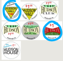
I've had an idea for a custom chip since the chip talk days, but never got around to it and I moved and didn't find a group to play with. I recently started playing again and started thinking about chips again. My last name is Hudson and wanted to play off the old Hudson Auto logos. My initial idea was using the neon sign as inspiration.

I saw the solids H molds for sale and thought I might as well get started. But I wanted to reserve my initial idea for true custom with edge spots. I found older logos that I thought would work with solids:
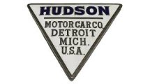
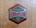
I have not decided on a name, but plan on using Hudson, but not sure if Hudson Hall, Club, House. or The Hudson. Below are some of the ideas I have come up with. Using word since I don't know graphic design software and just looking for a direction to send an artist. I also included "The Fabulous" with a nod to the Hudson Hornet.
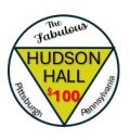
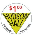


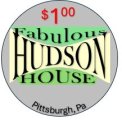
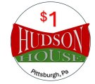
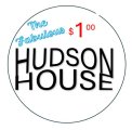
In a chip:
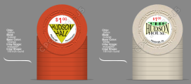
Not sure if this was too much to bite off at once, but would appreciate what the masses think would look best on a H mold solid.

I saw the solids H molds for sale and thought I might as well get started. But I wanted to reserve my initial idea for true custom with edge spots. I found older logos that I thought would work with solids:


I have not decided on a name, but plan on using Hudson, but not sure if Hudson Hall, Club, House. or The Hudson. Below are some of the ideas I have come up with. Using word since I don't know graphic design software and just looking for a direction to send an artist. I also included "The Fabulous" with a nod to the Hudson Hornet.


In a chip:

Not sure if this was too much to bite off at once, but would appreciate what the masses think would look best on a H mold solid.

