Looking for feedback - custom birthday web mold set (2 Viewers)

stubidet

Waiting List
Joined
Mar 27, 2024
Messages
9
Reaction score
7
Location
London, UK
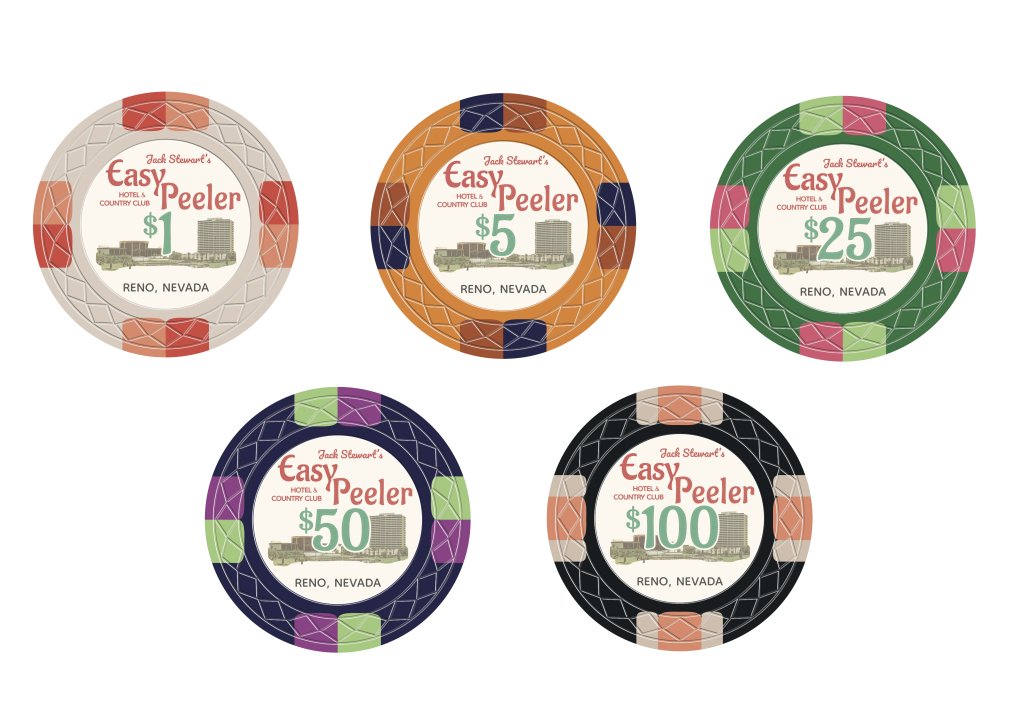
Hi All, as the title suggests I am posting for feedback on my first custom set. This set is actually a birthday present for a friend of ours who has been hosting our small stakes cash game for years and often talked about upgrading from the dice mold chips we have used since we first started playing at university. When we first decided to upgrade we had no idea how deep the rabbit hole went! After a few months of lurking on PCF, getting our hands on some web mold samples, going through a few rounds of designs (and missing all deadlines to get this present to him in time for his actual birthday!) we have finally come up with something we are quite happy with.

We took inspiration from (/copied) the classic paulson edge spot progression and borrowed the design idea from a classic dunes chip copied below. My main concern with the current design is that some of the text will be too small, but then we have also been considering the fact that you will only really ever read the inlay once or twice and when the chips are actually in play you will be paying attention mostly to the edge spots, so it might not matter if you have to squint a bit to make out the text? As a group of totally novice designers we would really appreciate critical feedback because we want these chips to be as beautiful as possible!

Thank you all in advance for taking the time to share your thoughts

Inlay Inspiration:
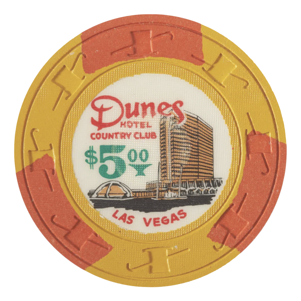
Dune5Dollar.png

Our design:
EPMockUp.jpg
 
I like the inlay design although I feel it’s too busy with all that text. I would lose either ”hotel and country club” or ”Jack Steward’s” and rework the text positions. The $1, $5 and $100 share many similar colors. Maybe not a problem dirty stack wise but I’d like more contrast.

Definitely lose the $50-chip. It’s redundant.
 
Like you said, most of the small text on there is going to be unreadable in most circumstances. If it were me, I would err towards simplifying the text to make it more readable vs trying to copy the dunes chip exactly.

I don't really like having the same edge spot color on sequential denominations, especially in the same location like how you have the light green on the $25 and $50. I would also be worried that the dark blue/ blurple $50 will look too similar to the black $100 depending on the lighting at the table, and again as sequential denoms I would want them to be more distinguishable. Though the different edge spots help, maybe consider a lighter blue? You probably could live with it but something to think about, also see my next point below.

I think having a $50 is unnecessary in this set. Denoms are just too close being 2x $25 and 1/2 $100 while the 1/5/25 are all 5x. If you want a 5th chip that fits into your set, maybe $500, a frac like 25c, or just go non-denominational for versatility. Depends on your game of course. Or just have 4 denoms: 1/5/25/100.

Also, I've heard that the inlays aren't always cut perfectly centered - see how close the D on the Dunes chip is to being off the edge of the inlay. I would try to get a little more space around the circumference of the inlay just to accommodate a slightly off-centered cut, since some of your text is really close to the edge.

Overall nice work, I think it's a great looking set but those are some of the tweaks I would consider.

P.S. - Missed opportunity to make the Peeler P look like the Dunes D
 
The edge spots are all the same from 1-50. Mix it up a little, go with the 3 wide marks, i think that looks nice, with the same color it's not as expensive... with 3 colors a little more. Experiment with different edges, make some variety. Also, make those $50's into $500's and your set becomes a little more versatile if you want to go from cash to tourney set. (I used the $1 chip because i only took the time to steal your logo once...)

1715785079870.png
 
After a long delay I am happy to be able to post an updated set. I am very grateful for all the help!

Changes in this set:
- Removed some of the smaller text to make it less busy/easier to read
- Taken on some of the advice about colour progression
- Managed to find the original Dunes font and incorporated this into the design https://fontsinuse.com/typefaces/16530/civilite-atf (I really liked GGHank's idea of making the P look like the dunes D but sadly I wasn't able to make it work)
- Got rid of the 50 and added a 500

I hope you will agree that the set is much improved! Thanks again for your suggestions. Next step for me is to order samples of this design (currently talking to Lyman on aliexpress). Will share pictures of the samples when I have them (wanted to wait and see if the blurple 100/black 500 are really too close in colour before changing this).

The next thing I have to work out now is how many chips to get in each denomination! I have loosely budgeted for 500 chips though am prepared to maybe go to 600 if necessary. The chips are for a cash game that is never more than an 8 player game and usually around 6 players. I have put together a rough guess at chip quantities based on some other threads I have read discussing similar size games below, but I am not at all sure and I would be grateful for any thoughts or feedback on this.

100 x $1
180 x $5
180 x $25
20 x $100
20 x $500


The set:
Chip Design with Web Mold.png

1$ inlay detail:
Inlay $1 detail.png
 
Have done some more reading on chip quantities - specifically in this thread - and it looks like a 600 chip set with the quantities below is probably a bit closer to what we need. As mentioned we have 6-8 players at our table, we used to play 1p/2p but now usually play 2p/5p with a max buy in of £10 (so in this set each dollar will be worth 1p). I have based these numbers off the 2/5 max buy in $1000 numbers in the other thread, I'm just not sure we really need 750 chips for our game so have cut back a bit on 5s and 25s to bring the chips down to 600. Does this seem balanced to you all?

50x $1
225x $5
200x $25
100x $100
25x $500
 
I’ll warn you, the label printer will shrink your art…they won’t print anything that close to the edge. They’ve reduced art on every set I made, even when I left generous space and asked that they not reduce the art further.
 

Create an account or login to comment

You must be a member in order to leave a comment

Create account

Create an account and join our community. It's easy!

Log in

Already have an account? Log in here.

Back
Top Bottom