MrRossKeys Web Mold Designs (1 Viewer)

MrRossKeys

3 of a Kind
Supporter
Joined
Feb 14, 2018
Messages
624
Reaction score
1,313
Location
Charlotte, NC
This thread will serve 2 purposes: an announcement of sorts, and a place to keep track of some of my chip designs.

Announcement
In the last few months I've created and produced a few Tina ceramics that have been well-received by the PCF population. I've been asked numerous times if these design would be available for public production, and I am happy to say that these designs will be available through @justincarothers Broken Arrow group buys starting in August.

This means that anyone who hasn't received samples from my original run should be able to order them through Justin. Also, the designs should be available on any of the molds Justin offers (correct me if I'm wrong Justin).

Designs
I am a hobbyist and by no means a "real" graphic designer, but I've come to learn enough to be able to create custom chips that (I personally) think are pretty awesome. I find designing a great creative outlet for me, and I find inspiration in both real life situations and imaginary spaces. I thought I'd be done designing after my Lunar Landing set, but since then I've started at least 6 new project ideas... they seem to be dropped into my brain mostly formed and ready for me to put them down on paper.

This thread will be the place that I share these designs. Anything I post here will be available for others to order through Justin. If you like and want to use a design feel free, just send me a note or a shoutout (which encourages me a lot)!
 
LUNAR LANDING CUSTOM CHIPS

In September of 2023 I welcomed my 3rd child into the world... a daughter. She was and is an answered prayer that my wife and I prayed for over a year of trying to conceive with no success. Just as we started to look into more invasive options, she was conceived! A week after she was born I came down with a rare severe form of pneumonia which manifested as a 6cm ball of infection in my lung. Coughing blood, couldn't breathe. Doctors were concerned and confused as to how it got there, but thankfully treatment over the course of 3-4 months reduced the infection to trace amounts!

I began working on the idea for this chip set before my daughters birth, but that process was accelerated once I got home from the hospital. All that time reflecting on life and wondering if I had reached the end of it gave me a lot of inspiration and drive.

Lunar Landing is a space themed set that explores the journey of our daughter's arrival on earth to her eventual "launch into space (society)" to navigate worlds on her own. The set uses one inlay throughout as the theme, but there are also alternate inlays in the cash set that depict our journey into pregnancy (launch .25¢), a barren land ($1), our daughter's arrival ($5), her growth into her own person ($5), and her eventual launch ($100).

Lunar Landing Display.png
Lunar Landing Chips-8.jpg
 
NEON NIGHTS CUSTOM CHIPS

The genesis of these chips start at the beginning of my life, or somewhere after I was born... As a child I knew I was different than most other humans, but over the course of my teenage years it started to become more and more apparent where those differences were tangible. Every time I hear a sound, I see a color. For those of you who are familiar with this phenomenon, you know this is a form of synesthesia. There are 6 studied variations of synesthesia, and I am (lucky/unlucky?) enough to have 4 of them.

The short definition is that humans with synesthesia involuntarily experience one sense through another sense.... aka every time I hear a sound I see colors. It also manifests in letters and numbers involuntarily evoking colors. The craziest one (for me) is the spatial awareness aspect: at any given point and time, I am very specifically aware of where I am in the subconscious world based on the time of day, day of the week, day of the month, and year. There is a physical vertical and horizontal plane that exists in my brain that plots my exact placement along the track of possible points... and if you were to prove to me otherwise I would probably combust into a pile of dust and cease to exist (it's that real to my brain).

What does all of this have to do with poker chips?? LOL

Neon Nights was/is my attempt to create a visual representation of what those colors look like in my brain when I hear sounds. Most sounds are more dull colors (wind = gray, footsteps = dark gray with some white overtones), but single melodic sounds and many voices actually produce beautiful monochromatic colors. Chord progressions produce fantastic visual scapes, but individual sounds produce more solid colors (almost like poker chip solids).

I have perfect pitch musically, so the general rule is that a note (like middle C for example) is more saturated the lower in octave it is. The higher the note, the more washed out and "white" it is. Therefore, middle C is more saturated than a C note 2 octaves above it. The tri-pies gave me the opportunity to do something unique on a poker chip (never seen anyone do tri-pies before) while also using it as a visualization of each note spanning over 6 octaves (saturated to desaturated).

Neon Nights represents the following colors and notes for me (Note: all people with perfect pitch or synesthesia will map the notes they hear to different colors. That is why if you ask 2 different people to give you a color for a note, 9/10 those colors will map differently):

Green 25¢: G
Yellow $1: Bb (though for me Bb is more bronze than yellow, but would have clashed color-wise with orange)
Maroon $5: F# (once again, stretched the color into red, where it has more black+red tones)
Blue $10: C
Purple $20: B and also shades of E
Orange $100: Eb

NN idea 2-02.png
_A7R5068 copy.JPG
 
MINT MUSEUM CUSTOM CHIPS

I recently moved to Charlotte, NC, and it's been a constant state of work, unpack, build furniture, repeat... This past week my (grown) children were in town, and we decided to go downtown and visit the Mint Museum. I've been to many museums in my lifetime, but somehow this museum started giving me all the vibes and feels. Later that night I began tinkering with a design, and 2 hours later I had 90% of the design finished.

The visuals for this design take a lot of the colors I liked from what I saw and apply a lot of white space around them. You guys can probably tell I'm a big fan of black inlays (and gradient inlays that color match the chip base color), but this set is one of the first that doesn't use the majority of the inlay purposely to give the rest of the content room to breathe.

Practically, I've been wanting a set that doesn't take itself too seriously, so the font choices for this set give both straight edge vibes + fun/whimsical vibes. It's the play between the very straight lined geometry in the logo + the Mint and Dollar text that allow the denomination and Museum text to feel fun.

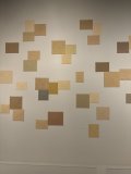
The colors for the chips and edge spots are my take on the art pieces that spoke to me when I walked through the museum. One abstract piece especially got me thinking about an entire set that spanned the colors used:
IMG_1971.jpeg

My thought while looking at this: "can I create a set that includes these colors collectively while keeping the spirit of the relationship between the colors?" I think the short answer is "no" lol, but I definitely tried, and then I made adjustments to avoid a dirty stack situation.

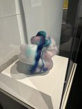
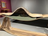
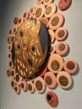
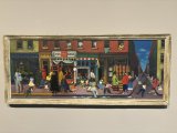
Here are some other pieces that inspired this set:
IMG_1962.jpegIMG_1964.jpegIMG_1965.jpegIMG_1966.jpegIMG_1969.jpegIMG_1970.jpeg

Mint Museum3.png
 

Create an account or login to comment

You must be a member in order to leave a comment

Create account

Create an account and join our community. It's easy!

Log in

Already have an account? Log in here.

Back
Top Bottom