bluffnbandit
Sitting Out
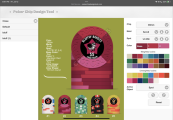
I don’t really have much experience with designing these so I was hoping I could get some feedback as well as any tips on how to convert these images into AI files for a Tina order. Additionally if anyone has some suggestions to make the design pop a little more I’m all ears!
Attachments
-
 IMG_0676.png283.7 KB · Views: 111
 -
 22BA6C6E-9D37-4057-BA36-727756CA7038.jpeg105.6 KB · Views: 110
 -
 767E59EE-4756-4948-9D5F-0B07478DBECC.jpeg104.8 KB · Views: 104
 -
 840055DB-A67A-45C2-A3FE-AD5211D5133D.jpeg103.9 KB · Views: 83
 -
 994EB59E-4EDE-40A0-9C81-AA9860E8C227.jpeg103 KB · Views: 76
 -
 4AA098D8-C6F7-49DD-A944-10BBD842BFE4.jpeg100.6 KB · Views: 73
 -
 6E765CEA-0E4A-47D0-A792-6645E479201B.jpeg102.3 KB · Views: 105