New movie inspired set... (1 Viewer)

phcjpp

Two Pair
Joined
Oct 22, 2017
Messages
404
Reaction score
1,097
Location
(London) + Shipping to Portland, Oregon, USA
Evening all,

I have the very beginnings of a movie inspired set that I have been working on today in Adobe Illustrator (never used before today but was fairly easy to get going in the end - the pathfinder tool is amazing for chips!).

Once I have a decent idea I will hand everything over to one of the resident design experts. At the moment I am thinking 43mm Sun Fly polyinno HB005 (Chip Diameter: 43mm, Sticker Diameter: 25.4mm Thickness: 3.3mm) although could be convinced otherwise.

The base colours of the chips need to be black , white (or grey), red, green, blue, pink, any colour, any colour. Shades of colour and the colour of the last 2 chips is completely flexibly as are the edge spot designs.

I have picked a few of my favourite movies but if you have better ideas please do shout - the movie needs to be related to the colour somehow! Finding a green movie was a shocker. I would have loved to do Ferris' day off for the red one but couldn't find a vector of the Ferrari!

Very best
Chris
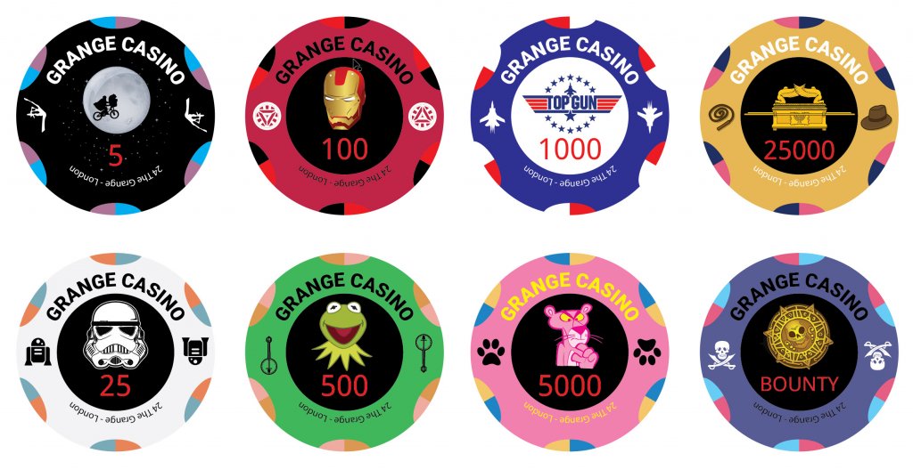
PokerChips.jpg
 
Art-wise, something like this can be tough to put together, because there are few (or no) elements that help tie everything together.

Might I suggest considering using different art on the two sides of the chip? One side could be (mostly) consistent among all chips. The other side could have the movie-specific graphic.
 
You may also experience push-back on using copyrighted images without permission.
 
Great idea, and what you have looks really good. The only thing that sticks out to me is that the Top Gun chip is the only one that says in text what the movie is. It doesn't fit with the others that way. Love that chip otherwise! Good luck with it.
 
You may also experience push-back on using copyrighted images without permission.
I paid for the graphics from shutterstock so I should be OK I think - they come with a license to use them.

Art-wise, something like this can be tough to put together, because there are few (or no) elements that help tie everything together.

Might I suggest considering using different art on the two sides of the chip? One side could be (mostly) consistent among all chips. The other side could have the movie-specific graphic.
That’s a great idea - I will have a think on that!

Chris

Great idea, and what you have looks really good. The only thing that sticks out to me is that the Top Gun chip is the only one that says in text what the movie is. It doesn't fit with the others that way. Love that chip otherwise! Good luck with it.
Good spot - I will see what I can dig up as an alternative!
 
Like the idea behind this, some good artwork ideas already here too.
You mention struggling for Green Movies - how about The Hulk? I know you already have Ironman so that kind of covers Marvel, but thought I'd throw it out there.

Will these be printed chips, or labels? I only ask as you have text and icons on the outer edge of the faces (banjo's, planes etc), these would be outside of the sticker inlay? Or I could have missed that part.

Good work though.
 
Nice idea ... i am very into movies myself, but as @allforcharity already noticed, it might be hard to make this set work as the single chips are to different.

But I will definitely follow this thread and am curious how the set will turn out!
 
Okay, I give up. What are the movies for the 25K and bounty chips?
 
I’ve been in the art field for many years and used stock photos many times. I was intrigued when you mentioned you got the logos on shutterstock. I see that people aren’t selling the logos, but PHOTOS of the logos. Now while this might be a workaround for that photographer, I can’t imagine useage of the photographed logo absolves you from a violation of copyright from the movie company. Just be warned, you might face issues getting a chip maker to produce these.
But I hope you get them made, they look great!

Fair point - I guess I will have to see! Can you name the films? (Not overly happy about the colours on these yet).

Chips 19.jpg
 
Love the gremlin green chip. I was going to suggest Pineapple Express or Dazed and Confused for the green chip but that one works muuuch better.
 
25k- Raiders Of The Lost Ark?

Bounty-Goonies or is it Pirates Of The Caribbean? Looks familiar
Yeah I figured Indiana Jones for 25k afterward (didn't notice hat and whip). Still no idea on bounty.
 
The latest. Someone who knows suggested I stop trying to merge movies and James Bond. I have also gone with a fan art style to limit the copyright issues (these will never be sold so will help there from what I am reading).

Let me know what you think.


Chris
One of the spots (orange?) on the red 100 chip lacks sufficient contrast and looks odd.

Some design tips:

Although each chip face may look great on it's own merits, this does not always equate to a good look overall as a set. This is particularly true with three-color spots that take up a large amount of space on the rolling edge such a your design.

With that much alternative color on each chip, what often happens is that it becomes difficult to discern the base color when viewing the rolling edge in stacks. For example, instead of seeing a green chip, all the brain registers is a rainbow of green-red-white-yellow color with no clear identity.

And when ALL of the different chips are designed in a similar fashion, then stacks of chips and splashed pots become seas of Skittles, where it is difficult or impossible to accurately determine the color -- or value -- of anything, making play difficult and cumbersome.

Sometimes less is more. Build some side view of chips in stacks, and your best design direction will become more apparent.
 
I prefer the old design with the writing, but I get the idea of wanting it more simple.

Also, I strongly agree with BGinGA, don't let the edge spots take over the chip. Each chip should be easily identified from the edge by one color.
 
I prefer the old design with the writing, but I get the idea of wanting it more simple.

Also, I strongly agree with BGinGA, don't let the edge spots take over the chip. Each chip should be easily identified from the edge by one color.
Which design - there have been so many - do you mean the one with 'The Grange Club' on it?

Ta
Chris
 
Simpler edge spots and a slightly larger sticker?

View attachment 466736
I think that spot design will translate to a much nicer looking and more playable set. Are these to be printed ceramics?

edit: Nevermind, I see you're considering hybrids. Get samples -- I'm a big fan of the 43mm Small recess HB005 blank, but don't care for how the large-recess version looks, feels, or sounds. Ymmv.
 

Create an account or login to comment

You must be a member in order to leave a comment

Create account

Create an account and join our community. It's easy!

Log in

Already have an account? Log in here.

Back
Top Bottom