Ollin Casino & Resort: Unveiling My Custom Aztec Themed Poker Chip Set (4 Viewers)

Lopii9

Sitting Out
Joined
Aug 22, 2024
Messages
26
Reaction score
63
Location
Belgium
Hey everyone, happy to share the project I've been working on the last couple of months.

My dream has always been to have my own custom designed poker chip set.

I have been inspired by a lot of people here on the forum, but most in particular @Cratty & @MrRossKeys' colorful designs helped guide this project in the direction I wanted.

My custom poker chip set draws inspiration from the fascinating and intricate Aztec culture. The rich symbolism and vibrant colors of the Aztec civilization have always intrigued me, and I wanted to incorporate those elements into my design. I have been using this gold coin featuring the iconic Aztec calendar as a card protector for quite some time now.

0. CardProtectorGoldCoinAztec.jpg


I created this set to be able to host cash games in the near future. We usually play micro stakes 0.05/0.10 - 0.10/0.10 & 0.25/0.25 from time to time, but I wanted a set that could potentially grow and accommodate higher stakes too.

You'll see below how I came up with the name Ollin and the mockups of the chips.
I'll be certainly ordering my first sample set soon from Tina. Hope I'll find some help from EU people who've also ordered directly from them.
I think the Hybrid Greek Mold would fit the theme perfectly, but i'm not sure what size to go.

1. Front page.png
2. Intro.png
3. Moodboard.png
4. Chips.png
5. Ollin 5 cent.png
6. Ollin 25 cent.png
7. Ollin 1 dollar.png
8. Ollin 5 dollar.png
9. Ollin 20 dollar.png
10. Ollin 100 dollar.png
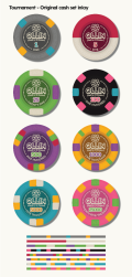
11. Tourney OG inlay.png


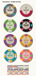
12. Tourney Alt inlay.png
13. Dealer, Bounty & Ollin Button.png
14. Table topper.png


Sorry for the long post!

I'm really looking forward to hearing your thoughts and feedback on this project!
 

Attachments

  • 12. Tourney Alt inlay.png
    12. Tourney Alt inlay.png
    300.8 KB · Views: 12
  • 11. Tourney OG inlay.png
    11. Tourney OG inlay.png
    299 KB · Views: 11
I am a huge fan of your cash set. Especially the black $1 and blue $100... but all of them are fantastic! Great job!
 
Very nice design! I could see some dirty stack issues with those 5$ and 20$ chips, though.
Thank for the input! I had the feeling the base color of the 20$ was prominent enough (yellow/gold) to not have a dirty stack issue with the 5$ purple.
If my memory doesn't fail me, I think @Cratty had similar neighbouring denom colors in his TMPT set ( 5c & 25c). Did you have any issues with those 2 by any chance?

Fucking amazing design!
Congrats!
Thanks man, appreciate it!
 
Thank for the input! I had the feeling the base color of the 20$ was prominent enough (yellow/gold) to not have a dirty stack issue with the 5$ purple.
If my memory doesn't fail me, I think @Cratty had similar neighbouring denom colors in his TMPT set ( 5c & 25c). Did you have any issues with those 2 by any chance?


Thanks man, appreciate it!
The chips could be fine! They'll look a bit different from the mock-up in real life. This was just my first impression from the picture, since they share 3 colors. (orange, green, purple). You'd have to see them in a stack to know for sure, my personal experience tells me, to not risk it though and try to avoid too similar colors for neighboring denoms. :)
 
The chips could be fine! They'll look a bit different from the mock-up in real life. This was just my first impression from the picture, since they share 3 colors. (orange, green, purple). You'd have to see them in a stack to know for sure, my personal experience tells me, to not risk it though and try to avoid too similar colors for neighboring denoms. :)
Yeah I see it now that they do share 3 colors. Will have to look at this once I finally put in a sample order! Danke schön :D
 
Just adding... my experience with Tina's colors would make me adjust your input colors to the following (did my best to match/forecast) if you want to actually get close to some of your render colors - knowing print comes out different than provided (especially w/ purples, some blues):

Note, just the main chip colors - did not do your alt/tourney.

1730734485342.png
 
Just adding... my experience with Tina's colors would make me adjust your input colors to the following (did my best to match/forecast) if you want to actually get close to some of your render colors - knowing print comes out different than provided (especially w/ purples, some blues):

Note, just the main chip colors - did not do your alt/tourney.

View attachment 1414912
Wow Cratty :love: You didn’t have to do that! Thank you so much. I’ve been following your threads on the colormatching and it was definitely something I wanted to implement on my set to get as close to the colors on my screen. Again, thank you! :tup: I love this community.

Thank you!
Tina and PCF members changed the game. Good work everyone keep it up! @TheJestyr
Thank you so much. This project builds on the great work of other PCFers before me. Let's keep pushing forward together!
 

Create an account or login to comment

You must be a member in order to leave a comment

Create account

Create an account and join our community. It's easy!

Log in

Already have an account? Log in here.

Back
Top Bottom