-
This site contains affiliate links. If you choose to make a purchase after clicking a link, Poker Chip Forum may receive a commission at no additional cost to you. Thank you for your support!
You are using an out of date browser. It may not display this or other websites correctly.
You should upgrade or use an alternative browser.
You should upgrade or use an alternative browser.
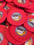
San Fernando’s MISSION BELLE (Custom CPC) pron. (19 Viewers)
- Thread starter Johnblue
- Start date
Johnblue
Flush
Chief objectives:
The main thing i wanted to achieve with this set was affordability. Don't get me wrong, this set was expensive for me. I had a budget, i always have been a nit in terms of chipping. The only way i could justify spending this much in one lump sum was if it was a "deal" compared to boats and Tigers. knowing that I can have this custom set at 1/3 the cost of something in that range was the trick I played on myself to go ahead with the purchase.
San Fernando and the Mission is in Cali, so i had to tip the hat and do cali colors. (best i could)
Had to be vintage inspired.
History and key elements:
The San Fernando Valley and the City of San Fernando are a a part of Los Angeles. Mission Hills is where i'm from and i grew up near the mission and the connected cemetary. Bob Hope is buried here along with alot of my family. This "mission" is one of the oldest standing buildings and if you don’tknow about Californias missions its cool history. Most of Californias major cities (the ones that start with San) were built around these missions.
I drempt up a fantasy old timey western casino that might have sprung up later...
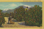
The next major element were the orange groves, The valley was mostly orange groves up until the 40s, Theres still orange trees everywhere, but it’s pure Los Angeles sprawl now.


Color and progression:
I had to be realistic, I wanted some "flash" but there was no way I could afford the workhorse chips to be the high end of CPCs spot options, so I went with this classic progression, once I honed in on that it really narrowed down all the choices.
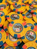
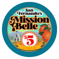
Arc Yellow is my favorite color in both paulson and CPC, the entire set started with that $5 design, I worked around that... something about orange and blue. high contrast this chip was a no brainer as my workhorse...It was the mainstay every mock up i did.
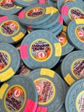
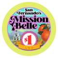
That 2a12 $1 chip helped the budget, tons of DG color, In my opinion its the sleeper in the CPC spot lineup and I don't see too many people utilizing it as a lower cost option to get flashy. this chip was second to secure its position.
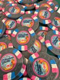
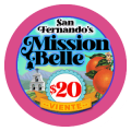
The $20 chip i knew had to be 3ta316 because in my opinion its the classic baller spot choice if i didn't have 3ta316 in this set i fail. @David Spragg helped me out with advice... I asked him if i should use black, or charcoal, and he responded with a very thoughtful response, he said "the rest of the chips are softer colors, charcoal for sure, black would stand out too much" and he nailed it, I hadn't even realized that overall, it was a pretty lightly colored set. Thanks again @David Spragg I couldnt be happier, With the chips or the customer service from CPC.
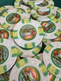
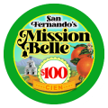
The $100 4ta181418 was me having fun. i didn't have any green in the set, so this was a good time to do it. I don’t need a ton of 100s for my games, so i got to splurge. This spot design was a great progression for what i had going. i had to stay cali white... and it was a gamble to put yellow in the center, i wasnt quite sure wou would be able to even see it... it reminds me of money... great for the biggest chip.
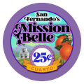
The frac was the hardest, the budget was the main factor here... if i could change anything, i would have made a spotted blank and had it hotstamped... i still might do it later... thats what kept me from posting these for so long... i still might, but doesnt have to be anytime soon. Red Cali solid, send it.
Label design:
In spent the most time and effort designing the labels. In doing so I strayed from 3 chip label design "norms".
1. “Don't match the label colors to the spot colors”
I double did it, the label "rings" are one spot color while the title glow and denom ribbon outline are the secondary spot color.
2. “Picturesque backgrounds are too busy”
I usually agree with this. and the “clean” designs we see here on PCF regularly … they always work… but i had no "main logo" The best i could come up with was the actual bell, and it made it into to the title design. but if that's all i had it looked exactly like taco bell or mission salsa's designs and there was no getting away from that, so picturesque it was.
3 “Tiny fonts, and overall small print elements don’t work”
I am actually extremely impressed with the print quality of the labels, when i was squeezing all this stuff in, i went back and forth with David a few times, which left me doing my final design layout down to the pixel, if you notice the "inner ring" beneath the actual ring, its the contrasting color and it was exactly 1 pixel i was working with. the edges of the "ribbon" and the "title" actually extend onto the ring and it gives it a floating appearance... that's how deep i was into this label design.. shaving pixels.
The Spanish translated denoms were a tip of the hat to the Latino culture of the area, as well as a test in the printing and color limits, I wasn’t expecting to be able to even see the words when printed, but I can.
——————
The only direction i had was vintage orange crate labels, there were actually a couple cool ones that were from the area, but nothing i could steal much from, the oranges on the labels were borrowed from an actual orange crate label, and so was the mountain backrounds.
All in All, I am very happy with these chips, I had great fun designing them and they are keepers for life.


The main thing i wanted to achieve with this set was affordability. Don't get me wrong, this set was expensive for me. I had a budget, i always have been a nit in terms of chipping. The only way i could justify spending this much in one lump sum was if it was a "deal" compared to boats and Tigers. knowing that I can have this custom set at 1/3 the cost of something in that range was the trick I played on myself to go ahead with the purchase.
San Fernando and the Mission is in Cali, so i had to tip the hat and do cali colors. (best i could)
Had to be vintage inspired.
History and key elements:
The San Fernando Valley and the City of San Fernando are a a part of Los Angeles. Mission Hills is where i'm from and i grew up near the mission and the connected cemetary. Bob Hope is buried here along with alot of my family. This "mission" is one of the oldest standing buildings and if you don’tknow about Californias missions its cool history. Most of Californias major cities (the ones that start with San) were built around these missions.
I drempt up a fantasy old timey western casino that might have sprung up later...
The next major element were the orange groves, The valley was mostly orange groves up until the 40s, Theres still orange trees everywhere, but it’s pure Los Angeles sprawl now.

Color and progression:
I had to be realistic, I wanted some "flash" but there was no way I could afford the workhorse chips to be the high end of CPCs spot options, so I went with this classic progression, once I honed in on that it really narrowed down all the choices.
Arc Yellow is my favorite color in both paulson and CPC, the entire set started with that $5 design, I worked around that... something about orange and blue. high contrast this chip was a no brainer as my workhorse...It was the mainstay every mock up i did.
That 2a12 $1 chip helped the budget, tons of DG color, In my opinion its the sleeper in the CPC spot lineup and I don't see too many people utilizing it as a lower cost option to get flashy. this chip was second to secure its position.
The $20 chip i knew had to be 3ta316 because in my opinion its the classic baller spot choice if i didn't have 3ta316 in this set i fail. @David Spragg helped me out with advice... I asked him if i should use black, or charcoal, and he responded with a very thoughtful response, he said "the rest of the chips are softer colors, charcoal for sure, black would stand out too much" and he nailed it, I hadn't even realized that overall, it was a pretty lightly colored set. Thanks again @David Spragg I couldnt be happier, With the chips or the customer service from CPC.
The $100 4ta181418 was me having fun. i didn't have any green in the set, so this was a good time to do it. I don’t need a ton of 100s for my games, so i got to splurge. This spot design was a great progression for what i had going. i had to stay cali white... and it was a gamble to put yellow in the center, i wasnt quite sure wou would be able to even see it... it reminds me of money... great for the biggest chip.
The frac was the hardest, the budget was the main factor here... if i could change anything, i would have made a spotted blank and had it hotstamped... i still might do it later... thats what kept me from posting these for so long... i still might, but doesnt have to be anytime soon. Red Cali solid, send it.
Label design:
In spent the most time and effort designing the labels. In doing so I strayed from 3 chip label design "norms".
1. “Don't match the label colors to the spot colors”
I double did it, the label "rings" are one spot color while the title glow and denom ribbon outline are the secondary spot color.
2. “Picturesque backgrounds are too busy”
I usually agree with this. and the “clean” designs we see here on PCF regularly … they always work… but i had no "main logo" The best i could come up with was the actual bell, and it made it into to the title design. but if that's all i had it looked exactly like taco bell or mission salsa's designs and there was no getting away from that, so picturesque it was.


3 “Tiny fonts, and overall small print elements don’t work”
I am actually extremely impressed with the print quality of the labels, when i was squeezing all this stuff in, i went back and forth with David a few times, which left me doing my final design layout down to the pixel, if you notice the "inner ring" beneath the actual ring, its the contrasting color and it was exactly 1 pixel i was working with. the edges of the "ribbon" and the "title" actually extend onto the ring and it gives it a floating appearance... that's how deep i was into this label design.. shaving pixels.
The Spanish translated denoms were a tip of the hat to the Latino culture of the area, as well as a test in the printing and color limits, I wasn’t expecting to be able to even see the words when printed, but I can.
——————
The only direction i had was vintage orange crate labels, there were actually a couple cool ones that were from the area, but nothing i could steal much from, the oranges on the labels were borrowed from an actual orange crate label, and so was the mountain backrounds.
All in All, I am very happy with these chips, I had great fun designing them and they are keepers for life.
Last edited:
Johnblue
Flush
Pron
Last edited:
Very nice!
Grimace
Full House
Very nice. Well done. Love the $20 and on my favourite mold.
- Joined
- Nov 22, 2018
- Messages
- 13,841
- Reaction score
- 29,804
- Location
- 129 West 81st Street, Apartment 5B
Heck yeah! Love seeing more and more so cal customs come out. A rare custom with denoms in Spanish, leggo!

CarlosStorm
Straight
Nice set, congrats
Johnblue
Flush
Born x RaisedHeck yeah! Love seeing more and more so cal customs come out. A rare custom with denoms in Spanish, leggo!
View attachment 1465064
MichaelBubly
Flush
Those $1s are hawwwtt! Great work on the inlays as well! The outer ring looks great!
MeridianFC
Flush
That set is 100% guaranteed by the FDIC and with full scientific peer reviewed proof Baller
Johnblue
Flush
haha  thank you!
Similar threads
- Replies
- 20
- Views
- 1K
- Replies
- 20
- Views
- 1K
- Replies
- 5
- Views
- 422
- Replies
- 16
- Views
- 523

