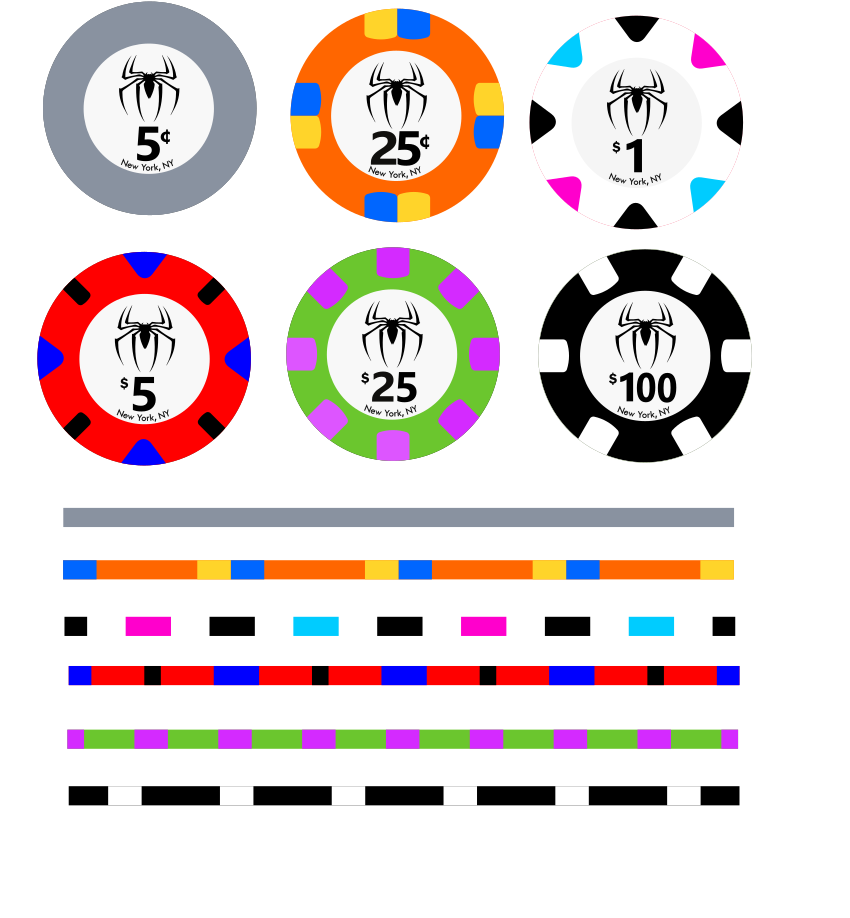
The new web mold made me think of Spider Man, so I did a little designing. It's still pretty rough, though. One of the big issues is that there just isn't a lot of color variation in the Spider-verse. Lots of green and purple. I'm also considering doing a tournament set. Any one that is more skilled than I, that wants to take this over let me know. My plan was to make the design open to anyone that wants it, or even one of the "stock" designs. Here is what I have so far, 5c - Rhino, 25c - Hobgoblin, $1 - Spider Gwen, $5 Spider Man, $25 - Green Goblin, and $100 - Venom. I don't have everything planned out for the tournament set, but my idea was T25 - Mysterio, T100 Miles Morales. Not sure on the others, maybe get MJ in there somewhere. Also, i don't have the web mold overlay, so they look pretty basic.
You are using an out of date browser. It may not display this or other websites correctly.
You should upgrade or use an alternative browser.
You should upgrade or use an alternative browser.
The Amazing Poker Man?? (1 Viewer)
- Thread starter RedDirtBo
- Start date
Nice similar idea for the web mold lol
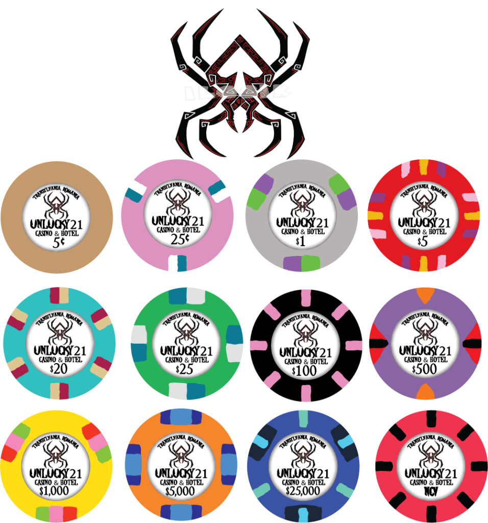
Don’t mind the colors those were just examples before actually choosing a design lol. It’s still a draft
joeyshin
Straight Flush
Lots of dirty stacks
I said don’t mind the colors I just grabbed 10 random ones to put the inlay and see how I felt about the label itself first.Lots of dirty stacks
Oh and any recommendations on the label are welcomed!
MrRossKeys
3 of a Kind
OMG, please don't change the $1, $5, or $100.. LOVE those chips. The $1 is super baller
Thanks! I think the $1 is my favorite.OMG, please don't change the $1, $5, or $100.. LOVE those chips. The $1 is super baller
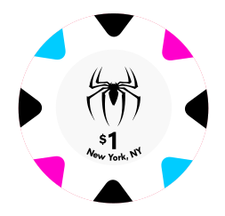
I made the denominations smaller, and "bolded" the New York, NY. I feel like the inlay is still too plain though. It needs something else. You can do so much more with the hybrid inlays than you can with regular ceramics.
Love Spider-Man, hate the small webs, would shrink the big webs. Needs a black Venom and a Green/purple. Love the theme, well done, keep workshopping. I'd replace hobgoblin with some type of yellow or tan for Sandman/Electro but to each their own.
Webhead Cardroom
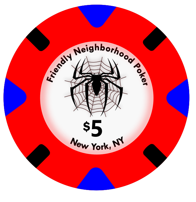
Friendly Neighborhood Poker
Great Power Poker
Kingpin's Game
Webhead Cardroom
Friendly Neighborhood Poker
Great Power Poker
Kingpin's Game
How about a shading that matches the color of the chip similar to the ESST set?
Sure; personally, if I'm making a cash set that includes nickels I'm not throwing Venom all the way at $100, his colors are fantastically simple at just black and white and I would prefer to see more of them on the table as half-pies or whatever. Casino colors don't matter at my place, made the workhorses the prettier colors lol.I like your name suggestions. The 1st $100 is supposed to be for Venom. I hadn't thought about a yellow or tan for sandman, since he's kind of another mainly green and purple villain.
Yeah, I think I my original idea was a quarter for Venom. I might go back to that, make Hobgoblin the nickel, or work on something for a Sandman nickel. The plain gray for Rhino is kinda bland. Here's the latest on the inlay. Is that what you meant by shrinking the big web?Sure; personally, if I'm making a cash set that includes nickels I'm not throwing Venom all the way at $100, his colors are fantastically simple at just black and white and I would prefer to see more of them on the table as half-pies or whatever. Casino colors don't matter at my place, made the workhorses the prettier colors lol.
Not sure what you mean by that, I'm not much of a graphics guy. You talking about the circle at the edge of the inlay in this pic? Not sure I know how to do that, lol.How about a shading that matches the color of the chip similar to the ESST set?
Yup! Use whatever colors you like best for the workhorses, whatever, people will figure it out and you'll be happier. Used white nickels, orange quarters, light blue ones and dark blue $5s, and everyone survived.Yeah, I think I my original idea was a quarter for Venom. I might go back to that, make Hobgoblin the nickel, or work on something for a Sandman nickel. The plain gray for Rhino is kinda bland. Here's the latest on the inlay. Is that what you meant by shrinking the big web?
View attachment 1274557
Not sure what you mean by that, I'm not much of a graphics guy. You talking about the circle at the edge of the inlay in this pic? Not sure I know how to do that, lol.
View attachment 1274558
Yes that's what I meant, the web and spider are one "logo", love the beginning of the inlay. Looking better and better, keep tweaking.
Keep tweaking, love it. Inlay keeps looking better and better.Here's what I've got for a Sandman $100, based on this picture. I might need to tweak the yellow a bit.
View attachment 1274584
View attachment 1274585
Colquhoun
4 of a Kind
I recommend avoiding upper and lower case for the small type on chips....stick with upper case. I also like to increase the space between letters so they dont run into each other, which is common when putting text on a curve.
And be careful getting close to the cut line with your text...any variation in the final cut will make the inlay look off-center. Use the Empress Star chip in the previous post as a guideline for spacing.
As far as the graphic, I liked it without the web in the initial designs. If you want the web, maybe make it 50% gray instead of black?
I think I have the shading figured out. I'm using Inkscape, since it's free. I know I'll have to eventually convert it to CYMK, and an .ai file.
I'm open to all suggestions. Hopefully, I'm building a set that someone other than me would want.
I'm open to all suggestions. Hopefully, I'm building a set that someone other than me would want.
Thanks for the suggestions, I'll work on the text. I also hadn't noticed how far in the text was on the ES chip. I had wondered about where the inlay gets cut at. The "inlay" measures 23.805mm in Inkscape, so I assumed some of it would get cut off, but being 5/1000s didn't know.I recommend avoiding upper and lower case for the small type on chips....stick with upper case. I also like to increase the space between letters so they dont run into each other, which is common when putting text on a curve.
And be careful getting close to the cut line with your text...any variation in the final cut will make the inlay look off-center. Use the Empress Star chip in the previous post as a guideline for spacing.
As far as the graphic, I liked it without the web in the initial designs. If you want the web, maybe make it 50% gray instead of black?
Poker-man, Poker-man,
Plays wherever his poker can,
Calls a raise, any size
Wins the pot, just likewise
Look out! Here comes the Poker-man!
Plays wherever his poker can,
Calls a raise, any size
Wins the pot, just likewise
Look out! Here comes the Poker-man!
buzzmonkey
Flush
Parker's Place
Ben's Den
Club Arachnid
Wall Crawler's
Ben's Den
Club Arachnid
Wall Crawler's
Queens, NY
jpietrella
4 of a Kind
Last edited:
Here is the latest version. I liked Friendly Neighborhood Poker, but it was looong.
Edit: Took out the pic of the $5 to add the "group" pic. I made the $25 darker, and added some orange to represent pumpkin bombs. Changed the yellow on the $100 to look a bit sandier. I think I like the 1/4 pie nickel better than the 1/2.
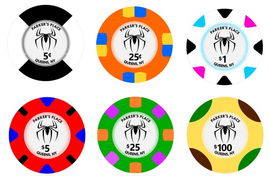
Edit: Took out the pic of the $5 to add the "group" pic. I made the $25 darker, and added some orange to represent pumpkin bombs. Changed the yellow on the $100 to look a bit sandier. I think I like the 1/4 pie nickel better than the 1/2.
Last edited:
I know they are meant to look like spotted paulson chips; however, I think you are missing an opportunity to make the 100 "swirling with sand" with the full face printing on ceramics. IMHO...Here is the latest version. I liked Friendly Neighborhood Poker, but it was looong.
Edit: Took out the pic of the $5 to add the "group" pic. I made the $25 darker, and added some orange to represent pumpkin bombs. Changed the yellow on the $100 to look a bit sandier. I think I like the 1/4 pie nickel better than the 1/2.
View attachment 1274798
jpietrella
4 of a Kind
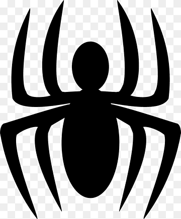
I'm an avid Spider-Man fan, so just curious about your selection on the art used for the inlay. This looks like the chest logo from one of the movies, specifically Toby Maguire's version in Spider-Man 2. Just wondering if you preferred this one to one of the more classic front or back logos from the comics:

Similar threads
- Replies
- 1
- Views
- 127
- Replies
- 12
- Views
- 732
- Replies
- 136
- Views
- 10K
- Replies
- 14
- Views
- 1K
