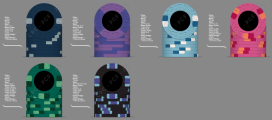
Hi everyone! This is my first time drafting up a custom poker chip set.
I am getting married next year, and I thought that I might create a custom poker chip set to celebrate and give myself a gift. My initial thought for this set was to match the color scheme of our wedding, dusty blue and sage green. I started with designing the $1 and $25 chips since I love the Nevada color scheme. I then shifted my focus to the $5 chip, and I chose to have more of a pink hue rather than red since I thought red might be a little too harsh of a color for the feel I am trying to go for. For the $100 chip, I was struggling to find a color combo, but I think the one I chose is pretty simple and nice. The one I'm having trouble with is my $0.25 chip. I am between two options: the dark blue chip w/ grey spots or the purple 1/4 pie. I started designing the dark blue version first, and I wasn't sure how to really implement it into the set. I was searching around this site and I saw a lot of comments about liking solid or 1/4 pie fracs, and I ended up creating a second option with the 1/4 pie purple chip. I am liking the purple chip a bit more, but am curious if others also thought so, or had any ideas to improve anything. I tried to keep in mind the edge spot progression, even if it's not a real thing.
I am for sure going to have to get color samples to make sure i know what they look like in real life. I also want to play around with the mold, so I might want to get samples of that too.
For the inlay, I'm currently working on it in the background, I was planning on having a cartoon style side profile of both of my dogs as the logo and have "The Doghouse Card Club" in circle text. I just need to work on my photoshop skills, and have free time.
Feedback requested:
Which frac option do you prefer: dark blue w/ small edge spots, or purple 1/4 pie?
Any suggestions on $100 edge spot colors?
Thoughts on the overall set, or some things you suggest I could tweak to make it better?
Clarification:
$0.25 - either purple 1/4 pie, or dark blue chip
$1 - light blue
$5 - pink
$25 - dark green
$100 - black
Attachments
Last edited:

