The Winery - A Vineyard Tribute Set (1 Viewer)

MikesDad

Flush
Supporter
Joined
Nov 6, 2014
Messages
1,761
Reaction score
2,938
Location
Odenton/Crofton, MD
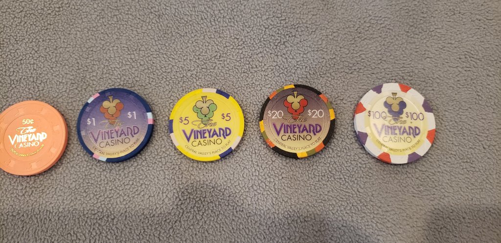
I've always wanted a Cali set and love the Vineyards (YMMV), so I've decided to go forward with a CPC Vineyard tribute set,
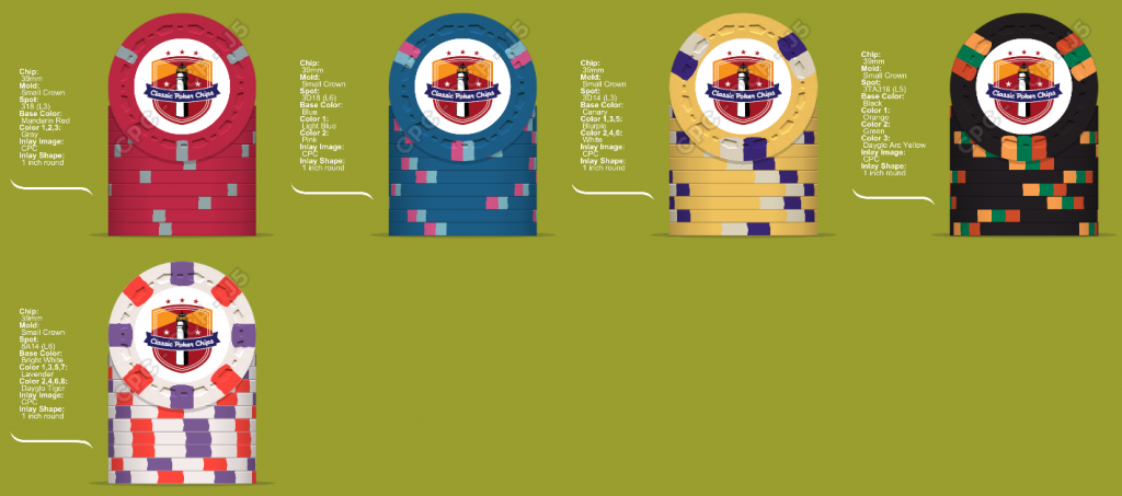
tentatively called the Winery. Still working on the inlay, but here are the chip color mockups along with the Vineyards for comparison.

A couple of notes first..
1. Thanks to @inca911 for his ideas and support and his outstanding thread on the Vineyards.
2. Shout out to @krafticus, @Chippy McChiperson , @Highli99, @arch3r for their input.
3. CPC has no color close to the Vineyard frac which is an 0.50 and a hotstamp, so went with a 0.25 frac that seems to fit well with the rest.
4. Debated on the base color for the $1. Retro Blue seems closer to the original base color, but Blue seems to fit better with the rest, still has
sufficient contrast with the Lt Blue spot and avoids potential conflict with the $20
5. CPC does not produce 4TA318 so went with 3TA318 for the $20 which seems to fit fine.

Thanks for looking. Thoughts appreciated
Master1111.png

AllVineyards.jpg
 
Also, CPC regular pink is pretty dark, DG pink while a lot brighter thank the light pink of the original will give much better contrast and much more pop.
 
Looks good. Have you considered the FDL mold with a 1-1/16” inlay to get more of the grand inlay feel of the original?
I'm not a huge fan of the FDL mold Adam, but I like the idea sir! I'm pretty sure you can still do the larger inlays on the H mold... I love those chips. Unfortunately Dennis already owns a custom set on the H mold, everyone wants a new set of customs on the Scrown... I understand where he is going with this!

Cool little feature many may not know! I'm not sure if they still offer this.
20201111_081322.jpg

These are @AfterTheFact customs... with the large inlay on the H mold... if you zoom in a bit you will see the clay actuall stops on the bottoms of the H's... I know it's a tiny detail but I think it is awesome!!

Again not sure they still offer this!

Side note to David... I'm positive these will be a family heirloom but man if they were ever to sell Dibs all the way brother!! I love everything you did with the Monopoly Chips!! Even with all the crazy awesome customs out there today I would still say this is top 10 for me!

Fellow Chipper Ben
 
I like this idea. I would also consider using retro blue for the $1s and dg yellow for the $5s

As noted, I did consider Retro Blue for the $1 .Retro Blue is very dark so I had a little concern of pot confusion with the $20s.
Blue seems to be more complementary to the other, more muted colors.

I also tried DG Yellow for the $5, but I think it has a bit of a greenish tint. Yellow is a bit too dark
 
Also, CPC regular pink is pretty dark, DG pink while a lot brighter thank the light pink of the original will give much better contrast and much more pop.

Worth considering... thanks. The Vineyard pink spot seems to somewhere in between Pink and DG Pink
 
Last edited:
Dang you Brie.. nice. Thought about the DG peach for the frac.. just didn't think it went as well as the red.
Maybe have to reconsider
I do see your concern with the blue/black but i think the right edgespots will show enough contrast between the 2


1605101717769.png
 
Also, I personally would take the gamble on the 1 1/16 inlay, at least on the scrowns if David would allow it. They definitely need a bigger inlay, and other than the plain mold I'm not sure what else would work best here. Like Ben's image above the overlapping inlay is sweet looking, and might come out really cool on an elephant/crown or large crown if you are comfortable taking the risk of slightly off center. (honestly wouldnt bug me, gives it a more "realistic" feel, since paulson sometimes misses there target as well)
 
Also, I personally would take the gamble on the 1 1/16 inlay, at least on the scrowns if David would allow it. They definitely need a bigger inlay, and other than the plain mold I'm not sure what else would work best here. Like Ben's image above the overlapping inlay is sweet looking, and might come out really cool on an elephant/crown or large crown if you are comfortable taking the risk of slightly off center. (honestly wouldnt bug me, gives it a more "realistic" feel, since paulson sometimes misses there target as well)

I may ask him, but not sure the 1/16th of an inch will make that much of a difference. I'll check with designer for his input too.
Thanks for the idea
 
After some thought, I think @Rhodeman77 is right about the DG Pink for the $1 chip
Also, after looking at @FordPickup92's mockup in post #12, I've thought about a possible change to the frac.
I like the symmetry of the spots in my original mockup -- 318, 3d18, 3d14, 3T18, but her frac made me think a little diversity might be good.

Let me know what you think about a possible 218 or 214 frac.
Of course now I feel like I'm overthinking this :( :eek:

3Fracs.png
Let
 
Last edited:
Does the $1 and the $20 in the original Vineyard set get mixed up ever in pots? @inca911 - I personally would use that info to guide the choice on retro blue v blue probably. The blue in the original set looks very dark already.
 
Does the $1 and the $20 in the original Vineyard set get mixed up ever in pots? @inca911 - I personally would use that info to guide the choice on retro blue v blue probably. The blue in the original set looks very dark already.

The blue in the original $1 is pretty dark, but I suspect the giant inlays make this less of an issue than in a CPC set where more of the chip color is seen.
Blue is just a shade lighter than the original whereas Retro Blue and Dark Blue are both darker. I exchanged some PMs with @inca911 on this and other concerns and he agreed (maybe even suggested) Blue was a better choice to avoid any chance of mixed pot confusion
 
Last edited:
Lots of $5s and skip the $20s? Just a big fan or retro blue
 
Last edited:
Lots of $5s and skip the $20s? Just a big fan or royal blue

It's true that we usually play 0.25 / 0.50 up to 0.50 /1.00 so not that many $20s on the table, but still like the regular Blue
in the overall scheme of things

Going for 140 / 300 / 360 / 140 / 60.. so lots of $5s, but love the $20s too
More chips than I'll need but supports one table of 0.25 / 0.50 up to $2/$5
Did I mention MOAR CHIPS?
 
Love the lineup in the OP (with the revision of dg pink for the $1 spots). Nice work. I think regular blue is the right choice here. It's an under appreciated color because it's not flashy by itself but with those spot colors, it will look great imho.
 
Love the lineup in the OP (with the revision of dg pink for the $1 spots). Nice work. I think regular blue is the right choice here. It's an under appreciated color because it's not flashy by itself but with those spot colors, it will look great imho.
Thanks.. that's the lineup I'm going with but changing the $1 spot to DG Pink
 
Thanks.. that's the lineup I'm going with but changing the $1 spot to DG Pink
Love it Dennis, personally I like option 3 on the frac with the 2 small edge spots (i don’t know all the edge spot lingo and names) as opposed to 3, but love all of your chips so far so Imsure they will come out great!!!
 

Create an account or login to comment

You must be a member in order to leave a comment

Create account

Create an account and join our community. It's easy!

Log in

Already have an account? Log in here.

Back
Top Bottom