Tournament Set Feedback (1 Viewer)

digirati

Flush
Supporter
Joined
Nov 9, 2023
Messages
1,105
Reaction score
688
Location
Colorado
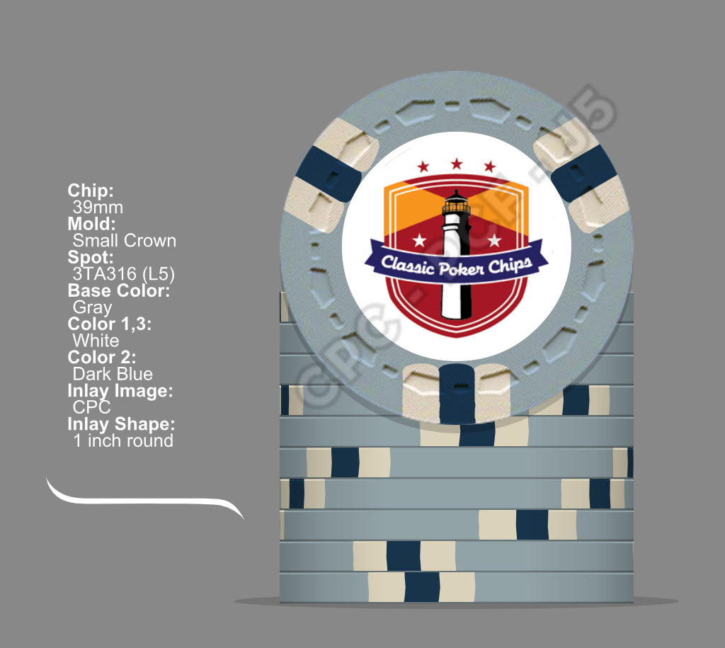
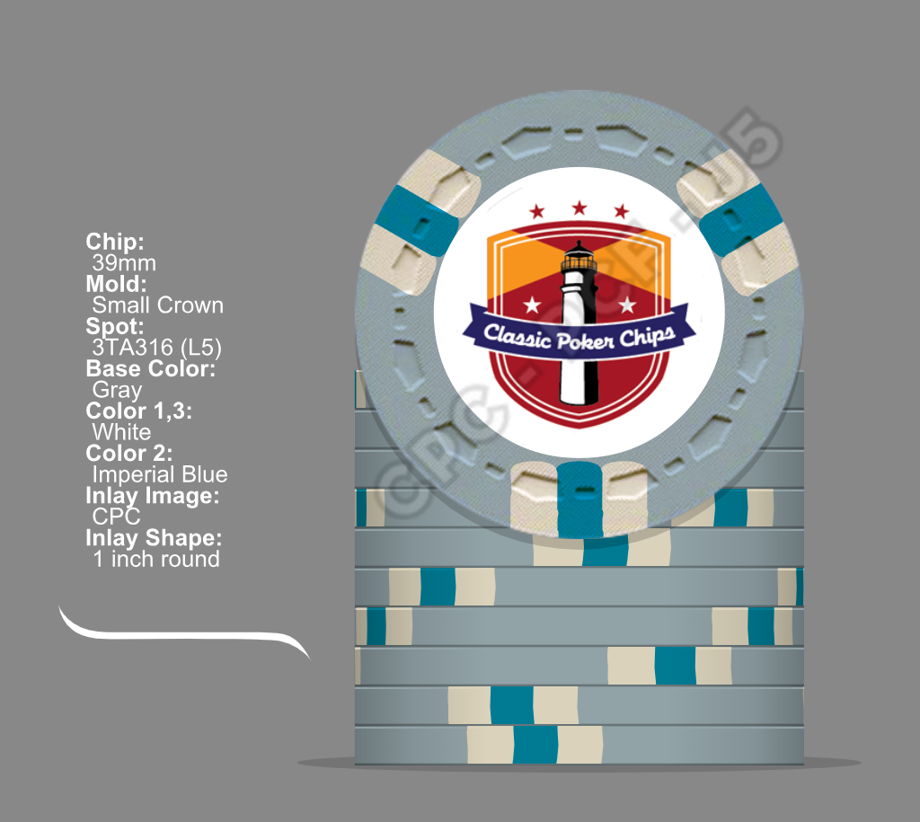
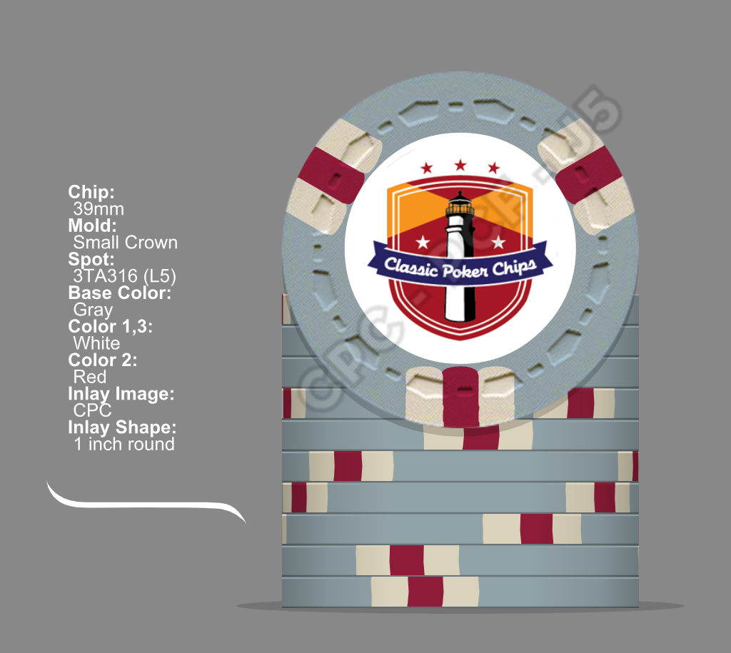
I put together a T25/T100/T500 tournament set (gives me options) and would like to get feedback on the colors/design. I'm still uncertain about the T5000 spot colors (grey chip).

I originally thought I would do a spot progression but kind of like the uniformity of the 3TA316 spots. I kept everything similar except the base color and center spot colors. I'm still working on the inlay logo, which has a mid-century modern, old Las Vegas style, so for now I just used the CPC inlay logo. Denominations are as follows:

T25 - Green
T100 - Black
T500 - Purple
T1000 - Yellow
T5000 - Grey
T25000 - Brown

So, please give me your thoughts on the set, AND which of the grey chip colors do you feel works best (i.e., Dark Blue, Imperial Blue, or Red). I welcome any and all feedback. Thank you and Merry Christmas!
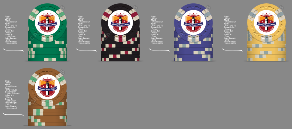
Tournament 3TA316 NO GREY 12-25.png

Tournament set without grey chip.

T5000DarkBlue.png

Dark blue spot color.

T5000ImperialBlue.png

Imperial Blue spot color.

T5000Red.png

Red spot color.
 
I'm not a fan of duplicating some of the spot color combos: white/green T25/T25k, white/red T100/T5000, and especially white/grey T500/T1000.

3TA316 is a good choice for a common spot pattern, as it allows the base color to be easily discernable in stacks and pots.

Using a common spot color (white) can help tie the set together visually, but consider using unweighted accent colors for the middle spot color (white/xxx/white), as it will allow for some extra pop.

Take a look at how these play together (all 3TA316 pattern with white/xxx/white spots):

T25 -- Green base, DG Green spot
T100 -- Black base, Retro Red spot
T500 -- Purple base, DG Arc Yellow spot
T1000 -- Canary base, Retro Lavender spot
T5000 -- Grey base, DG Peacock spot
T25K -- Light Chocolate base, DG Tiger spot

Make sure you also have a current CPC color set in hand, as the screen colors of the design tool are not always reflective of the actual colors.
Thanks for the great advice. I thought the T25/T25K (for sure) and T100/T5000 (most likely) would never be on the table at the same time due to color ups. Do you think the T100/T5000 would be in play at the same time?
 
Last edited:
Take a look at how these play together (all 3TA316 pattern with white/xxx/white spots):

T25 -- Green base, DG Green spot
T100 -- Black base, Retro Red spot
T500 -- Purple base, DG Arc Yellow spot
T1000 -- Canary base, Retro Lavender spot
T5000 -- Grey base, DG Peacock spot
T25K -- Light Chocolate base, DG Tiger spot
Ok, tried those colors in 3TA316 and it looks great. Do you think the 3TA316 is worth the extra $740 additional for the set over the 3D14? I've included both sets below.
3TA316 - Bright White.png

3D14 - Bright White.png
 
Do you think the 3TA316 is worth the extra $740 additional for the set over the 3D14? View attachment 1246654
It would be worth it to me -- I think the 3D14 spot really lacks the visual impact and set continuity povided by the 3TA316 pattern with a bracketed middle spot color.

Fwiw, I mocked up these two variations earlier tonight for your viewing pleasure:

v1v2.png
 
It would be worth it to me -- I think the 3D14 spot really lacks the visual impact and set continuity povided by the 3TA316 pattern with a bracketed middle spot color.
I see your point and agree. 3TA316 for the win.

Fwiw, I mocked up these two variations earlier tonight for your viewing pleasure:
I appreciate you doing that!
 
In general, listen to @BGinGA but remember it's your money and your set.
My additional unnecessary 2 cents would be:
-Your grey 5K chip needs either Dark blue or Retro blue (and, sure, white) spots
-When it comes to a brown chip, my only refuge (NOT reminiscent of excreement) would be Maroon, for some reason :)
 
First, let me say a big thank you to @BGinGA and everyone for so much helpful feedback. This tournament set has been a challenge. I'm trying to balance certain colors I like WITH the feedback from everyone. The feedback has been excellent. I would VERY MUCH appreciate everyone's feedback on the three latest revisions.

My personal favorite is the set labeled Alt 1, and though on screen the chips look different, I'm concerned there "could be" dirty stack issues with the lavender chip and either the yellow or brown chips. I've also attached a photo of the chip samples on my desk. I know the center spot colors (surrounded by bright white) will not be the dominate color, but when I lay them on my desk I get concerned (especially because of the purple and yellow chips). Ignoring the spots, the base colors appear very different, but I'm not sure how they'd turn out when completed.

Alt 2 changes the only the lavender chip to purple.

Alt 3 changes the light green to green, lavender to purple, and the brown chip's center spot color.

I only had a set of white (not bright white) mold samples so the white chips aren't as bright as they would be when completed.

Please let me know what you think, and again THANK YOU ALL!

3TA316 - Alt 1.png

Alt1

3TA316 - Alt 2.png

Alt 2

3TA316 - Alt 3.png

Alt 3

Alt 1 Samples.jpg

Alt 1 Sample Chips
 
Biggest color concern I have with tournament sets is how black plays with both the green and purple chips in low light (especially if they have similar-shade spot colors, like pink/red).

For that reason, I usually pair darker green and darker purple chips with a lighter-colored 100 (usually either charcoal, grey, or white). Or similarly, a black 100 plays better with a lighter shade of green T25 and a lighter shade of purple T500 (and with dissimilar spots/colors on the T25/T500, in either case)

That all steers me to prefer your alt1 lineup (although I'd avoid the pink/red conflict on the T25/T100). I also like the alt3 lineup, but only if switching the T100 base color to something lighter. And DG Tiger spot on the T25k ftw, regardless of lineup -- it was my fav when doing your mockups earlier.


edit:
To resolve the alt1 pink/red T25/T100 issue, consider changing the T25 spot to DG Peacock and the T5000 spot to Retro Blue (or just the T25 to Retro Blue). Either change also balances the set, resulting with two spots each in the blue / red / yellow ranges.

So I followed your suggested edits, which helped a lot. Behold the new and improved Alt 1b set. I guess my only remaining question is the T500/T1000 chips and the possibility of them creating dirty stacks or being confusing next to each other. I've also attached two photos of those sample chips isolated from the others for clarity. In the chip designer they seem very different, but when the samples are laid on my desk, they scare me. Is this just an illusion? Having not made chips before I'm uncertain if these two will become an issue. Any final thoughts?

Thanks again @BGinGA !

3TA316 - Alt 1b.png

lav yellow 2.jpg


lav yellow 1.jpg
 
I think the overwhelming amount if base color present in both face and edge views eliminates any chance of confusion in bets/pots or stacks.

Swapping the T25k Tiger and T500 Arc Yellow spots might let the T500 stand apart from the T1000 a bit better, but I don't think it's necessary. Try it with your color sample chips, and go with whichever combos you like best. (If switched, you might like the T25k better with Peach vs Arc Yellow).

Also keep in mind that some of those sample set colors will look a lot different (more vibrant, less muted) once oiled (as the chips should be when received), particularly on the rolling edges. Maybe try oiling the samples first and then compare combos.
 
Swapping the T25k Tiger and T500 Arc Yellow spots might let the T500 stand apart from the T1000 a bit better
That absolutely helped! You need to start billing by the hour! ;)

Do you think the Tiger spot seems a little "hotter" than the other spot colors in the set? I tried swapping out Tiger for Peach on the T500 spots Here's the two mockups and two desktop photos showing the difference. Which do you think works best?

3TA316 - Alt 1e.png

3TA316 - Alt 1f.png

Tiger.jpg

Peach.jpg
 
Late to party but I vote tiger. This is a very cool tourney set idea btw. Can’t wait to see final product. Any plans for color matching on the inlays?
 
Late to party but I vote tiger. This is a very cool tourney set idea btw. Can’t wait to see final product. Any plans for color matching on the inlays?
That's ok! I finalized my tournament set and will post it tonight or tomorrow.
 
Well, here it is. My Skyfall Poker Room Tournament Set. Everything shipped off to @David Spragg at CPC. So excited about my two sets (cash and tournament). David was very helpful and patient with all of my many questions. I really appreciate all of the help from other PCF members, and especially @BGinGA for numerous helpful feedback along the way.

Tournament Set Final 1-24-2024.png
 

Create an account or login to comment

You must be a member in order to leave a comment

Create account

Create an account and join our community. It's easy!

Log in

Already have an account? Log in here.

Back
Top Bottom