Tropical Sunset Cards Mold Cash Set - Looking For Design Suggestions (1 Viewer)

Joined
Jun 12, 2023
Messages
1,219
Reaction score
1,626
Location
Honolulu
Current Draft

Screen Shot 2023-08-16 at 8.26.15 PM.png
Screen Shot 2023-08-16 at 8.26.31 PM.png


Goals

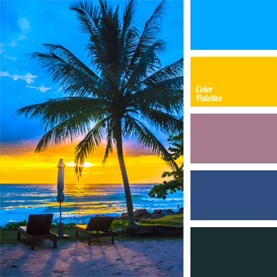
The chips should remind you of watching a sunset during an island vacation.
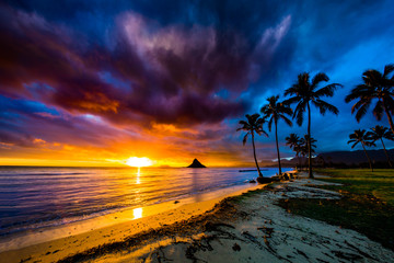
hawaiian_sunset.jpeg
hawaiian_sunset_2.jpeg


They should feel distinct from @JeepologyOffroad's excellent Moonlight Cardhouse sets.

---

Anything feedback and suggestions is welcome.

- Can Tina print these browns and light blues, or do I need to make some adjustments?
- Is the charcoal detailing in the "inlay" too fine or too similar in color to be visible?
- What should I add to the $20/$100 chips, if anything?


---

Previous Iterations

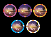
#5
Screen Shot 2023-08-15 at 1.28.34 AM.png


#4

Screen Shot 2023-08-02 at 12.38.46 AM.png


#3

Screen Shot 2023-07-31 at 1.59.40 AM.png


#2

Screen Shot 2023-07-29 at 9.10.25 PM.png


#1

Screen Shot 2023-07-28 at 1.12.58 AM.png
 

Attachments

  • Screen Shot 2023-08-01 at 10.54.09 PM.png
    Screen Shot 2023-08-01 at 10.54.09 PM.png
    66.6 KB · Views: 87
  • Screen Shot 2023-08-02 at 12.31.59 AM.png
    Screen Shot 2023-08-02 at 12.31.59 AM.png
    90 KB · Views: 57
  • Screen Shot 2023-08-16 at 7.50.21 PM.png
    Screen Shot 2023-08-16 at 7.50.21 PM.png
    275.6 KB · Views: 52
  • Screen Shot 2023-08-16 at 7.50.33 PM.png
    Screen Shot 2023-08-16 at 7.50.33 PM.png
    356.4 KB · Views: 52
  • Screen Shot 2023-08-16 at 8.17.50 PM.png
    Screen Shot 2023-08-16 at 8.17.50 PM.png
    330.2 KB · Views: 50
Last edited:
My very subjective take/questions:

Why the same spot pattern on the $1 and $5? Doesn't seem to follow the rest of the set. What about something like:

Improviseallday Suggestion.png


This is just me but I hate 1X spot like on the $100. That's just me though. I'm not a fan of complexity for complexity's sake, but since these are Tina chips doesn't cost more to do something different there.

I'll let a proper designer comment on the background, but it does look a bit too subtle to me.

In general though the set seems to work well together color wise. I like that it's simple. I like the non traditional colors. The set looks good and looks like it would work.
 
Still welcoming any feedback!

I made some improvements in the latest iteration, including a warmer 25c chip, a mythical 4D16 pattern for the $1, and switching the $5 to 4DS18.

---

Why the same spot pattern on the $1 and $5? Doesn't seem to follow the rest of the set. What about something like:

View attachment 1170470

Good point. I adjusted the $1 and $5 slightly. The spot width and separation should provide enough differentiation now.

In general though the set seems to work well together color wise. I like that it's simple. I like the non traditional colors. The set looks good and looks like it would work.

Thanks for the support!

---

If you need some design inspiration, @detroitdad made a Sunsets set, and @Eloe2000 made Casa Mango: https://www.pokerchipforum.com/threads/casa-mango-cash-cpc-csq.83913/

I've seen Casa Mango before! It's definitely very inspiring. The Sunsets set is new to me, thanks for sharing.
 
I wouldnt get a spot pattern that requires a fill of the same colour as the base, some samurai palace 25c and $1000 are good examples of it going wrong.
Unless your doing a ceramic but with all the design limitations of copying clay chips which seems super popular here. Then go 4 it
 
i think the Arc Yellow-ish color in your .25 and $100 are too close and might give you dirty stacks.

I considered this, but it seems like it should be fairly safe because white will appear in most $100 chip half-edges (there's going to be some white paint at the top edge) and medium gray will appear in every $0.25 half-edge. I'm working on creating the edge strips and I'll post stacked strips. Maybe I'll darken the $0.25 gray.

I just looked at a few dirty stacks. Some significant changes to one of the chips are necessary. Let me think about how.

---

I wouldnt get a spot pattern that requires a fill of the same colour as the base, some samurai palace 25c and $1000 are good examples of it going wrong.
Unless your doing a ceramic but with all the design limitations of copying clay chips which seems super popular here. Then go 4 it

Not really sure what you mean by the first sentence. I looked at the Samurai Palace sample set and am drawing a blank.

FWIW I am doing a ceramic that mostly looks like clay (some spot patterns don't exist but there's no reason they couldn't).
 
Last edited:
IMG_6540.jpg

Pic courtesy of @Eriks

Different batches of mustard used to fill gaps shows up, these r meant to look like a chip with just 2 grey edgespots. doesnt matter for you though cos your doin tina printed claylook ceramics
 
From your two image samples, I prefer the one on the right, with the palm tree. I think it helps to have something to draw your eye and also create a motif through the denominations.
 
From your two image samples, I prefer the one on the right, with the palm tree. I think it helps to have something to draw your eye and also create a motif through the denominations.

I like the palm idea, but it doesn't seem to work with any of the textures that I'm into.

Screen Shot 2023-07-30 at 2.51.33 PM.png


But I have another currently unrevealed idea about what to add...
 
I like the idea, however I don't feel the chips you have express that idea. I'm bad at suggesting changes, so I won't. Can you make the colors of the chips look more like the sample pictures? Sorry.
 
My take: look at those that have done something similar. DDs sunsets and the Casa Mango both have the inlay as a strong suit regarding style, overarching theme, etc.

Look at others. Mount Raniers for example.

Long story short - if you’re not working with something in the middle of the chip to support a landscape/picturesque theme, it doesn’t matter how/what spots you use your theme will be lost in translation.

But as is? The chips evoke the following feelings:

.25: stone, steel, gravel
$1: island flower
$5: nothing (it’s popular, it pops, but….ucla?)
$20: earth, nature, natural
$100: collar
 
Last edited:
The chips evoke the following feelings:

.25: stone, steel, gravel
$1: island flower
$5: nothing (it’s popular, it pops, but….ucla?)
$20: earth, nature, natural
$100: collar

LOL collar! Your other guesses are pretty close though, which makes me think I'm on the right track, even if I'm not there yet.

I like the idea, however I don't feel the chips you have express that idea. I'm bad at suggesting changes, so I won't. Can you make the colors of the chips look more like the sample pictures? Sorry.

Does this help at all? (Assuming 30 barrels with the usual 100/200/200/80/20 distribution)

Screen Shot 2023-07-30 at 6.02.34 PM.png
hawaiian_sunset.jpeg


25c- the sandy beach
$1- the evening sky
$5- the sunlit ocean. (I would go with a darker blue, but I think that creates dirty stack issues for colorblind players.)
$20- trees and vegetation
$100- the sun casting giant rays of brilliance

That said, the chips won't be in this configuration during play, so there needs to be a stronger connection, which brings us to:

My take: look at those that have done something similar. DDs sunsets and the Casa Mango both have the inlay as a strong suit regarding style, overarching theme, etc.

Look at others. Mount Raniers for example.

Long story short - if you’re not working with something in the middle of the chip to support a landscape/picturesque theme, it doesn’t matter how/what spots you use your theme will be lost in translation.

There's going to be some feature artwork in the background behind the text (still working on it), but even looking at my next iteration I think it can be stronger. Thanks for the feedback.
 
Last edited:
Threw away a bunch of work- it was too dry. Then got some inspiration from an AI image generator.

Screen Shot 2023-07-31 at 1.59.40 AM.png


This illustration needs a lot of work- it needs to be more aligned to the text, it needs a palm tree, the sun needs to be smaller and out of the way, etc. But does the concept work? (If it does, it's time to hire an illustrator.)
 
This is all my humble opinion. Do what you want, but my thoughts are that I think the 1$ and 5$ are pretty on point. The color on the 25$ needs to be less muddy and brighter. I'm not sure what to do with the 25c and 100$. If you're going to just have a single barrel then they need to be bright yellow IMHO and represent the sun. On the 25c maybe try to make it more beach white sands to pull it together and differentiate it from the 100$ chip.
 
Threw away a bunch of work- it was too dry. Then got some inspiration from an AI image generator.

View attachment 1171991

This illustration needs a lot of work- it needs to be more aligned to the text, it needs a palm tree, the sun needs to be smaller and out of the way, etc. But does the concept work? (If it does, it's time to hire an illustrator.)
Disclaimer - not an artist. I think the major thing I notice here is that 1) the different shades of the sunset aren't distinguished enough and 2) the monetary value should be on a solid-color portion of the chip.
 
Disclaimer - not an artist. I think the major thing I notice here is that 1) the different shades of the sunset aren't distinguished enough and 2) the monetary value should be on a solid-color portion of the chip.

1) Good eye. The currency would be on the water (one or a few shades of dark blue) when I hire someone to do the artwork.

2) By necessity, for contrast reasons, all the colors in the middle will need to be dark (or light, but then where's the sunset?) Not sure if it's possible to distinguish more. I'll try to play with the saturation.
 
Also, I was thinking about it --
1690858384872.png
this image
and the other image you posted look really beautiful while the casino chip currently looks good (but not amazing.) I think the reason this looks so nice is because of the presence of the blue sky (I think the purple amalgamation of clouds in this pic looks nice but dont know if its worth going after that look) so you might wanna get some blue in there.
 
Needless to say, I am not an illustrator.

But this iteration makes me happy enough to hire an illustrator to complete the vision.

Screen Shot 2023-08-02 at 12.38.46 AM.png


Thanks for all the feedback. You can see the improvement in each iteration.

---

Some things left to do:

- Figure out the dirty stack situation between the 25c and the $100
- The currency font reminds me of Comic Sans, and not in a good way.
 

Attachments

  • Screen Shot 2023-08-01 at 10.54.09 PM.png
    Screen Shot 2023-08-01 at 10.54.09 PM.png
    66.6 KB · Views: 69
  • Screen Shot 2023-08-02 at 12.31.59 AM.png
    Screen Shot 2023-08-02 at 12.31.59 AM.png
    90 KB · Views: 51
Last edited:
why not use white red green black or blue yellow purple white for the 1/5/20/100? Both setups pair with your current 25c chip (which I think looks quite nice) but also are standardardized, making the chips more appealing on average. Your current color scheme, to be fair, does accentuate the tropical feel -- I think California colors in conjunction with the current 25c would do the same (albeit to a lesser degree.) Also, your 100 only has one edge design -- is this intended? People on certain sides of the table wont see the edge spot
 
LOL collar! Your other guesses are pretty close though, which makes me think I'm on the right track, even if I'm not there yet.


Does this help at all? (Assuming 30 barrels with the usual 100/200/200/80/20 distribution)

View attachment 1171859View attachment 1171860

25c- the sandy beach
$1- the evening sky
$5- the sunlit ocean. (I would go with a darker blue, but I think that creates dirty stack issues for colorblind players.)
$20- trees and vegetation
$100- the sun casting giant rays of brilliance

That said, the chips won't be in this configuration during play, so there needs to be a stronger connection, which brings us to:


There's going to be some feature artwork in the background behind the text (still working on it), but even looking at my next iteration I think it can be stronger. Thanks for the feedback.
never mind just saw this post

one thing you can do to rectify the dirty stack situation is on the 25c, make a larger percentage of the circumference gray (maybe with small spots here and there so people viewing side on can count chips.)
 
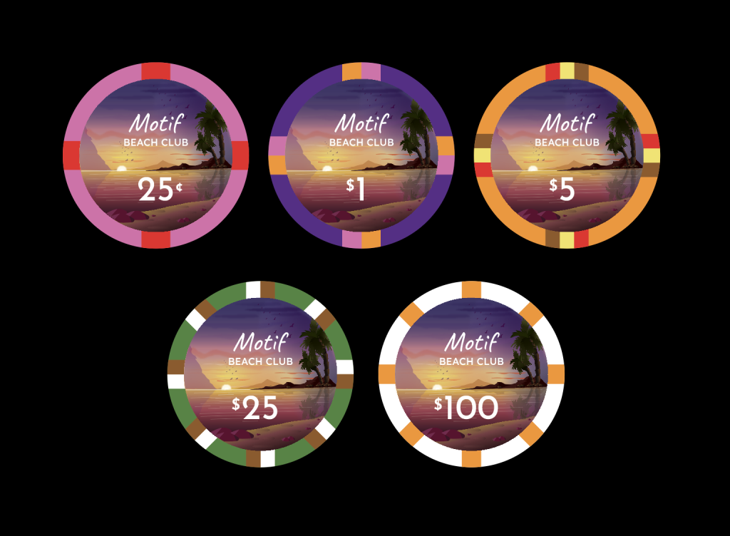
Screen Shot 2023-08-15 at 1.28.34 AM.png


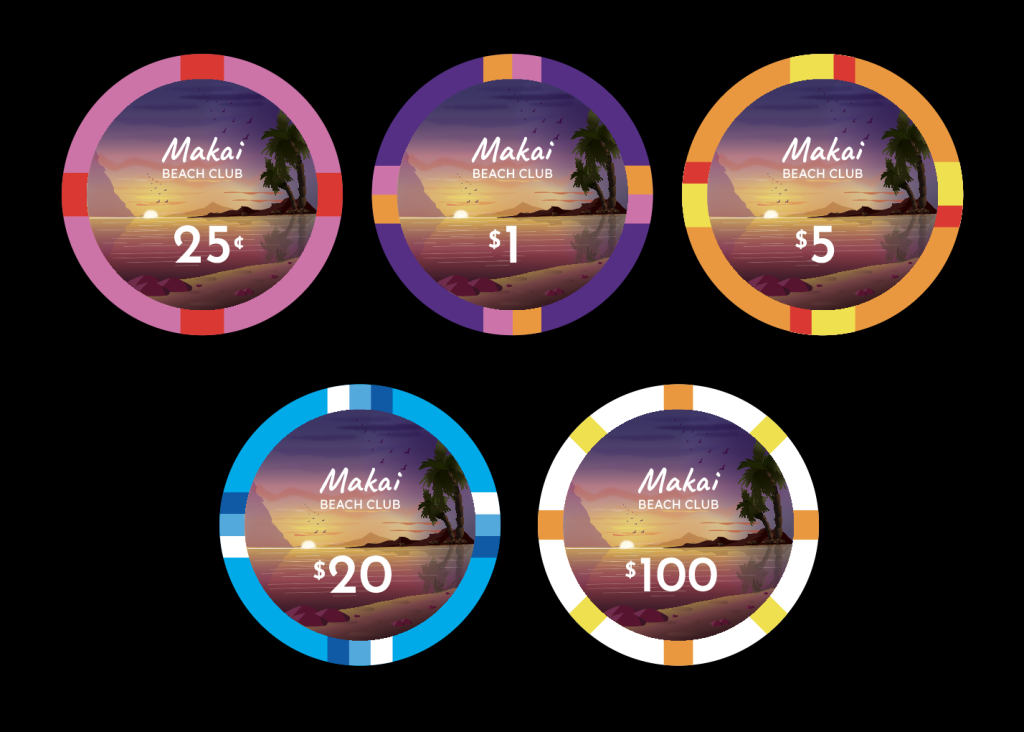
Hired an illustrator and got some detailed artwork. This inlay deserves to be seen, so I increased its size and removed the cards mold.

I also changed the color scheme. More repeated colors. The long stripes of base chip color should prevent dirty stack issues.

25c: Pink plumeria
$1: Sunset sky
$5: Mai-tai
$25: Coconut tree
$100: Sun

The only thing I see needing a fix are the thin white lines on the water- they need to be a little bolder. Time for me to get better at Illustrator.

What do you think?
 
Last edited:
Nice! I have to say, usually big full pictures inlays are not really my cup of tea… but hey, if it works, it works. And it works pretty well :-)

Some random "no coffee yet" morning thoughts about the colours: I quite liked your #4 quarter-pie 25c, and I feel like the green-white is the add/weak link. I wonder if you could keep the blue, that feels more "beach"?

Not sure what you mean about the thin white lines, seems fine. Do you fear they will disappear one printed? I would perhaps give a tiny bit more weight to the name, either by making it a bit larger, or perhaps add a thin stroke?
 
Some random "no coffee yet" morning thoughts about the colours: I quite liked your #4 quarter-pie 25c, and I feel like the green-white is the add/weak link. I wonder if you could keep the blue, that feels more "beach"?
The quarter pie was fun, but I sacrificed it to get pink-purple-orange as the main "workhorse" lineup.

I added the blue back in and am leaning towards it. Better spot pattern. I wonder if I can do better than monochrome.

Screen Shot 2023-08-15 at 10.14.44 PM.png
Screen Shot 2023-08-15 at 1.28.34 AM.png


Not sure what you mean about the thin white lines, seems fine. Do you fear they will disappear one printed
Yes, I'm concerned that there will be a bleeding issue that makes the white lines disappear. I'll check with Tina.

I would perhaps give a tiny bit more weight to the name, either by making it a bit larger, or perhaps add a thin stroke?
Maybe you got the sense that the name was fighting the denomination for attention. If so, I did as well, but took the opposite approach- the denom is more important than the name. So I reduced the size of the name a bit.
 
Yeah I also feel like the Blue works best :tup:

You are right, your pink-purple-orange progression is nice.

Seems weird, probably an European thing… but I get major "Belgian/German flag" vibe from the 5. I wonder if it would work to keep only the red and the yellow, with the same spots as the Blue 25.
And then perhaps complexify a bit the 25 spots, or exchange with the 5, and try add a nice green or a pale yellow to the blue?

I have no idea what colours and spots are available by Tina, but could you make your 100 sun with several yellow-orange tints to pimp it a bit more?

Sorry for the confuse rambling, good luck :wtf:

Edit: yeah, smaller name could work too. I would still try to bold it a bit. I think it is not so much about the competition with the denom, but as its is, I feel it competes with the baseline; I would try to have three reading levels: baseline-name-baseline.
 
Last edited:
Thanks for all the detailed feedback and ideas!

Screen Shot 2023-08-16 at 1.08.06 AM.png
Screen Shot 2023-08-16 at 12.43.01 AM.png


Seems weird, probably an European thing… but I get major "Belgian/German flag" vibe from the 5. I wonder if it would work to keep only the red and the yellow, with the same spots as the Blue 25.
And then perhaps complexify a bit the 25 spots, or exchange with the 5, and try add a nice green or a pale yellow to the blue?
I had other flags to discard earlier but didn't catch the Belgian flag. Came up with two alternatives, leaning towards the asymmetric one. This allows the $20/$25 to stay as is.

I have no idea what colours and spots are available by Tina, but could you make your 100 sun with several yellow-orange tints to pimp it a bit more?
Any spot shape is possible since it's just ink. I tried gradient and alternating but I think simple is best here. Simple in the extreme denominations and more complex in the workhorse denominations.

Screen Shot 2023-08-15 at 11.57.49 PM.png
Screen Shot 2023-08-16 at 12.42.55 AM.png
Screen Shot 2023-08-16 at 1.07.19 AM.png

Edit: yeah, smaller name could work too. I would still try to bold it a bit. I think it is not so much about the competition with the denom, but as its is, I feel it competes with the baseline; I would try to have three reading levels: baseline-name-baseline.
I made the hierarchy more clear at the expense of a little readability... shrunk the "BEACH CLUB". Bolding the Motif helps too.
 

Attachments

  • Screen Shot 2023-08-16 at 12.02.14 AM.png
    Screen Shot 2023-08-16 at 12.02.14 AM.png
    110.6 KB · Views: 49
  • Screen Shot 2023-08-16 at 12.47.15 AM.png
    Screen Shot 2023-08-16 at 12.47.15 AM.png
    108.6 KB · Views: 48
  • Screen Shot 2023-08-16 at 12.59.20 AM.png
    Screen Shot 2023-08-16 at 12.59.20 AM.png
    280.3 KB · Views: 49
Chips look real nice, I think you have the background nailed down. My only suggestion would be to maybe enlarge the word “Motif”, or maybe make it look like a logo. It could be a small graphic or something tied in with the text to make it that way. It just looks a little like a word with a different typeface right now.
Here's a bit of what I mean:
motif-logo.jpg
 
Thanks for all the detailed feedback and ideas

My pleasure, happy to help :-)


Any spot shape is possible since it's just ink.

Really? So more like ceramics? I thought Tina's were injection-mold plastic with "fake" inserts. Good to know.

I quite like the alternating yellow-orange 100. It would keep the 2 colours spots logic.


It just looks a little like a word with a different typeface right now.

That is a perfectly valid definition of a "logo" ;)

Sorry to disagree, but I would not complicate the wordmark. Right now the star is the inlay. Adding a graphic element would conflict with the sun, and add useless clutter imho…
 

Create an account or login to comment

You must be a member in order to leave a comment

Create account

Create an account and join our community. It's easy!

Log in

Already have an account? Log in here.

Back
Top Bottom