Windmill Card Room - Design Feedback (1 Viewer)

Cratty

3 of a Kind
Supporter
Joined
Mar 17, 2024
Messages
587
Reaction score
3,383
Location
Michigan
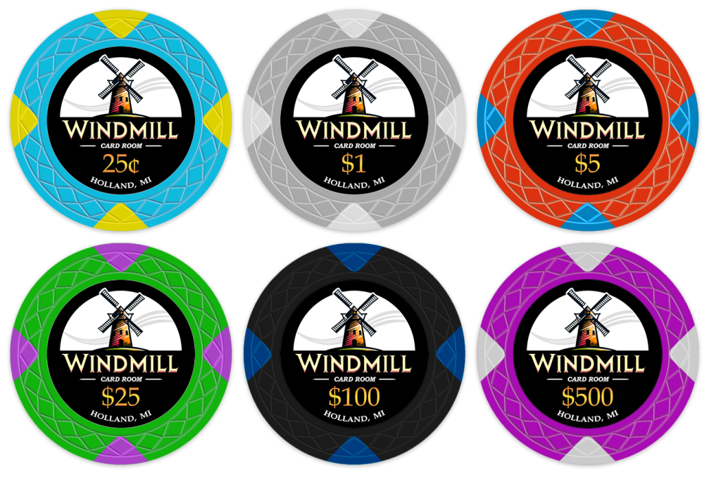
Hi all, fairly new here.. looking to place a group buy in an upcoming "Tina" order. Toying around with inlays, would love some feedback! Latest design:

I'm not attached to poker chip design/color scheme yet, but liked the thought of a windmill-esque pattern.
V4Test.png
 
Love it! Nice and clean looking, go for it! Did you do the design yourself?

The only thing I can suggest now that I look at it is to see how matching the color of the windmill on the inlay to the chip base color would look. Could add some pop and add uniqueness to each chip!
 
Oooh and that little wind in the background, faint color to match the base chip color? Good eye.

Great inlay! When you're picking colors/edgespots, remember you can really go crazy when its ceramic. In clay, the more complicated edgespots are much more expensive, but on these its just one price.
 
Love it! Nice and clean looking, go for it! Did you do the design yourself?

The only thing I can suggest now that I look at it is to see how matching the color of the windmill on the inlay to the chip base color would look. Could add some pop and add uniqueness to each chip!
I did yeah, thanks! And good suggestion, I'll play around a bit with colors to see if I can integrate base chip color. Tried in older design revisions, but may be easier now that I've gone with a dark theming.
 
Oooh and that little wind in the background, faint color to match the base chip color? Good eye.

Great inlay! When you're picking colors/edgespots, remember you can really go crazy when its ceramic. In clay, the more complicated edgespots are much more expensive, but on these its just one price.
Good thought. I actually somewhat like going full boar with the wind after testing it...
V4Test_Wind_Color.png
 
Don't love the gray $1 chip but that's a personal opinion. The black $100 inlay feels muted compared to the other chips.
Yeah, I need to toy around with chip design/colors next. Only put in ~5 min of thought just to get something going to test inlay designs with. Agree that they all leave something to be desired!
 
Look great! I’m a fan of colored inlays that match the base color. So like other said, maybe match the wind, or the windmill blades to the base imo
 
I really like your design. The colored wind stream in the background adds a great element. I think the words "card room" will be nearly unreadable. Perhaps a bolder, more extended font will do if you drop the dashes on either side? Chip spots, colors and patterns are entirely subjective. I don't see any real "dirty stack" issues as long as the 10¢ and 25¢ chips are not in play at the same time.
I personally have always been cautious of having all the same spot patterns within a set. Your set has that "uniform" look to it but all the same spots in a set strike me as being purchased from a stock lineup. It doesn't look like a truly CUSTOM set and your design is certainly deserving of that. But this is also a subjective element.
 
Last edited:
I like how the vanes on the windmill break through the black border slightly!
I agree that the "CARD ROOM" font size will have to be a bit bigger to be readable.
I would also be careful about the gradient text on the denomination which might reduce legibility when printed out.

The only way to find out for sure is to do a test print, hold it at arm's length, and see if the result is satisfactory.
 
In general I agree that I prefer mixed spots in custom sets but given the windmill theme I don't mind keeping that pattern throughout. Personally not a fan of the grey $1 but otherwise love the set.
 
Appreciate all the feedback! I made "Card Room" larger, adjusted the gradient on the denomination amounts to be less aggressive, and played with some chip colors. Overall very happy and thankful to all!

That said, personal opinion, but I love the $1 chip. LOL

I also toyed with making the design more unique vs stock... but really did want to stick with the common "windmill" chip design look. But hey, next design!

mockup.jpg
 
Nice inlay design!
Clean and simple. I like that.
I would try a dark grey outline-ring for the 100.
And maybe the € sign?

In general i think we aren‘t use to see the full potential of ceramics…?
It‘s often a try to match a clay chip.
No bad - it‘s what you except for a common chip.
The spot pattern is very nice, no doubt, but i still wait to see something new with ceramics…

Go for it and have fun!
 
what are you doing your chip edge spot designs in?
Photoshop primarily at a very high pixel per inch (1000) to make sure details aren't lost in printing. Illustrator likely preferred, but I'm just faster in PS.
 
Nice inlay design!
Clean and simple. I like that.
I would try a dark grey outline-ring for the 100.
And maybe the € sign?

In general i think we aren‘t use to see the full potential of ceramics…?
It‘s often a try to match a clay chip.
No bad - it‘s what you except for a common chip.
The spot pattern is very nice, no doubt, but i still wait to see something new with ceramics…

Go for it and have fun!
Yeah, I put this order on pause (may adjust some if I come back) to prioritize my Dunes chips, which I did play with the chip a bit more on higher denims, but I really prefer chips that look more like casino clays.. but likely a good middle ground!
 
Photoshop primarily at a very high pixel per inch (1000) to make sure details aren't lost in printing. Illustrator likely preferred, but I'm just faster in PS.
Do they print that fine?
 
Do they print that fine?

Nah, likely obsessive, but doesn't hurt to mitigate loss and no real extra work on my end. Generally speaking anything above 500 dpi likely more than safe for some of the fine text to make sure there aren't quality issues.. but I always air higher to just be doubly sure when not using illustrator/vectors.

But I'm sure there are people out there with more printing experience. I just dabble from time to time.
 
This windmill design is :chefs kiss: very nice. Are you taking on customers? :D I have no idea where to start to try and make a chip design, but I think I want to create one. I run a pickleball club in my neighborhood and we have just transitioned to running some poker nights. Would love to try and come up with something.
 
This windmill design is :chefs kiss: very nice. Are you taking on customers? :D I have no idea where to start to try and make a chip design, but I think I want to create one. I run a pickleball club in my neighborhood and we have just transitioned to running some poker nights. Would love to try and come up with something.
Here is a list of artists (on the left) that you can reach out to as well.
Screenshot_20231029_235802_Samsung Internet.jpg
 

Create an account or login to comment

You must be a member in order to leave a comment

Create account

Create an account and join our community. It's easy!

Log in

Already have an account? Log in here.

Back
Top Bottom