Wolfpack Poker - New Wynn Inspired (1 Viewer)

WoodenMonkeyLamp

Pair
Supporter
Joined
Jan 8, 2023
Messages
154
Reaction score
392
Location
Richmond, Va
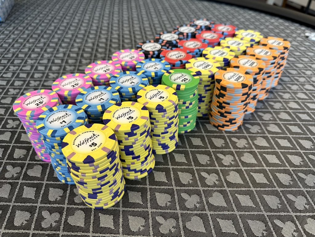
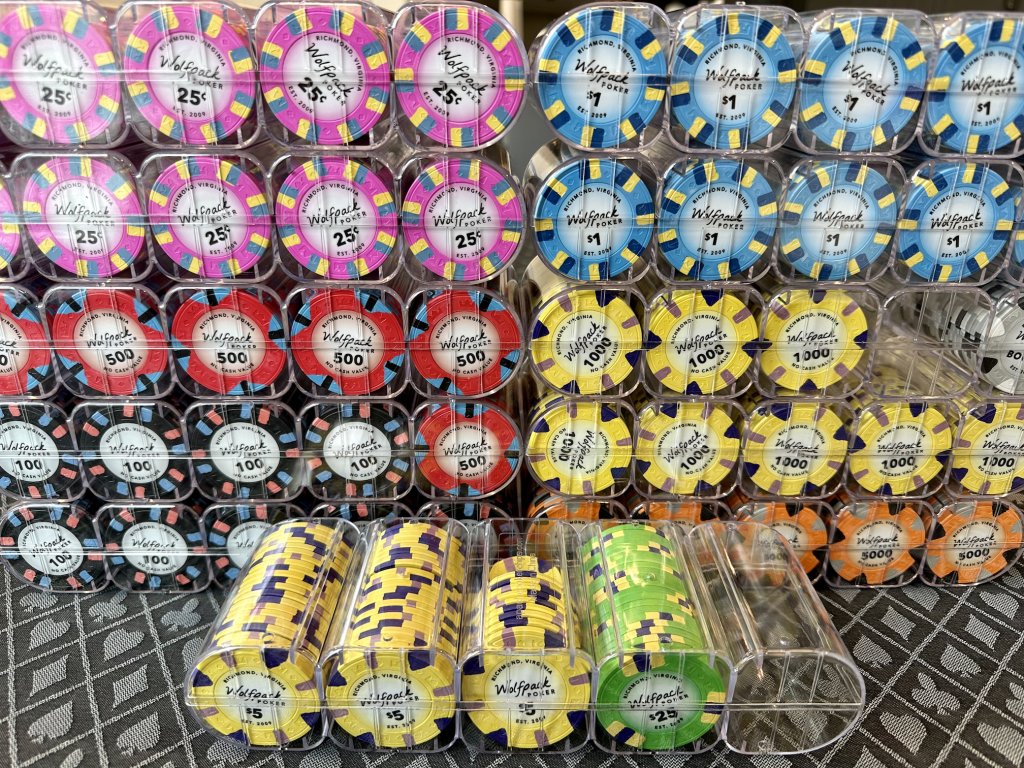
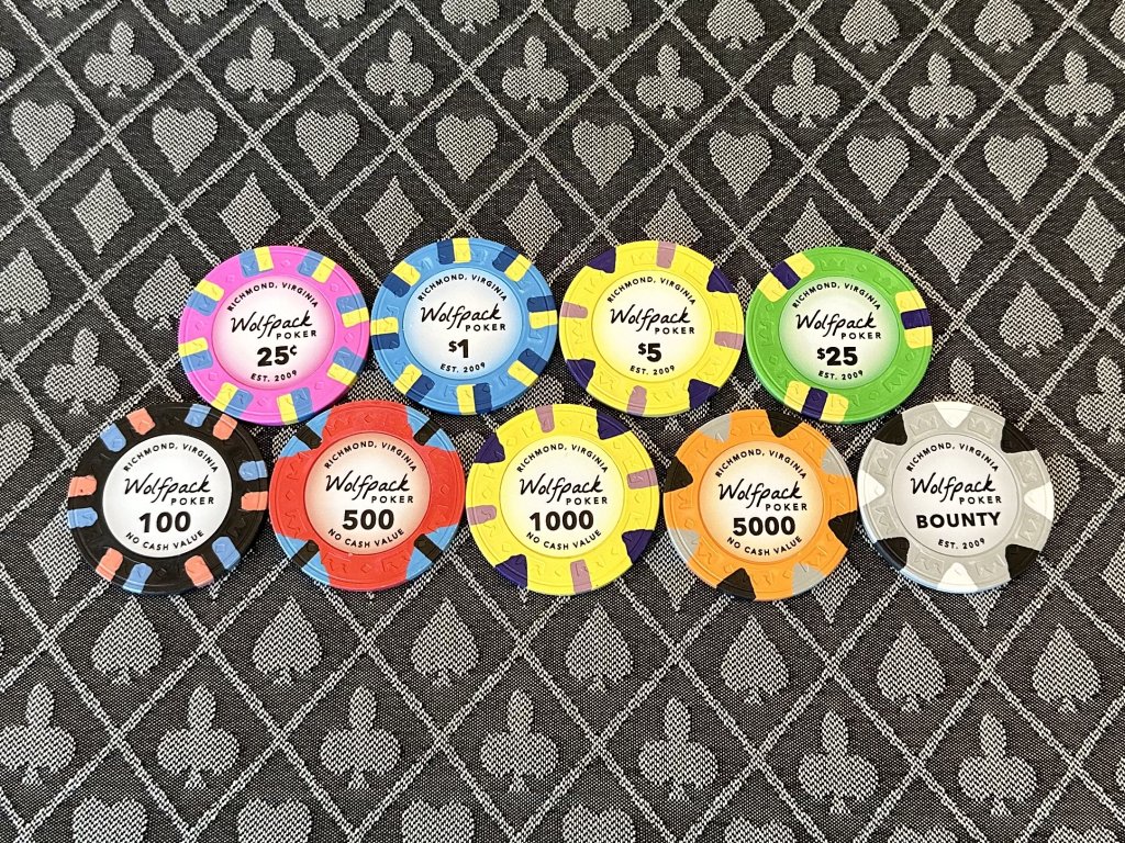
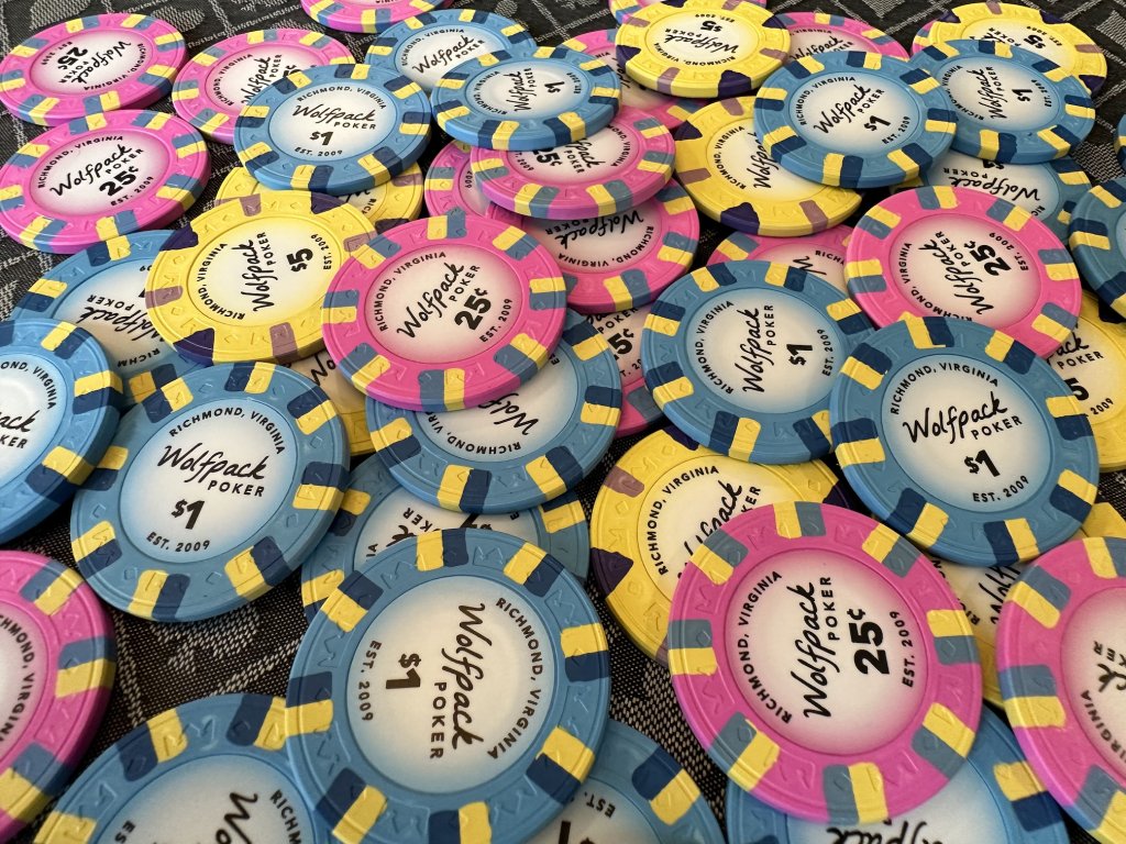
Sharing my first custom labeling journey for a new set of Royals. Went with them over Majestics because of the great colors (please Josh can we have more variations!) and different spot patterns. Not a huge fan of the Aria flag white so I did cali for cash (except for that green $25 because it's awesome and other options were limited).

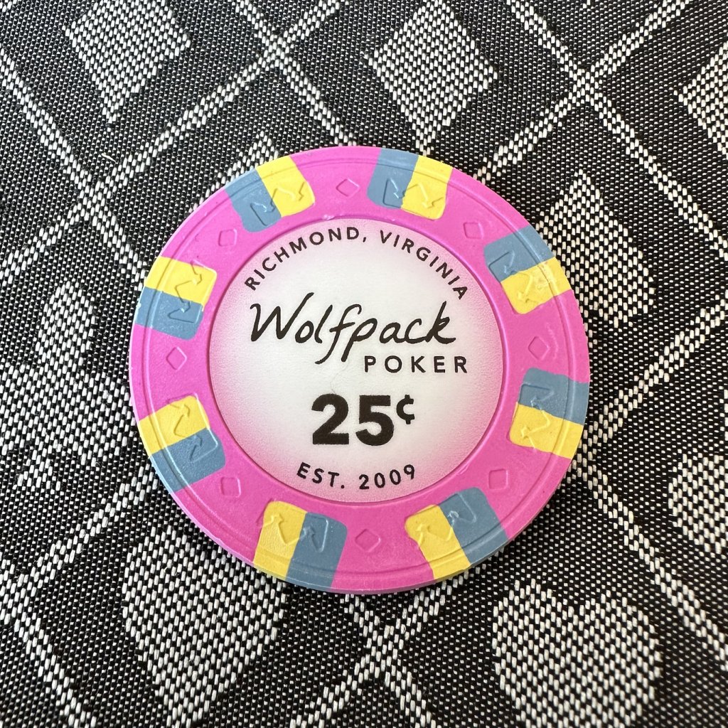
For the label design I liked the simplicity of the new Wynn chips (and love the Wynn in general) so that obviously had a big influence. Wolfpack comes from an old inside joke with our crew from The Hangover, sorry NC State fans.

I did Sticker Mule for printing which was a ton of back and forth, tweaking, and waiting for samples to come in (along with me learning Illustrator at the same time :D). Overall the experience with them was ok but spotty, so I'd definitely recommend Gear if you don't mind waiting.

Pretty happy with how they turned out! They could definitely use some oil but our first with them game is tonight so they will be getting the natural treatment.
0.jpg
all.jpg
2.jpg
3.jpg
4.jpg
 
Very nice, the Royals are great! Really digging the subtle color matching
 
Sharing my first custom labeling journey for a new set of Royals. Went with them over Majestics because of the great colors (please Josh can we have more variations!) and different spot patterns. Not a huge fan of the Aria flag white so I did cali for cash (except for that green $25 because it's awesome and other options were limited).

For the label design I liked the simplicity of the new Wynn chips (and love the Wynn in general) so that obviously had a big influence. Wolfpack comes from an old inside joke with our crew from The Hangover, sorry NC State fans.

I did Sticker Mule for printing which was a ton of back and forth, tweaking, and waiting for samples to come in (along with me learning Illustrator at the same time :D). Overall the experience with them was ok but spotty, so I'd definitely recommend Gear if you don't mind waiting.

Pretty happy with how they turned out! They could definitely use some oil but our first with them game is tonight so they will be getting the natural treatment.
View attachment 1071573View attachment 1071578View attachment 1071575View attachment 1071576View attachment 1071577

Looks good, why Wolfpack Poker? NC state? (Nevermind….night shift brain). Cool set!
 
Well done on the labels. Royals are very nice chips. My players love them.
Very nice! Yes - we are upgrading from an old Poker Knights set so my crew is used to heavy chips. The Royals are a nice in-between and once I saw the great colors and patterns I was sold.
 
Sorry for reviving this old thread, but could you share the artwork for your labels (minus the text)? You did a great job matching the colors of the Royals. How'd you get it so spot on? It's not uncommon for printed color to be slightly different than what you expect.
 
Sorry for reviving this old thread, but could you share the artwork for your labels (minus the text)? You did a great job matching the colors of the Royals. How'd you get it so spot on? It's not uncommon for printed color to be slightly different than what you expect.
Unfortunately I've lost all the original .ai files (don't ask) but I can tell you how I did it. First I got the biggest images of the chips I could off Apache's site and removed the inlay portion. Then in Illustrator I put my design in the middle of the Apache image and used Digital Color Meter (Mac, not sure what's out there for Windows) to find the hex value of each chip color, and created a gradient starting with that color. They key was to make the gradient circle slightly bigger than the label itself, so that you can play around with the gradient sliders and getting the right mix of color (this is why having the image of the Apache chip helps). This unfortunately does mean you also need to add a cut line (1.08in) to your art when using Stickermule, but it's the only way I found to not make the gradient too "harsh". There's probably a better way to do this but I'm not an Illustrator wizard. From there I just printed a lot of tests on my home printer and got a few Stickermule samples (10 stickers) to make sure it looked ok on the real chip. I agree it's pretty tricky to get this kind of thing right, and the lighter color Royals work better than the dark ones/white/black.

It's a good time to bring this thread back, I have version 2 on different chips coming soon. ;)
 
Thanks for that, makes perfect sense. Nicely done. Happy with the stickers still? (We’re they “labels” or “stickers”?)

I’m looking at doing a cash set of Majestics and since they don’t sell blanks anymore, I would need to remove existing labels. Easy from what I’ve read.
 
Yep, still going strong. Moved to Paulsons for the cash set but still have these for tourney. Go with the “stickers” - the labels are thinner and more papery feeling.

And yeah removing the Apache labels is easy just time consuming.
 
Beautiful designs on both sets of chips. What size did you select for your Royals on Sticker Mule? I read 1.08 inch in your post above but I wasn't sure if it was for your gradient design or for the sticker. I don't plan on doing a gradient design and want to know what size would fit best. I measured the labels I removed and it is about 1.125 so I am thinking that I should do 1.1 inch. Your gradient design does a great job blending the label with the color of the chip hiding the gap or any imperfections if I don't set it perfect.
 
For the Royals I did 1.082in for the entire sticker. There’s maybe a little room to go slightly larger but not much. Either way I recommend ordering samples with your final size/design just to make sure everything is good before placing a large order.
 

Create an account or login to comment

You must be a member in order to leave a comment

Create account

Create an account and join our community. It's easy!

Log in

Already have an account? Log in here.

Back
Top Bottom