Yeah, I think I'm going to start with a Tina run (so believe limited to web, cards, greek, blank) just to see how they come out/look before I jump into the higher CPC/otherwise pricing.I had the same thought
You are using an out of date browser. It may not display this or other websites correctly.
You should upgrade or use an alternative browser.
You should upgrade or use an alternative browser.
Dunes... of Arrakis (3 Viewers)
- Thread starter Cratty
- Start date
Yeah, I think I'm going to start with a Tina run
Not to sound elitist, but please reconsider this. This design is too nice to get stolen, reused and mass produced.
buffalojim
Royal Flush
Hard to judge by this mock but your 1s and 5s could create some dirty stacks issues. The color of the quarter would be better suited as your 1 for more traditional style Vegas colors.
Possibly, it's a good call-out. I'm also going to rethink the $1 and $100 chips.. just not completely jiving.Hard to judge by this mock but your 1s and 5s could create some dirty stacks issues. The color of the quarter would be better suited as your 1 for more traditional style Vegas colors.
Thinking this may be slightly better.. also liking overall scheme more.Hard to judge by this mock but your 1s and 5s could create some dirty stacks issues. The color of the quarter would be better suited as your 1 for more traditional style Vegas colors.
buffalojim
Royal Flush
I'm just not a fan of this particular 1 and 5 together. The colors look too similar overall to me and there's not enough contrast. Just my opinion but I'd use the quarter color as your 1 then maybe a yellow quarter or some other color with better contrast.Thinking this may be slightly better.. also liking overall scheme more.
View attachment 1303015
View attachment 1303016
Yeah, point is understood. Here's the closest I'll go I think. Do like the thought of swapping with the 25c chip.I'm just not a fan of this particular 1 and 5 together. The colors look too similar overall to me and there's not enough contrast. Just my opinion but I'd use the quarter color as your 1 then maybe a yellow quarter or some other color with better contrast.
Last edited:
I think the rolling edge should have the Litany Against Fear on it.
Much better imo. Personally though, if you’re set on ceramics, I quite liked the $100 with the star pattern.Yeah, point is understood. Here's the closest I'll go I think. Do like the thought of swapping with the 25c chip.
View attachment 1303069
If you mean the font for the denomination, I tend to agree that it doesn't seem to fit.IMO, the font is too 1980's Tron.
Yeah, I'm debating adding the stars to the higher denominations (also knowing I likely will only max out this set personally at a $100 denom).Much better imo. Personally though, if you’re set on ceramics, I quite liked the $100 with the star pattern.
Yeah, I understand. I'm doing this somewhat as a just-for-fun to test out, and thought I'd likely just open it up for Justin to offer as a free-to-use set for others if I like the way it comes out. I have a few other set ideas I want to move on to that are more personal that I'll likely do as a 1 of 1 CPC set.Not to sound elitist, but please reconsider this. This design is too nice to get stolen, reused and mass produced.
I think I would do multiple labels, and I prefer an image on one side and a denom on the other side. I would focus on key attributes of the movie. Dune, Harkonnen, Paul or Mentat, Litany of fear, Juice of sapho. I would likely drop the denom and put a worm running under 'Dune' (dropping the s) and then in the worm put Arrakis with a blended font, so it could be the scales of the worm and not just letters. I would also darken the white on the label to be 'dirty' or sandy in color for the Dune chip, and I would likely have it as the 5 in the set, and build around it, Harkonnen would be dark in color so I'd make it a 20.
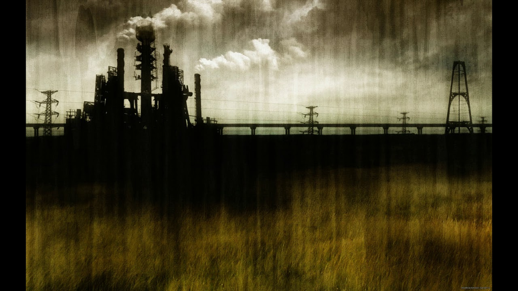
I would do a city scape something like this with your style of art though, for Harkonnen.
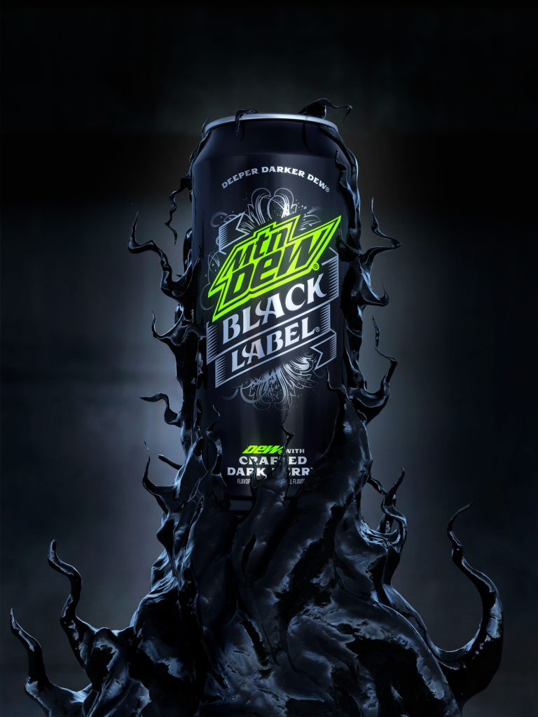
I'd do a frac or 1 with 'Juice of Sapho' again with your art but something like this
-'Now with 7% more SPICE!' (or 1 since it would be a 1 usd chip)

The hundo would be something for the Litany of fear
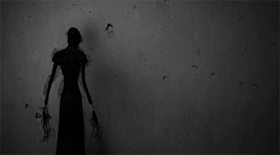
Frac would be like be something for the Fremen and blue within blue eyes, or the desert mouse
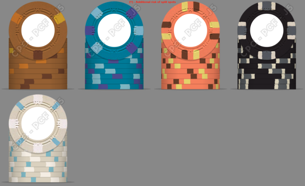
I think I would so something close to this for chip colors
I would do a city scape something like this with your style of art though, for Harkonnen.
I'd do a frac or 1 with 'Juice of Sapho' again with your art but something like this
-'Now with 7% more SPICE!' (or 1 since it would be a 1 usd chip)
The hundo would be something for the Litany of fear
Frac would be like be something for the Fremen and blue within blue eyes, or the desert mouse
I think I would so something close to this for chip colors
Last edited:
Hell yeah, I'm all about this. I definitely went more of the "subtle" route and more homage to Dunes casino, but really like where you'd take this and pull more theme out.I think I would do multiple labels, and I prefer an image on one side and a denom on the other side. I would focus on key attributes of the movie. Dune, Harkonnen, Paul or Mentat, Litany of fear, Juice of sapho..................
This is really coming along, a great design.
I do have a recommendation about the kerning of the numbers, in the $100 and $1000, the 1 looks too far away from the zeros.
And I prefer to see the $ on all the inlays to not stand above the other numbers….if you shifted that down a bit so it’s at least in line on the top with the numbers, I think it would look better.
But these are small things, it’s a great look overall.
Good calls, updated both.. will update overall mockup in a bit. Thanks!This is really coming along, a great design.
I do have a recommendation about the kerning of the numbers, in the $100 and $1000, the 1 looks too far away from the zeros.
And I prefer to see the $ on all the inlays to not stand above the other numbers….if you shifted that down a bit so it’s at least in line on the top with the numbers, I think it would look better.
But these are small things, it’s a great look overall.
Just want to say I love the idea! Looks great - personally I would stick with Dune without the ‘s’ to be closer to the book than the casino.
Following on with great interest.
Following on with great interest.
drdr
3 of a Kind
I've not ever liked the idea of murder until now. But these labels on Dunes house mold... tempting?
slimshady4239
Sitting Out
Very in for a Tina GB
elemeno
Pair
Really cool! I wonder, would you prefer “the spice must flow” or “One/Five/etc Solari”
elemeno
Pair
Also, I want to add that I really dig the non-traditional edgespots and the clean look of the current design. It’s terrific.
With that said, one complaint I see often is that we don’t take full advantage of the ceramic medium when we mimic clay edgespots. I’m only guessing, but I think it’s possible to take these chips to another level with an even more unorthodox look.
I am definitely not an artist and couldn’t have come close to what you’ve already created, which again is magnificent, so please don’t take the above as criticism. It’s just something to consider. If it’s of interest, perhaps you could draw inspiration from using google images and searching dune theme, original dune book covers, house atreides/harkonen/corrino/etc sigil, crysknife, etc.
And one last thing, one of my favorite factions in Dune is the Bene Gesserit, who caught the men of destiny in their web. I wonder if there’s something more that can be done with this notion and the web mold. (The Bene Gesserit sigil unfortunately doesn’t really match the web mold, at least to my pedestrian eye)
The Litany of fear imbodies the Bene Gesserit, the fear box, the gom jabvarAnd one last thing, one of my favorite factions in Dune is the Bene Gesserit, who caught the men of destiny in their web. I wonder if there’s something more that can be done with this notion and the web mold. (The Bene Gesserit sigil unfortunately doesn’t really match the web mold, at least to my pedestrian eye)
I like the spacing guild as well
Poker Zombie
Royal Flush
Personally, I think a Dune set should be a T10,000 tournament set, with 25/50 blinds that never increase.
It's the only way to get an accurate feel for the length.
It's the only way to get an accurate feel for the length.
Just gorgeous! I fear the 500 and the 100 are too close in color though, maybe use white for the 500 as it will never be in play with the nickel.
Similar threads
- Replies
- 0
- Views
- 144
- Replies
- 13
- Views
- 803
