10 Vegas Casino Topper + Harolds Club (1 Viewer)

GreekRedEye

Flush
Supporter
Joined
Jun 4, 2023
Messages
1,727
Reaction score
2,842
Location
Washington, D.C. area
I would like to make a custom topper that showcases 10 Vegas casinos around the outside. These would double as seating markers as well as nostalgia faire. E.g., someone draws the "Bellagio" chip they get the Bellagio seat.

This is a mockup - not a final design. There is a lot wrong here. But I think it has potential. Please, be brutal, swift, and constructive in your feedback. I don't have a lot of time to pull this together!

In the center I am thinking of doing a repeating light grey pattern made from the "short" casino logos, e.g. palm for Mirage, lamp for Aladdin, bird for Flamingo, etc.

I'm not 100% settled on the casinos - so make your case for a different lineup!
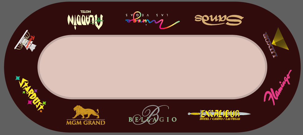
1714872588843.png
 
I like the seat position idea.

I wonder if the colors for each casino should be more muted... Have you tried making them all one color?

I like the idea overall, but I'm concerned about the entire topper getting too busy, aka a pattern of the casino logos in the center... depending on how you pull that off I'd try to ensure there isn't too much going on overall.

Other than that, you're on the right track, cool idea!

I have not tried muting the colors around the outside. I will give it a try.
In terms of the center pattern, I'm thinking something like this with casino small logos:
1714873484569.png
 
I like the monotone a LOT better. Also, I'd maybe go with white for the logos, and including your center pattern, I really like that look as it will look like a 3 color topper.
 
I agree that monotone does make things more even. If you wanted to keep the color, that’s be fine too, but I think you have to shuffle some of the logos around.

I think the logos are too large right now. In real size, I’m guessing you’re looking at 8” - 10” minimum, if not closer to 12”. I think 6” is the biggest you’d want to go. Give them some room to breathe, especially if you’re putting smaller visual representations n the diamond pattern of the field
 
I would like to make a custom topper that showcases 10 Vegas casinos around the outside. These would double as seating markers as well as nostalgia faire. E.g., someone draws the "Bellagio" chip they get the Bellagio seat.

This is a mockup - not a final design. There is a lot wrong here. But I think it has potential. Please, be brutal, swift, and constructive in your feedback. I don't have a lot of time to pull this together!

In the center I am thinking of doing a repeating light grey pattern made from the "short" casino logos, e.g. palm for Mirage, lamp for Aladdin, bird for Flamingo, etc.

I'm not 100% settled on the casinos - so make your case for a different lineup!

View attachment 1323907
I like it a lot and I like the colors. Have you thought about positioning casinos in their relative locations on the strip? South on one side, center strip casinos in the middle, then north strip on the other side. Something like this (starting from where you currently have Tropicana and continuing clockwise):

Luxor
Excalibur
bellagio
mirage
Circus circus
Sahara
Flamingo
Paris
Mgm
Tropicana

Something like this would even capture which side of the street the casino is on.
 
I agree that monotone does make things more even. If you wanted to keep the color, that’s be fine too, but I think you have to shuffle some of the logos around.

I think the logos are too large right now. In real size, I’m guessing you’re looking at 8” - 10” minimum, if not closer to 12”. I think 6” is the biggest you’d want to go. Give them some room to breathe, especially if you’re putting smaller visual representations n the diamond pattern of the field
You have a good eye there. The Bellagio is 12" x 5". I will try reducing the size.

I like it a lot and I like the colors. Have you thought about positioning casinos in their relative locations on the strip? South on one side, center strip casinos in the middle, then north strip on the other side. Something like this (starting from where you currently have Tropicana and continuing clockwise):

Luxor
Excalibur
bellagio
mirage
Circus circus
Sahara
Flamingo
Paris
Mgm
Tropicana

Something like this would even capture which side of the street the casino is on.
That is a super cool idea. And one I would have never thought of - I'm not familiar enough with LV.

So, you are saying Luxor in the spot were Tropicana is now, the Excalibur where Aladdin is, etc., correct?

I'm happy to add CC, Sahara, and Paris. But I'd be sad to lose Aladdin (such a great logo), Stardust, and Sands. Hey, maybe I put them in the center, very lightly showing. Like the ghosts of fallen casinos?
 
here are a couple of printed cloths to give you an idea of how they look in real life.
i've tried a vegas colored inside my felt.
But I made real size tests and chips where "lost" by the colors. It was beautiful but unplayable.
I finally made the inside B&W/greyish.

So my advice is to do a real size print in A3 and try your chips & cards & dealer on it. You'll certainly see that it doesn't work with your chips/cards/dealers.

Too bad because it makes beautiful felt :oops:
 
Anyone have a good vector of the Tropicana fountain? Mine kind of sucks.

In the center I might do a repeating pattern of small, light colored pattern made from Casino names. That'd allow me to give tribute to a whole host of places.
1714913525780.png
 
i've tried a vegas colored inside my felt.
But I made real size tests and chips where "lost" by the colors. It was beautiful but unplayable.
I finally made the inside B&W/greyish.

So my advice is to do a real size print in A3 and try your chips & cards & dealer on it. You'll certainly see that it doesn't work with your chips/cards/dealers.

Too bad because it makes beautiful felt :oops:

Thanks for the tip. After sleeping on it, I woke up really liking the gold gradient look. So I'm going with it.

If anyone has vectors of any classic Vegas casino not already included (Dunes, Landmark, etc. etc.), I'd appreciate you passing them to me. I am going to try a repeating pattern of these other logos in the center, about 2 inches across each.

I intend to make this design available for others to order, if @rjdev7 wants it.
 
I like your gold gradient as well. Your render from yesterday looks really classy.
Thanks. @MrRossKeys
@wonderpuddle I took your advice.

I am pretty happy with this. I'm going to put the order in tomorrow or day after. So, please, let me know if you see an error or have suggestions.

1714967184962.png


Close up of the patterns. I could have vectorized more logos, but I am running out of steam and time.

1714967398885.png
1714967424687.png
 
Fabulous!

The only thing I would change (if it were me) would be to make the "East Side of Strip" etc text smaller. When the felt prints out everything is much larger, and I feel like that text will be pretty big and in your face.. If you love it I like it, so... not a big deal....

Great work!
 
Love the idea! Hate the monochrome logos. They need to be in the actual colors of the casino logos like the first pic. They looked great on Bills felt with the grey racetrack. They don't look as good on yours because of the maroon racetrack.

Are you doing this as your personal topper, or a group buy? If a GB I may be interested. If not, then ignore my thoughts and make it the way you want it.
 
Fabulous!

The only thing I would change (if it were me) would be to make the "East Side of Strip" etc text smaller. When the felt prints out everything is much larger, and I feel like that text will be pretty big and in your face.. If you love it I like it, so... not a big deal....

Great work!
Good suggestion. I had it at 80 pt font! I put it all the way down to 36 font, which will still be very large.

Here are some variations:
1714991997563.png


1714994246141.png


1714994219562.png
 
Love the idea! Hate the monochrome logos. They need to be in the actual colors of the casino logos like the first pic. They looked great on Bills felt with the grey racetrack. They don't look as good on yours because of the maroon racetrack.

Are you doing this as your personal topper, or a group buy? If a GB I may be interested. If not, then ignore my thoughts and make it the way you want it.
See my previous post - I did a variation with color back in.

This is a personal topper. But I'm happy to let others use it. I'm going to keep tweaking it tonight and then I'll order tomorrow. If it comes out well, then folks can have at it. I'm still unsure whether to go with gold gradient or colors.
 
I'm still unsure whether to go with gold gradient or colors.
To my taste i find the #1 & #2 more classy/elegant. Really great design you've done.

The #3 colored version seems more like a patchwork and colors do not add any beauty or informations. Logos monocolor are strong by themselves.
Just my taste, I like minimal.
 
And for the seat draw, you have to find a chip from each casino and let them blindly choose it.
Seat draw process will be really classy even if PCF players can identify chips by touching them.

Or may be cards (?) and let people choose between ten :as: from ten decks from those ten casinos
 

Create an account or login to comment

You must be a member in order to leave a comment

Create account

Create an account and join our community. It's easy!

Log in

Already have an account? Log in here.

Back
Top Bottom