So let's say... my friend, ReallyGreatUsername, wants to know the difference between a "Missed Blind" and "Small/Big Blind" button? I'm going to figure my friend also doesn't fully understand a Kill button. Thanks!I'm doing:
Missed blind - 50mm dark blue
Small and big - 45mm light blue and rose/red
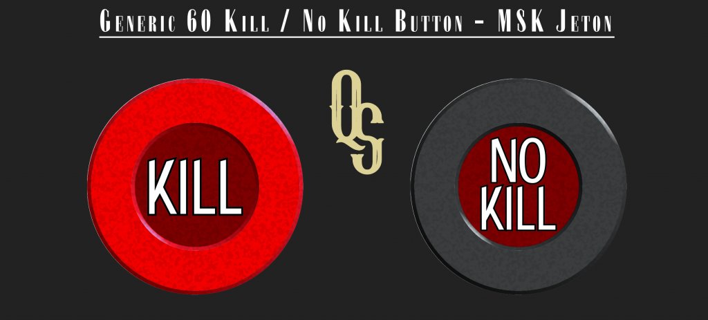
Kill - 60mm dark red
All In - bright yellow
You are using an out of date browser. It may not display this or other websites correctly.
You should upgrade or use an alternative browser.
You should upgrade or use an alternative browser.
Accessory Button Poll - Kill/All-in/Missed Blind/Rabbit Hunt/Time (1 Viewer)
- Thread starter Quicksilver-75
- Start date
- Status
- Not open for further replies.
Quicksilver-75
4 of a Kind
Missed blind goes down Infront of an absent player. When he returns he has to pay the blinds that he missed.
Small and big I would never use. That simply move around the table with the dealer button. Good for new players, otherwise just table junk..
Kill and half kill go as such. A full kill will double the blind on the next hand. In limit hold'em at say a $2-5 the next hand on a pot that goes over a limit, say $50, will double to $5-10.
Half kill is the same thing except it make a 2-4 go to 3-6 rather than 4-8
Geremie
Full House
How about a rebuy/add-on Button?
Quicksilver-75
4 of a Kind
I'll work on a showem chip today if I get the chance. Any color in particular? Size? I was thinking either 45-50mm for an MSK or 49mm for the ceramic.Would be cool to see a show ‘em chip too.
Quicksilver-75
4 of a Kind
Size? Color? Medium preference, MSK or Ceramic?How about a rebuy/add-on Button?
Quicksilver-75
4 of a Kind
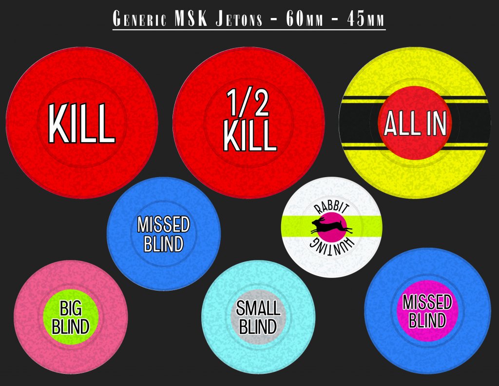
Here are some MSK mocks. Let me know if you want to alter colors. I really want to try to narrow down some options and move from the discussion stage.
moose
4 of a Kind
The kill and 1/2 kill need to say no kill on the other side
The dealer button should be integrated with the high low button.
Quicksilver-75
4 of a Kind
If there's no kill, wouldn't you just not use the button at all?The kill and 1/2 kill need to say no kill on the other side
Pocketful of Aces
Pair
The big blind looks nice, great contrast.
The small looks a little out of place color wise, I think it's just the gray label.
If possible can we try another label color, maybe purple or orange?
The hi/lo's looks nice.
The missed blind looks great.
The all ins look pretty nice too.
The small looks a little out of place color wise, I think it's just the gray label.
If possible can we try another label color, maybe purple or orange?
The hi/lo's looks nice.
The missed blind looks great.
The all ins look pretty nice too.
Quicksilver-75
4 of a Kind
For sure. The center of the MSK small blind will be much whiter than I can recreate here.The big blind looks nice, great contrast.
The small looks a little out of place color wise, I think it's just the gray label.
If possible can we try another label color, maybe purple or orange?
The hi/lo's looks nice.
The missed blind looks great.
The all ins look pretty nice too.
But a different color is easy enough.
Quicksilver-75
4 of a Kind
Pocketful of Aces
Pair
Lookin good  , truthfully I wouldn't mind if both sb and bb buttons had a green inlay, it just pops! They both have very specific primary colors so I don't think anyone would confuse them.
Quicksilver-75
4 of a Kind
This thought crossed my mind as I was placing them on the canvas.Lookin good, truthfully I wouldn't mind if both sb and bb buttons had a green inlay, it just pops! They both have very specific primary colors so I don't think anyone would confuse them.
Pocketful of Aces
Pair
I might be in the minority on this, but I favor the initial color for the bb.
It was an aesthetic match to the turquoise blue of the sb.
It was an aesthetic match to the turquoise blue of the sb.
Geremie
Full House
50mm MSK? Some sort of dual color?Size? Color? Medium preference, MSK or Ceramic?
moose
4 of a Kind
If there's no kill, wouldn't you just not use the button at all?
Because the no kill side serves the same purpose of a leg up button which other people have asked for but is more generic. The no kill side can be used in hi/lo games to show that the kill is off and also given to the player who has the leg up in games where the kill is established by winning two pots in a row. But a leg button is meaningless is split pot games where the kill is established by a scoop.
https://www.pokernews.com/pokerterms/leg-up.htm
Personally I don't think a half kill button is necessary because if you are running a game with a kill it won't ever switch between a half and a full kill so simply "kill" is sufficient.
Quicksilver-75
4 of a Kind
Update:
Here is a pic show of the various buttons thus far. I want to start a BUY page but want to get some final feedback on options, colors and anything I missed.
Ceramic options:


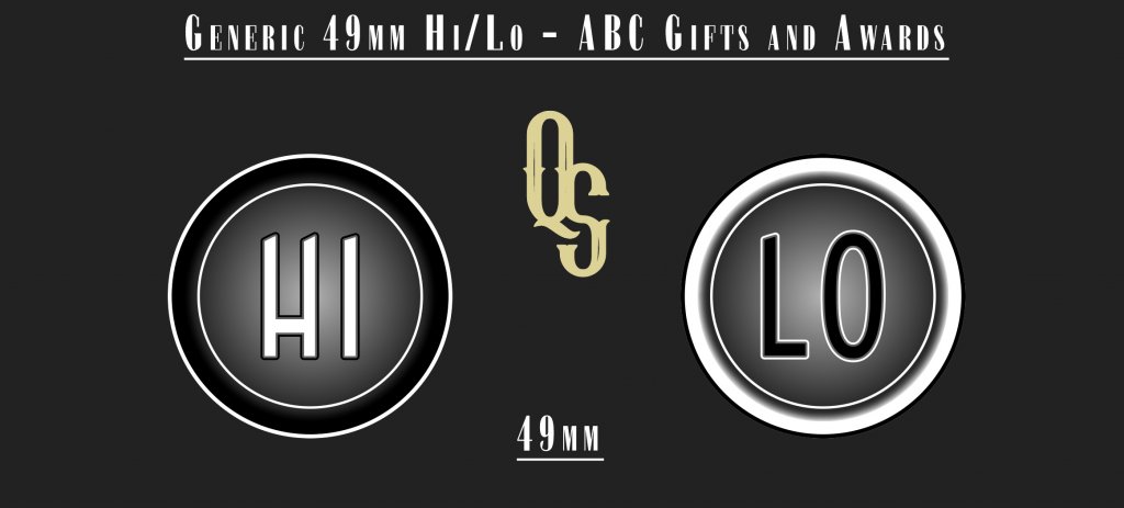
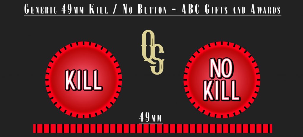
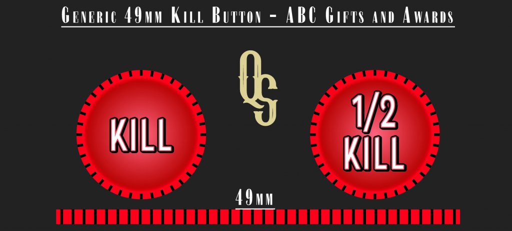
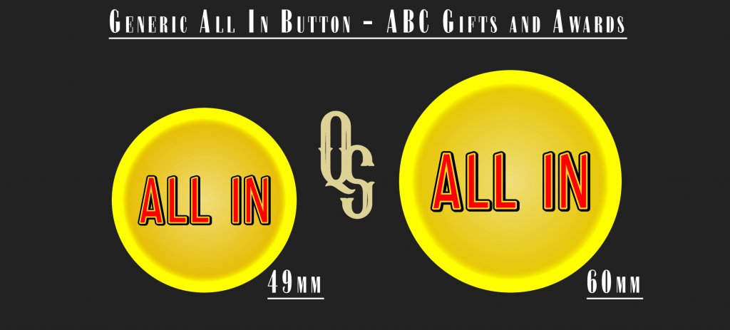
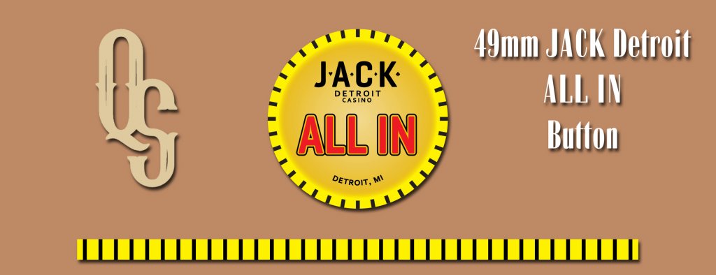
MSK Jetons
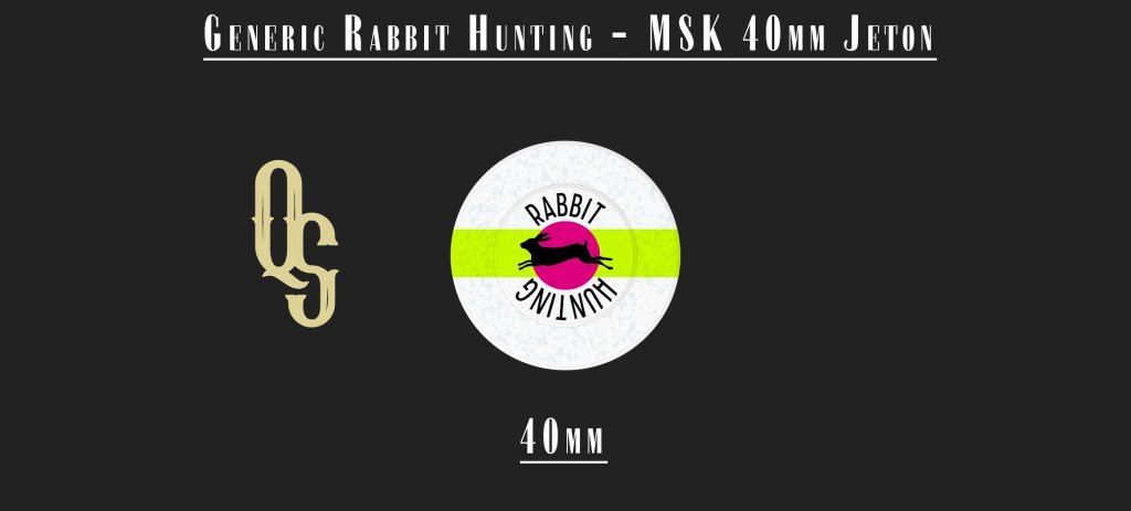
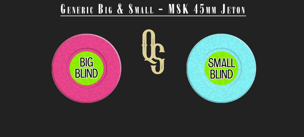
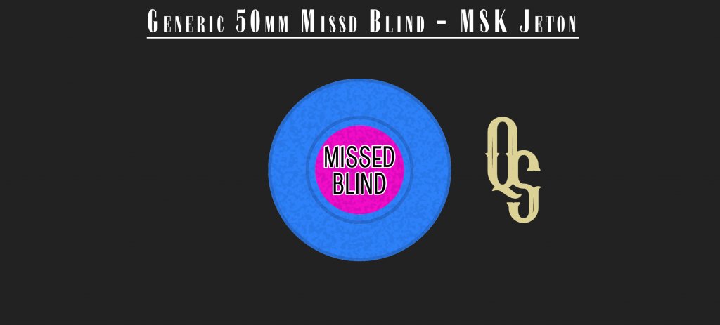
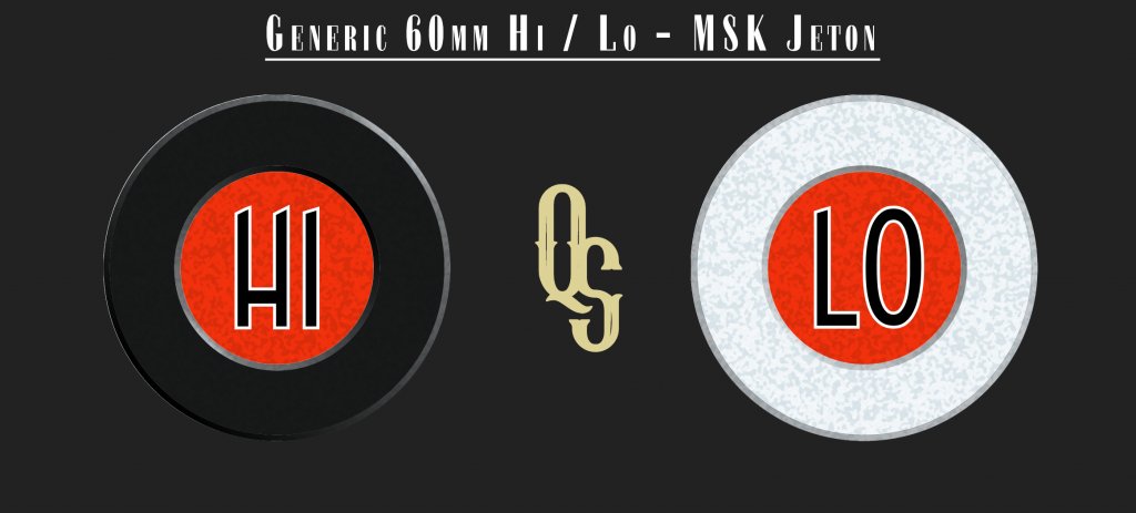
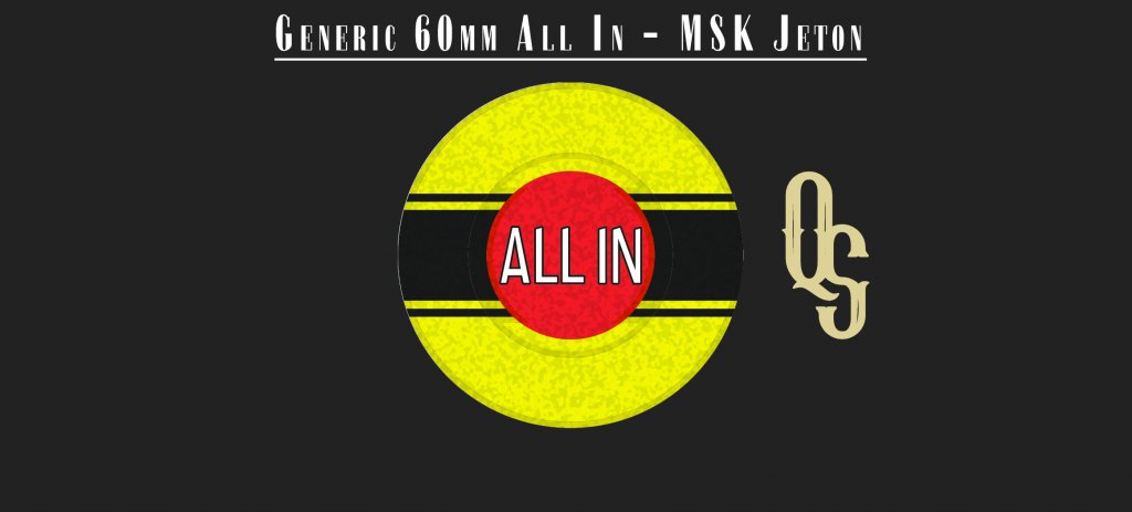
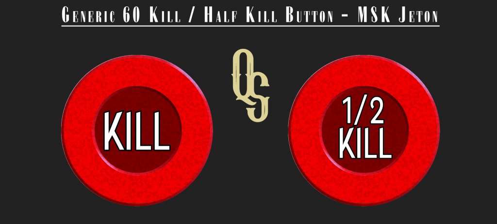

Here is a pic show of the various buttons thus far. I want to start a BUY page but want to get some final feedback on options, colors and anything I missed.
Ceramic options:
MSK Jetons
Last edited:
Forty4
Full House
Would it be possible to get a 50mm MSK all in? Just feels like 60 is too big IMO.
Quicksilver-75
4 of a Kind
So I'll do a 50mm option and 60mm option. No problem. I've been told there isn't a minimum and no artwork fees/set up fees. So both shouldn't be an issue.
Quicksilver-75
4 of a Kind
The 50 would have to be 51mm. My bad.
Size options:
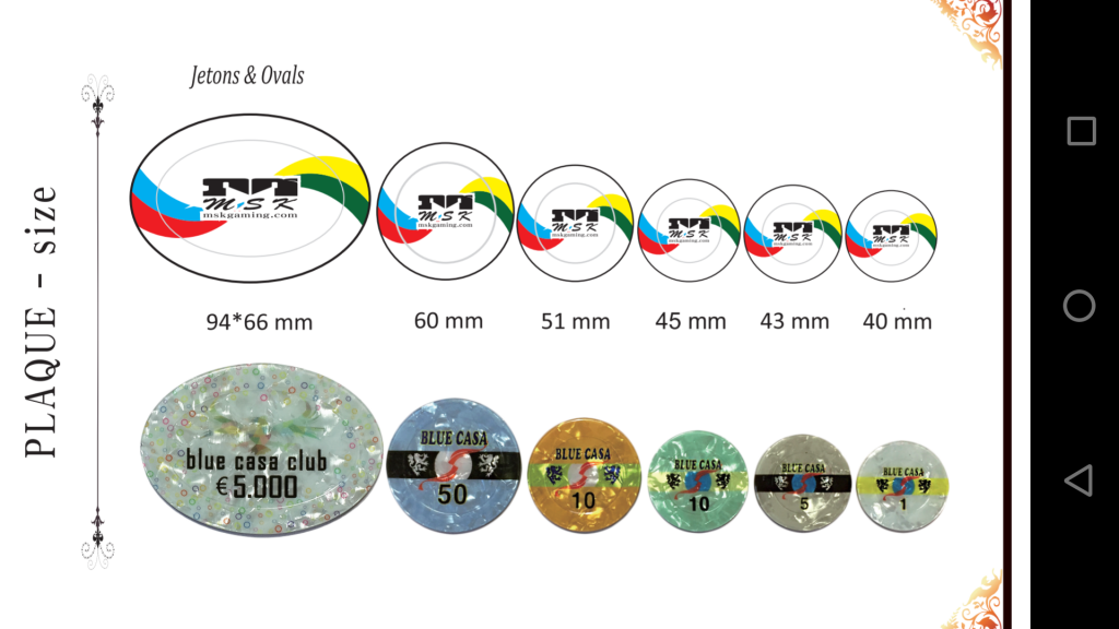
Size options:
Forty4
Full House
Looking at the MSK literature makes it feel like we are missing out on an opportunity to do something really unique. Not super specific but more in lines with the rabbit hunting chip, a graphic and brighter colors, maybe even some swirl effect as we flush our money all in.
I know it’s generic and basic, also not being critical just feel way more potential.
I know it’s generic and basic, also not being critical just feel way more potential.
Quicksilver-75
4 of a Kind
I feel you. Problem is, when I try to cater to the masses the options keep getting broken down until we have 20 different options that only a few will select from. The ceramic options have largely been tailored to specific tastes.Looking at the MSK literature makes it feel like we are missing out on an opportunity to do something really unique. Not super specific but more in lines with the rabbit hunting chip, a graphic and brighter colors, maybe even some swirl effect as we flush our money all in.
I know it’s generic and basic, also not being critical just feel way more potential.
While the MSK options are very plain they will look very appealing having their marble effect show through. My mockups can't possibly do them justice.
The jetons/buttons being what they are, IMO don't need to have any flair. And if I do add some effect like a gradient my other fear is that I run the risk of having them look too alien to the various chip collections. Even just the font can't dictate whether they'll work on highly themed sets and tables.
Geremie
Full House
Can we get a reload/rebuy 51mm MSK similarto the rabbit hunting design?
krafticus
Straight Flush
Do we know approx. cost on these?
moose
4 of a Kind
Can the no kill side be a different colour like the black/white Hi/Lo button?
Quicksilver-75
4 of a Kind
Yup. Although I don't have the pricing for the 40mm or 43mm jetons....Do we know approx. cost on these?
MSK pricing -
45mm - $3.46/
51mm - $4.70/
60mm - $4.70/.
No difference from 51-60mm
Quicksilver-75
4 of a Kind
Any color in kind?Can the no kill side be a different colour like the black/white Hi/Lo button?
- Status
- Not open for further replies.
Similar threads
- Replies
- 62
- Views
- 5K
- Replies
- 302
- Views
- 28K
