-
This site contains affiliate links. If you choose to make a purchase after clicking a link, Poker Chip Forum may receive a commission at no additional cost to you. Thank you for your support!
You are using an out of date browser. It may not display this or other websites correctly.
You should upgrade or use an alternative browser.
You should upgrade or use an alternative browser.
Artwork discussion for new Paulson chips (2 Viewers)
- Thread starter Apache
- Start date
BeagleStorm
Pair
I'm happy with all of them except the last monopoly looking set. But my favorite........ hummmm
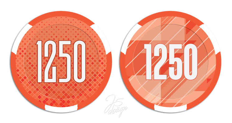
I like the 3rd Modern simple looking one the best if the value text is added around the edge like the 2nd group . Next would be the 2nd group top right white and orange one, but I think it will be too busy will all the others looking similar.
I like the 3rd Modern simple looking one the best if the value text is added around the edge like the 2nd group . Next would be the 2nd group top right white and orange one, but I think it will be too busy will all the others looking similar.
Last edited:
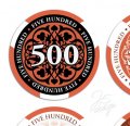
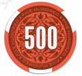
I’m a fan of the second set with the text around the perimeter.
RichMahogany
Straight Flush
Second set with the black and orange inlays is tops for me
Psypher1000
Straight Flush
Favorite is easily second set of images, top left.
Second place is the Apache Poker with the text around the circumference (although I wouldn’t mind seeing the other Apache Poker concept with a black outer ring instead of white).
Third would be the “monopoly” set, maybe using a different symbol with each denom. If choosing a static symbol then I like the FDL, the Horseshoe, or the Apache logo.
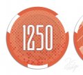
I lol’d at the use of 1250 for a denom. I understand why it was done, but that just caught me off-guard.
beefsack
High Hand
RowdyRawhide
Full House
Favorite is easily second set of images, top left.
Second place is the Apache Poker with the text around the circumference (although I wouldn’t mind seeing the other Apache Poker concept with a black outer ring instead of white).
I'll second this
justsomedude
Straight Flush
Want!!
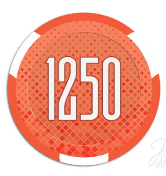
Might be an idea to combine the top two in the second picture by keeping the white larger circle with black text in it and then use the orange/black circle from he left side with the 500 that has the black outline so it pops. ?
Like all of them - love the second set, both the top left and right. Maybe use both on the same chip, one on each side?
Far and away; the Apache themed design (y) :thumbsup:
justsomedude
Straight Flush
View attachment 155396
I might switch my vote to this design with a thicker font like impact
Or maybe Futura BQ DemiBold.
Right, @Tommy??
One Eyed Dollar
Flush
I lean towards the first row because the denom doesn't overlap with the design, so it's easier to read.
Shaggy
Full House
FDLmold
Royal Flush
Apache Poker
JTBass
3 of a Kind
second set top left.
Rhodeman77
Straight Flush
These two look great. Agree that since all the edge spot are the same size and color that the face needs to be color matching/gradient to the base color to help tell the difference in splashed pots.
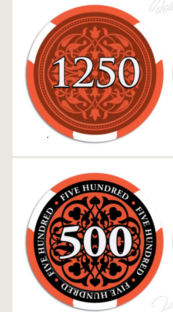
Hands down....Apache design
links_slayer
4 of a Kind
Well this should be easy 

One Eyed Dollar
Flush
So many choices... maybe this calls for some brackets like March Madness instead of a simple poll?
BeagleStorm
Pair
I originally did not like the idea of text around the edge but now I think adding it would really add useful interest to #3 without being distracting to the denomination.
Last edited:
Similar threads
- Replies
- 99
- Views
- 3K
- Replies
- 4
- Views
- 506
- Locked
- Replies
- 7
- Views
- 535
- Replies
- 17
- Views
- 922

