-
This site contains affiliate links. If you choose to make a purchase after clicking a link, Poker Chip Forum may receive a commission at no additional cost to you. Thank you for your support!
You are using an out of date browser. It may not display this or other websites correctly.
You should upgrade or use an alternative browser.
You should upgrade or use an alternative browser.
CAN/US custom 39mm Cards Mold small GB - Production completed (4 Viewers)
- Thread starter Raphmivey
- Start date
RunForestRun
High Hand
vanislander
Pair
The art is built for 43mm plain and they look great. If you switch to cards mold the inlay circle is going to cut through your text at varying points. +1 for plain mold hereI’m sure they’ll be great. However, I loved how the cards mold perfectly captures the feel of the original Palms’ giant inlays on RHC. Are you not doing the microstakes cash set?
200 Motels
Flush
Ugg a lot of the detail on my inlay isn't visible, like there's color bleed on the blacks or something. May have to update the design unless the manufacturer can adjust this.
vanislander
Pair
Make the text bold. I had the same problem on wacky shack v1. Omit the fish bones. These chips are 39mm wide putting those bones at fraction of a mm. They never had a chanceUgg a lot of the detail on my inlay isn't visible, like there's color bleed on the blacks or something. May have to update the design unless the manufacturer can adjust this.
200 Motels
Flush
I'm thinking if the black inlay became a dark grey, it may make the details more visible. I reached out to the designer. I also have to make a few color adjustments to the edge spots.Make the text bold. I had the same problem on wacky shack v1. Omit the fish bones. These chips are 39mm wide putting those bones at fraction of a mm. They never had a chance
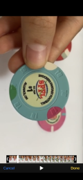
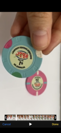
Greatful for these sample vid.
Ok I will request them to use the same grey I think they can do it without problem. I'm not sure if it is the same grey on the chips... @200 Motels is it the same grey for the two grey chips?As for risking it i'm cool to gamble the rest of the set looks great!
doing both in 43mm normally, but cash samples were done on the 39mm only as opposed to the tourney set samples that were done on both the 39mm and 43mm. I agree with you about the feel of the original Palms, but this recessed circle is annoying for the design. Thoughts?I’m sure they’ll be great. However, I loved how the cards mold perfectly captures the feel of the original Palms’ giant inlays on RHC. Are you not doing the microstakes cash set?
200 Motels
Flush
The grey on my 25c and T5k are both Grey 3 on the Bosco samples.Ok I will request them to use the same grey I think they can do it without problem. I'm not sure if it is the same grey on the chips... @200 Motels is it the same grey for the two grey chips?
lol!!! good catch. I bet it's an error for samples but I'll make sure they don't do the same mistake on the real ones. I will let them know tonight for sure.Only issue I have is with my $1. The image on the back side of the chip is off. It is reversed somehow
View attachment 617441View attachment 617440
I definitely see that on the All-in and Show ‘Em chips. I didn’t notice it on the cash value chips till I looked more closely. Maybe just shrink the center part of the design so nothing crosses the ring?doing both in 43mm normally, but cash samples were done on the 39mm only as opposed to the tourney set samples that were done on both the 39mm and 43mm. I agree with you about the feel of the original Palms, but this recessed circle is annoying for the design. Thoughts?
Yeah I though about replacing CANADA by QC which would solve the problem (QC is the state FYI instead of country) and making the POKER word slightly smaller. I really like that option too but then I still have recessed area that is not ideal... thoughts? it's really worth it you think?I definitely see that on the All-in and Show ‘Em chips. I didn’t notice it on the cash value chips till I looked more closely. Maybe just shrink the center part of the design so nothing crosses the ring?
SHOW EM and ALL-IN chips are going on 43mm that is for sure anyways. most probably the tourney set as well
PlayerADK
Flush
I trust that the white will look fine, I just want to make sure that it doesn't get lost in the sea of artwork that they have and accidentally print the original yellow.up to you I will mention the edge spot do not worry. Do you need to see samples? I don't want to delay the process white is white but if you need some I will.
I would appreciate a quick sample of the new chip if it's not too much of a hassle
I was just so enamored by the way they replicated the feel of the originals, with the colors, and how edge of the inlay going through the cards recesses, that I didn’t really notice the little details. In the end, if the ring is going to bother you, you should do the plain mold. Either way, they’re going to look great.Yeah I though about replacing CANADA by QC which would solve the problem (QC is the state FYI instead of country) and making the POKER word slightly smaller. I really like that option too but then I still have recessed area that is not ideal... thoughts? it's really worth it you think?
SHOW EM and ALL-IN chips are going on 43mm that is for sure anyways. most probably the tourney set as well
My role is to make everyone here happy so yes I can do that. The truth though is that the best way to avoid accident is a new .ai file. If that is what you are going for, avoid accident, I would go with that option.I trust that the white will look fine, I just want to make sure that it doesn't get lost in the sea of artwork that they have and accidentally print the original yellow.
I would appreciate a quick sample of the new chip if it's not too much of a hassle
ahah the truth is I had the same reaction as you! (it was a surprise as I did not expect to see them on that mold, there were supposed to be on 43mm mold) now I'm debating so I really like your inputs!I was just so enamored by the way they replicated the feel of the originals, with the colors, and how edge of the inlay going through the cards recesses, that I didn’t really notice the little details. In the end, if the ring is going to bother you, you should do the plain mold. Either way, they’re going to look great.
Fwiw I think the aquarium logo is dope.Ugg a lot of the detail on my inlay isn't visible, like there's color bleed on the blacks or something. May have to update the design unless the manufacturer can adjust this.
I agree! I love it as wellFwiw I think the aquarium logo is dope.
bounty is meant to go on the 43mm
200 Motels
Flush
Is the manufacturer able to make the following changes? If not, I'll see if the designer can.
1) Make the inlay a lighter black or dark grey so in an attempt for the details to show up? It would appear that the Bosco design samples don't have this kind of black color bleed. Perhaps Black 8 or 4.
2) T100 - Can the lightest pink (which is Pink 8) become lighter, perhaps pink 3 or 4.
3) T1000 - Can the blue edges are currently blue 7, blue 4, blue 2. Could this become blue 8, blue 1, blue 2?
4) T5000 - The black and dark brown are too similar. Could the edge spot go black 3, orange 7, orange 6?
5) Bounty - The Dark green seems too dark and the mid green is too close to the base color, Could they please select 3 greens that would show up nicely in a similar way that the T500 does. A nice gradient. Perhaps green 2, green 8 and grey 1.
Thanks.
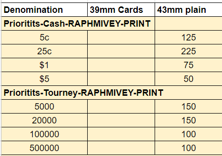
getting samples is way different than the real deal. it's not as organized. You are sending designs at different date etc. I am sending the files to them no going into the individual chip details. I say this artwork file on poker mold (cards mold from their perspective), this artwork file on 43mm, etc. When placing the order it will be much more organized. It will be with the excel files and everything, like this:

vanislander
Pair
Guys, I have to step in an be the bad guy for a minute. If you want a different design, change your artwork file. If you cant do it, pay someone to do it asap. We're well past the artwork deadline and several people are asking @Raphmivey to ask a chinese printing company to make structural changes to their design, in a different language, with no benchmarks. This isnt the right way to do this. I'm not intending to speak for @Raphmivey but I'm quite certain he volunteered to do this because he wanted some chips, not because he wanted to manage the ever changing requests of 20 ppl.
I think that would be too many changes. Can you have a new ai file?Is the manufacturer able to make the following changes? If not, I'll see if the designer can.
1) Make the inlay a lighter black or dark grey so in an attempt for the details to show up? It would appear that the Bosco design samples don't have this kind of black color bleed. Perhaps Black 8 or 4.
2) T100 - Can the lightest pink (which is Pink 8) become lighter, perhaps pink 3 or 4.
3) T1000 - Can the blue edges are currently blue 7, blue 4, blue 2. Could this become blue 8, blue 1, blue 2?
4) T5000 - The black and dark brown are too similar. Could the edge spot go black 3, orange 7, orange 6?
5) Bounty - The Dark green seems too dark and the mid green is too close to the base color, Could they please select 3 greens that would show up nicely in a similar way that the T500 does. A nice gradient. Perhaps green 2, green 8 and grey 1.
Thanks.
Pinesol13
Flush
If anyone has basic changes that need to be made, like changing colors or bolding text, PM me I can get it done today
Pinesol13
Flush
Btw, am I the only nutjob who's already thinking about their next order? I CAN'T STOP!!

vanislander
Pair
Not a single bathroom fixture?Btw, am I the only nutjob who's already thinking about their next order?I CAN'T STOP!!
View attachment 617590
I actually love this. You have some serious skills.Btw, am I the only nutjob who's already thinking about their next order?I CAN'T STOP!!
View attachment 617590
Pinesol13
Flush
Not a single bathroom fixture?
After two tournament sets, three cash sets, a limit set, and a variety of buttons I think it's time to diversify
Pinesol13
Flush
I actually love this. You have some serious skills.
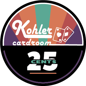
Thanks! Although I "borrowed" the denomination design for the China Club design.
This one came about b/c I was talking with a coworker about old tv shows, like the brady bunch and partridge family. I wanted to try to come up with something that used some "retro" colors.
still playing around with it. Trying to think of something to balance out the space on the bottom half. Don't love my purple rings.....
Similar threads
- Replies
- 295
- Views
- 14K
- Replies
- 163
- Views
- 19K
- Replies
- 290
- Views
- 28K
- Replies
- 182
- Views
- 15K


