Yes I have yours and it will get done after the weekendGotcha just curious to make sure mine was in there
-
This site contains affiliate links. If you choose to make a purchase after clicking a link, Poker Chip Forum may receive a commission at no additional cost to you. Thank you for your support!
You are using an out of date browser. It may not display this or other websites correctly.
You should upgrade or use an alternative browser.
You should upgrade or use an alternative browser.
CAN/US custom 39mm Cards Mold small GB - Production completed (4 Viewers)
- Thread starter Raphmivey
- Start date
your a very kind man thanks!Yes I have yours and it will get done after the weekend
Is this better for the $1For my sffl design. The spot on the quarter 5 and 1000 are all light blue. And the base color of the one is light blue as well. I’ve attached the file for reference. The orange should be a lot brighter also.
RunForestRun
High Hand
Much. Was it just lighting? Or a new print
I had them adjust the color and do a new printMuch. Was it just lighting? Or a new print
No payment yet I hope to have all samples first unless someone wants to skip samples. I won’t pay until order is placed. What I don’t wNt to happen is have this drag out for months making revisions. These guys are pretty good about getting samples done pretty quick
RunForestRun
High Hand
I am adding a yellow $5 to my order. Hopefully I’ll have it soon.
RunForestRun
High Hand
No. Adding a second $5
RunForestRun
High Hand
There will be a cash set consisting of the quarter one yellow five and twenty. The red 5 goes with the tournament set
For those of you using the cards mold, is it your intention to have the inlay print so much smaller than the embossed circle? My first test print looked like these too, so I had @timinater increase the size of the inlay from 22mm to 24mm so it would almost fill the circle.
I’m torn here - in a perfect world yes.For those of you using the cards mold, is it your intention to have the inlay print so much smaller than the embossed circle? My first test print looked like these too, so I had @timinater increase the size of the inlay from 22mm to 24mm so it would almost fill the circle.
But with a larger size inlay then we run the risk of the slight off-centered-ness missing the embossed circle and really looking goofy?
I currently have about half of my set in hand. Have looked at over 250 of them. No issues. All are very well centered with no overlap of the embossed circle, which is 25mm. Also, I believe @SeanGecko has thousands of these with 24mm printed inlay. I don't think he has had this issue either.I’m torn here - in a perfect world yes.
But with a larger size inlay then we run the risk of the slight off-centered-ness missing the embossed circle and really looking goofy?
Ahhh, bigger-but not in attempt to fill the entire thing. Yes I agree that looks better.@DLManiac I just looked through a bunch and this was the worst one I could find. Off center is noticeable at magnification, but only if you're looking for it otherwise.
View attachment 611609
Yes. Embossed circle is 25mm. My inlay is 24mm. This is what Tim suggested to both Sean and me. It looks great!Ahhh, bigger-but not in attempt to fill the entire thing. Yes I agree that looks better.
blackhole
Pair
Artwork sent. Hope everything is ok...
For some reason I wasn't getting notifications on this thread
The red JB quarter is a little light, almost bright red, not sure if it could be a shade darker?
These are looking awesome. The blue on the BF 1 is darker than I thought, but think it looks good.
The red JB quarter is a little light, almost bright red, not sure if it could be a shade darker?
mnebesny
Flush
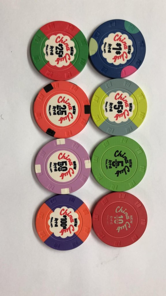
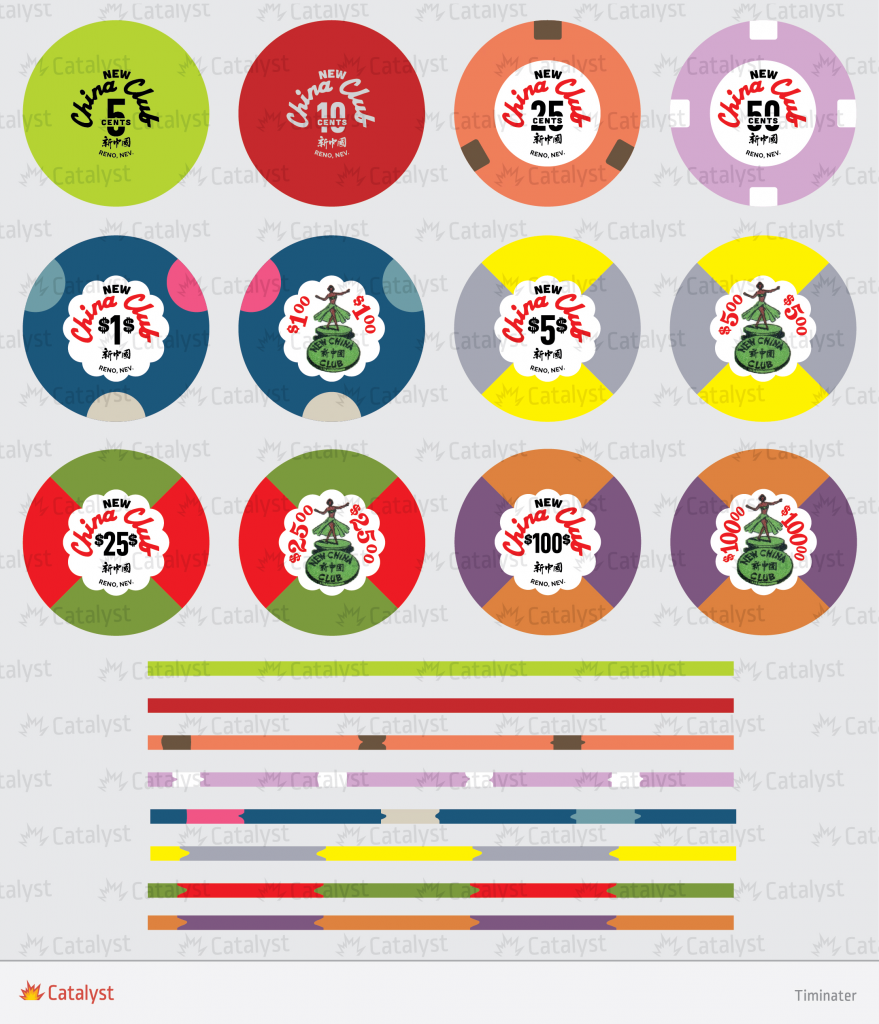
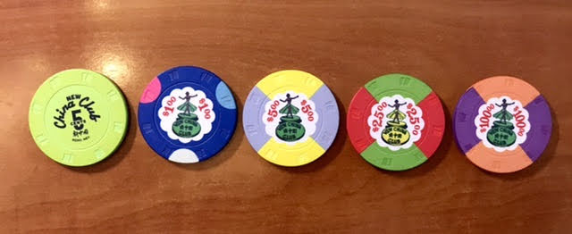
I wasn't thrilled with how some of the colors came out on my samples. I've gone through and compared with the art and some photos from the previous group buys. I'm not sure how much control the factory has over the colors, if they're just going off the art, or why they'd different from the previous group buy prints.
All the other chips look amazing
Factory samples (not my photo):

Art from @timinater :

Previous group buy (not my photo):

- In the $1 chip, the is significantly darker and less vibrant, the blue spot is much greener than I would have liked, and the grey spot is very yellow
- In the 5c chip, the green is darker and less lime/yellowey
- In the 10c chip, the text is very green/olive colored and not so much grey
All the other chips look amazing
Factory samples (not my photo):
Art from @timinater :
Previous group buy (not my photo):
I wonder if it's mostly lighting / photography. Even the white background on the inlays in the first pic are very dull. And the yellow on the $5 chip looks like the lime green color that the 5 cent chip should be. And the purple on the $100 looks dark blue. I think they are ALL off.I wasn't thrilled with how some of the colors came out on my samples. I've gone through and compared with the art and some photos from the previous group buys. I'm not sure how much control the factory has over the colors, if they're just going off the art, or why they'd different from the previous group buy prints.
I'm not sure if it's possible to correct any of that, but it would be great if so.
- In the $1 chip, the is significantly darker and less vibrant, the blue spot is much greener than I would have liked, and the grey spot is very yellow
- In the 5c chip, the green is darker and less lime/yellowey
- In the 10c chip, the text is very green/olive colored and not so much grey
All the other chips look amazing
Factory samples (not my photo):
View attachment 611969
Art from @timinater :
View attachment 611970
Previous group buy (not my photo):
View attachment 611971
mnebesny
Flush
That's what I was thinking, but wasn't really sure. Now that you mention it, everything seems skewed in the same direction. Like everything just seems greener. I actually went back and looked at some of the other samples, and they seem greener too, like the inlays here:I wonder if it's mostly lighting / photography. Even the white background on the inlays in the first pic are very dull. And the yellow on the $5 chip looks like the lime green color that the 5 cent chip should be. And the purple on the $100 looks dark blue. I think they are ALL off.
I'm assuming that the pictures were taken by the manufacturer and that we don't actually have the samples in hand?
PlayerADK
Flush
Marius L
4 of a Kind
Sorry, I haven't been following this specific thread. Those last pictured palms seems to have the cards mold. Are they really 43mm?
PlayerADK
Flush
Could I request that we change the yellow edge spots on the 25cent chip to white please?It depends if I can properly comnunicate what needs changed. For the Apple I was able to tell them the $1 should be a lighter blue.
I was hoping for a brighter contrast but I was also expecting this to be difficult to attain.
I'm loving the rest of them!
same question here. is it really 43mm? a cards mold 43mm? it was intended to be on a plain textured 43mm blankSorry, I haven't been following this specific thread. Those last pictured palms seems to have the cards mold. Are they really 43mm?
the green chip is amazingCould I request that we change the yellow edge spots on the 25cent chip to white please?
I was hoping for a brighter contrast but I was also expecting this to be difficult to attain.
I'm loving the rest of them!
View attachment 612070
Similar threads
- Replies
- 284
- Views
- 26K
- Replies
- 157
- Views
- 12K
- Replies
- 85
- Views
- 8K
- Replies
- 249
- Views
- 24K
