So, here’s the story of my plaque journey. Not the first, or last one, but one I'm very happy about!
It all started with me wanting to organize a yearly Casino Royale poker night with my group. I started with the chips, not caring too much about the plaques (after all, Apache has them in stock so I could order them whenever). Apache’s chips were not easy to get in quantities at the time, and communication was hard-to-impossible, so I decided I’d try to get old Cartamundis instead. Yes, the quality is ubercrap, but they're original. The search for those turned out to be harder than I had imagined (and I’m still not quite there... hint hint, @ChipOnMyShoulder?), but… what happened during that search is that a little bird called sleepypiggly saw my wanted-ad for the chips and pinged me about - the plaques. As it turned out, he has original B&G versions and some knowledge about their history, so an interesting read. Plaques were not a rabbit hole I was willing to get into, but me being me, it didn’t take much to take the dive. I quickly realized that making my own design, which would be closer to the originals than Apache’s plaques, wouldn’t cost much more. Still, far from cheap in such quantities, but as a wise man called @allforcharity once said, "it's not Bondesque unless you break the bank."
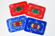
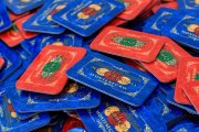
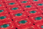
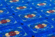
And here we are, I’m happy to present you the LeGold edition of Casino Royale plaques (and other stuff, but right now let's focus on them):

First, I did some research on PCF to see what had been done before, and got really inspired by this thread. MSK can do Pantone color matching?! Count me in!
Then, there was something bothering me with all the existing tributes. The circles in the middle, what colors should they be? I’d seen various representations, from green to gray (on the red plaques), and photos/videos of the originals didn’t help a lot. I was not familiar with the concept of lunettes, a feature present on B&G plaques, where these colored with a marble pattern. And, actually, transparent. Well, f***. Can’t get that with MSK, so I’ll have to improvise.
After some time, including shipping miniature versions of the originals from USA to Norway and buying Pantone samples, the journey had officially begun. Mr. Sleepy on his side took hi-res photos and detailed measurements of all the design elements on the large plaques, for me to recreate from scratch in Illustrator. Also, MSK’s two stock sizes match almost perfectly the originals, which was nice.
For the lunettes, I had to put my Illustrator skills to the test and, after a lot of back and forth, I finally got to the point where I was happy with the results for both the marble pattern and 3D effect. As colors on lunettes vary a lot depending on the background, I had to make a choice and I chose the look with a bright background:


Oh, remember how MSK was able to do Pantone color matching? Well, turns out it’s BS. They can’t, and it’s not even close. After a few rounds of samples, I gave up and decided I was happy with the slightly darker blue and paler red as they just couldn’t do any better (in retrospect, shipping them the mini originals might have helped, but I’m not even sure about that).
As for the gold foil color on the originals, I had to settle with a solid one which was not too yellowy. Also, you might get tempted to use the metallic gold print offered by MSK. There are two problems with it, at least for this particular design:

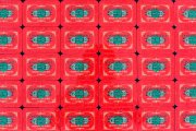
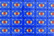
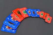
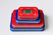
And yes, while at it, I also did a travel baby version of both:
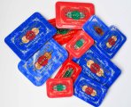
Lastly, some tips to future MSK customers:
It all started with me wanting to organize a yearly Casino Royale poker night with my group. I started with the chips, not caring too much about the plaques (after all, Apache has them in stock so I could order them whenever). Apache’s chips were not easy to get in quantities at the time, and communication was hard-to-impossible, so I decided I’d try to get old Cartamundis instead. Yes, the quality is ubercrap, but they're original. The search for those turned out to be harder than I had imagined (and I’m still not quite there... hint hint, @ChipOnMyShoulder?), but… what happened during that search is that a little bird called sleepypiggly saw my wanted-ad for the chips and pinged me about - the plaques. As it turned out, he has original B&G versions and some knowledge about their history, so an interesting read. Plaques were not a rabbit hole I was willing to get into, but me being me, it didn’t take much to take the dive. I quickly realized that making my own design, which would be closer to the originals than Apache’s plaques, wouldn’t cost much more. Still, far from cheap in such quantities, but as a wise man called @allforcharity once said, "it's not Bondesque unless you break the bank."
And here we are, I’m happy to present you the LeGold edition of Casino Royale plaques (and other stuff, but right now let's focus on them):
First, I did some research on PCF to see what had been done before, and got really inspired by this thread. MSK can do Pantone color matching?! Count me in!
Then, there was something bothering me with all the existing tributes. The circles in the middle, what colors should they be? I’d seen various representations, from green to gray (on the red plaques), and photos/videos of the originals didn’t help a lot. I was not familiar with the concept of lunettes, a feature present on B&G plaques, where these colored with a marble pattern. And, actually, transparent. Well, f***. Can’t get that with MSK, so I’ll have to improvise.
After some time, including shipping miniature versions of the originals from USA to Norway and buying Pantone samples, the journey had officially begun. Mr. Sleepy on his side took hi-res photos and detailed measurements of all the design elements on the large plaques, for me to recreate from scratch in Illustrator. Also, MSK’s two stock sizes match almost perfectly the originals, which was nice.
For the lunettes, I had to put my Illustrator skills to the test and, after a lot of back and forth, I finally got to the point where I was happy with the results for both the marble pattern and 3D effect. As colors on lunettes vary a lot depending on the background, I had to make a choice and I chose the look with a bright background:
Oh, remember how MSK was able to do Pantone color matching? Well, turns out it’s BS. They can’t, and it’s not even close. After a few rounds of samples, I gave up and decided I was happy with the slightly darker blue and paler red as they just couldn’t do any better (in retrospect, shipping them the mini originals might have helped, but I’m not even sure about that).
As for the gold foil color on the originals, I had to settle with a solid one which was not too yellowy. Also, you might get tempted to use the metallic gold print offered by MSK. There are two problems with it, at least for this particular design:
- The print is VERY speckly, not smooth. It used to be smoother years ago, but the current print is not. Also, you’ll notice stray gold speckles across the plaque…
- They need to run the metallic print separately from other layers, so placement would not be precise enough.


And yes, while at it, I also did a travel baby version of both:


Lastly, some tips to future MSK customers:
- Do not rely on MSK's color matching, at least not Pantone (and CMYK is very dependent on the equipment being used).
- If you are very particular on your design, do make prototypes! Can't stress this enough, as you might easily get disappointed.
- When you pay for prototypes to be made, they will want to charge again for new versions. I’d read of cases here on the forum where people only had to pay once. Maybe their current contact has a different policy. In any case, beware of that.
- When you make prototypes, you can choose to have different designs on each side! So, you can test 2-in-1.
- Be careful with choosing the metallic gold print. Get some recent samples in hands that will show you what it is about and whether it works for your particular case.
- Be very clear with your requests to MSK, and verify and question their proofs. In one case, they just decided to do things differently without saying anything (like not using metallic gold print when explicitly told to do so).
- Straight lines tend to be not so straight after all. My theory is that the print is done on top of their uneven marble background before putting the last layer, but it is just a wild guess. I noticed the same with B&G plaques though, so I just accepted it.
- Avoid elements that need to be centered/placed perfectly on the plaque. There will be variation, sometimes up to a few mm (whatever that might be in freedom units).
- I noticed their printer can be low on ink or have some other reason for causing stripes across the whole background. Their explanation was that certain CMYK combinations are just like that, but I just don't buy it.
