Chip Design Study: Montecito Casino (1 Viewer)

What do you think about the Montecito chip design?


  • Total voters
    27

CellarDoor85

High Hand
Joined
Feb 7, 2019
Messages
72
Reaction score
221
Location
Berlin, DE
(Hope this is the right place)

As I announced, I like to hear your opinion about various chip designs of real casinos.
(Inlay layout, colors, edge markings, etc.)
I made this study for casinos I visited or where I like the look.

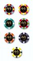
I like to start with the only casino on my list, which don't exist in reallity: The "Las Vegas Montecito Casino & Resort" of the TV series "Las Vegas".

I'm not lucky with the color composition but I love the really unique design of the chips.
 

Attachments

  • Montecito_chips.jpg
    Montecito_chips.jpg
    89.4 KB · Views: 550
  • 20190208_002056.jpg
    20190208_002056.jpg
    231 KB · Views: 580
  • Montecitochips.jpg
    Montecitochips.jpg
    42.3 KB · Views: 542
I really like the inlays or prints, just simple enough but with a nice clean look. Also the denominations are clearly visible and readable.

In your mockups the edge spots are way too big, they don't match the ones seen in the stacks. At that size there is almost nothing left from the base color to see.
 
I find them garish. Impractical. Way too easy for dirty stacks. Feels like they were made by someone who likes blingy things and not someone who has any understanding of a casino operation
 
For clarification, this isn’t a set you’re designing? This is a set that’s done, and not modifiable. So we’re not offering suggestions for improvement, just commenting on the existing design, right?
 
For clarification, this isn’t a set you’re designing? This is a set that’s done, and not modifiable. So we’re not offering suggestions for improvement, just commenting on the existing design, right?

Yap - this design is made only for the show (but not by me). Suggestions for improvements are too late ;)

Feels like they were made by someone who likes blingy things and not someone who has any understanding of a casino operation

I totaly agree.
I own one piece (found on eBay). The quality is weak - just simple plastic without any weight. But this understandable - because the showmaker only wanted to create a for TV screens good looking chip - not a practical ;)
But his approach allows the unique shape, which makes it interessting for me (never seen anything like this before or after).
 
"Casino resort" and "Las Vegas" are not readeble to me.
The value is readable because it's bold, but not enough contrast with the background
I do not like chips without spot progression.

I have to say something good about .. Let me see..
They are round, that's good.
 
Had to change my vote after I realized that these weren't the ceramic chips created in tribute many years ago.

245322
 
Size of the edge spots are totally overpowering the base colour of the chip.

You will have to play around with the text colour and how it actually prints. Fine line text on a black background can be very difficult to pull off without making it completely unreadable, especially a cursive script.
 
I’m new to this forum and had these made last month. Been trying to find the original chip outlays/strip pattern...no luck yet
783A3D1A-FBA4-40F5-AB9B-6DE4D8E0FDF0.jpeg
 

Create an account or login to comment

You must be a member in order to leave a comment

Create account

Create an account and join our community. It's easy!

Log in

Already have an account? Log in here.

Back
Top Bottom