JackSparrow
New Member
Hey Guys!
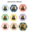
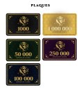
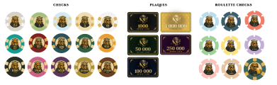
New member here, that joined a cupple of weeks ago. Great forum, learned a lot! I have worked on finishing up the design of my costum poker set, which will be quite a large order. I am going to buy 39mm Hybrid web mold ceramics Tina poker chips from Shenzhen City Chenglin Industrial Co. Will be using for all casino-games, but primarily blackjack. For the roulette chips I am going for either 39mm no-mold cheramics or 11.5G Roulette Ceramics (not really sure what's the difference hehe).
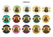
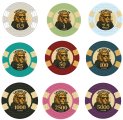
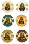
This is my current designs. Would love to get some feedback if there is something I should improve! I have printed out the labels and checked that the graphics is large enough.
The only thing that is left, is to get my design into right Illustrator format. My designs are currently in ps. It seems a bit intimidating with illustrator, but I saw a template that was uploaded here, and if I am not mistaken I could change the colors and labels, and the sides of the chips is already worked out, right? Or Is that something that the Tina-team can fix for me? If there is anybody here up for the task, don't hesitate to reach out! (I changed the design of the template a little bit, to make a roulette-chip style, so I guess that is going to affect the sides. Any way of knowing if the sides are lined up correctly with the front design?
Sorry for a post a little all over the place. Would love to hear from you guys.
Best regards
New member here, that joined a cupple of weeks ago. Great forum, learned a lot! I have worked on finishing up the design of my costum poker set, which will be quite a large order. I am going to buy 39mm Hybrid web mold ceramics Tina poker chips from Shenzhen City Chenglin Industrial Co. Will be using for all casino-games, but primarily blackjack. For the roulette chips I am going for either 39mm no-mold cheramics or 11.5G Roulette Ceramics (not really sure what's the difference hehe).
This is my current designs. Would love to get some feedback if there is something I should improve! I have printed out the labels and checked that the graphics is large enough.
The only thing that is left, is to get my design into right Illustrator format. My designs are currently in ps. It seems a bit intimidating with illustrator, but I saw a template that was uploaded here, and if I am not mistaken I could change the colors and labels, and the sides of the chips is already worked out, right? Or Is that something that the Tina-team can fix for me? If there is anybody here up for the task, don't hesitate to reach out! (I changed the design of the template a little bit, to make a roulette-chip style, so I guess that is going to affect the sides. Any way of knowing if the sides are lined up correctly with the front design?
Sorry for a post a little all over the place. Would love to hear from you guys.
Best regards