CPC Custom Trimoon set: How much color overlap is acceptable? (1 Viewer)

JMC9389

Royal Flush
Supporter
Joined
Jul 27, 2019
Messages
12,799
Reaction score
29,074
Location
NJ
One of the cardinal sins is to use too much of the same color on a chip set and namely, using the same color for an edge spot on another adjacent chip in the set. That being said, the mock up I made looks absolutely eye popping and beautiful.

But I do ask from those with more experience than I, how much overlap (if any) is too much?

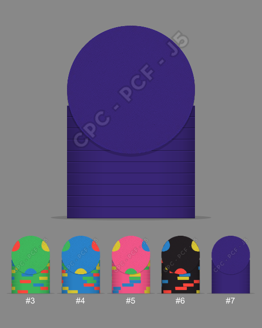
I plan on making a cash/tournament hybrid set somewhere down the line close to as it is mocked up below, with denominations of 5, 25, 100, 500, 1000, 5000, and the last blurple solid a bounty chip:
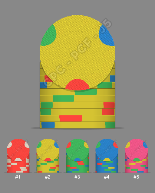
Plain Mold Trimoon Set.png


Plain Mold Trimoon Set 2.png


The trimoon edge spots are on the smaller side compared to other spots. Would there really be dirty stack and pot issues here? I'm having a hard time picturing it. I'm thinking that the colors are bright enough that they'd stand out on their own even when the same edge spots and body chips are close together, but I'm not sure.

All feedback and critiques are welcomed! I'm not planning on having this ordered any time soon; I'm giving myself plenty of time to tweak and play around with the design tool to get it just right before submitting the order.
 
There’s a few Venetian tournament sets that use this idea
I think color matched inlays are a must.
6BD49D06-8BD6-4D35-BFA1-AEF29612B31F.jpeg
AE8F640B-F863-487B-9125-4CD8FE631D97.png
1390B793-09CC-41C1-B014-8EB1CCD0F8D6.jpeg
2C1651D3-08CA-4DF5-943D-94131E55102D.jpeg
7F610802-9B44-4A70-9F7A-F6F48CCD15A0.jpeg
AB777D75-F022-48B3-864C-C76F690333F5.jpeg
 
I can 100% no questions asked inevitably guarantee you that if you use the same colors for the base as the same colors for all edgespots, you will have a mass of dirty spot issues.

Your current mockups are probably the worst you can get for this issue.
 
I can 100% no questions asked inevitably guarantee you that if you use the same colors for the base as the same colors for all edgespots, you will have a mass of dirty spot issues.

Your current mockups are probably the worst you can get for this issue.
Understood. In your experience does using dayglow spots exacerbate or mute this issue? Or it doesn't matter and they'll be a unicorn vomit inducing mess regardless?

If I were to pick, I would say the yellow chip is the absolute favorite I mocked up and wouldn't change that one. I can change the DG Tiger base on the "5" chip before it to be a bit of a darker orange, or maybe red even.

I can change the DG Saturn spot on the next green chip to another shade of yellow, or maybe change it to DG Pink (that doesn't appear again until 3 denominations later). Or...just make the "5" chip DG Pink and leave the yellow chip as is, and make the "1000" chip another color all together. No dirty stack issues that way, I don't think.
 
That being said, the mock up I made looks absolutely eye popping and beautiful.
Do you have a colour sample in hand? You mentioned the use of DG Saturn in a post after this one... DG Saturn doesn't pop at all and looks completely different than what you see on your screen. In normal lighting levels for poker DG Pink and DG Tiger look almost the same less than 2 ft away.
 
Take 2:

I don't have enough of viable options to make three unique spots on each chip without using any colors from the previous or subsequent chip in the set.

My only concern with this mock up is although I used two different shades of green on the yellow chip and the body of the following chip, but I'm just not sure they're discernible enough. Though I'm disappointed that I can't use all unique spots, I can live with this mockup. Thoughts?

Plain Mold Trimoon Set 3.png
Plain Mold Trimoon Set 4.png
 
Do you have a colour sample in hand? You mentioned the use of DG Saturn in a post after this one... DG Saturn doesn't pop at all and looks completely different than what you see on your screen. In normal lighting levels for poker DG Pink and DG Tiger look almost the same less than 2 ft away.
I do have a sample set! In a cash set that I'm making I want to use both, but I'm starting to think it's not such a good idea. I'm thinking of changing the DG Pink to DG Saturn.
 
I think color matched inlays are a must.
^ This ^

If you're set on using the same colours across all chips then you need to match the inlays to the chip base colours... it's not just dirty stacks that are an issue but dirty pots as well. It's more difficult to size up a pot when every chip has the same colours.
 
^ This ^

If you're set on using the same colours across all chips then you need to match the inlays to the chip base colours... it's not just dirty stacks that are an issue but dirty pots as well. It's more difficult to size up a pot when every chip has the same colours.
That is an excellent suggestion. I'm sure I can get the color background matched inlays from a designer.

I'm not married to using the same colors, but I just thought they looked cool initially.

I tried again with another mockup that I posted above; I'm thinking of changing the green chip to another base color completely, as I do worry about the edge spot on the previous chip being too close to the body of that chip, even though the edge spot is DG Green and the body of the following chip is light green. Sample in hand, the colors are pretty darn close.
 
I can 100% no questions asked inevitably guarantee you that if you use the same colors for the base as the same colors for all edgespots, you will have a mass of dirty spot issues.

Your current mockups are probably the worst you can get for this issue.
^ This. The yellow, green, and blue chips in particular will all play horribly with each other, with just three colors being used for all three base chips *plus* six of the nine possible spots (totalling a large percentage of each chip's circumference)... and with the last three spot colors *also* being the same across all three chips. Regardless of how awesome any of the individual chips may be, together, they are awful. It fact, it would be very difficult to design a worse three chip subset in regards to playability.
Understood. In your experience does using dayglow spots exacerbate or mute this issue? Or it doesn't matter and they'll be a unicorn vomit inducing mess regardless?
Dayglo itself is irrelevant, but the *relative* brightness or visual impact of *all* the colors used together is important. If all are bright/dayglo, or if all are soft/pastel, the effect is basically the same when large areas of duplicate color are used.
 
^ This. The yellow, green, and blue chips in particular will all play horribly with each other, with just three colors being used for all three base chips *plus* six of the nine possible spots (totalling a large percentage of each chip's circumference)... and with the last three spot colors *also* being the same across all three chips. Regardless of how awesome any of the individual chips may be, together, they are awful. It fact, it would be very difficult to design a worse three chip subset in regards to playability.

Dayglo itself is irrelevant, but the *relative* brightness or visual impact of *all* the colors used together is important. If all are bright/dayglo, or if all are soft/pastel, the effect is basically the same when large areas of duplicate color are used.
Thank you for your constructive thoughts! I'm taking everyone's word here for it as I'm sure someone has made the mistake of it before. I changed the light green to a darker green in my last mockup. It looks better than the previous one, but I'm still not sure. I think I may hire @timinater to design my whole set :D . Last mockup for a while:

Plain Mold Trimoon 5.png


Chip #6 and #7 from previous mock up is the same.
 
Thank you for your constructive thoughts! I'm taking everyone's word here for it as I'm sure someone has made the mistake of it before. I changed the light green to a darker green in my last mockup. It looks better than the previous one, but I'm still not sure. I think I may hire @timinater to design my whole set :D . Last mockup for a while:

View attachment 395557

Chip #6 and #7 from previous mock up is the same.
I think ^this^ one looks fine. Much better than previous versions.
 
There’s a few Venetian tournament sets that use this idea
I think color matched inlays are a must.
View attachment 395385View attachment 395386View attachment 395387View attachment 395388View attachment 395389View attachment 395390
Those double moons look awesome! It's a shame that CPC doesn't offer that spot pattern.

Thanks again all for your thoughts and criticisms. I have a lot of time to mull this over, as I'm placing an order on a totally different custom set with CPC in the coming weeks. This thread is dedicated to the project that is to come after that :D

Even then, in between CPC sets, I want to start building a Paulson mixed THC set. Have to be careful with budgeting money. Wife went part time at her work and I need to be more careful with money in the coming months.
 
For reference. Colors are slightly off, but focus is on trimoon size.
A1EC9C51-3CA3-42C2-95B2-D0A94597DF79.jpeg
 

Create an account or login to comment

You must be a member in order to leave a comment

Create account

Create an account and join our community. It's easy!

Log in

Already have an account? Log in here.

Back
Top Bottom